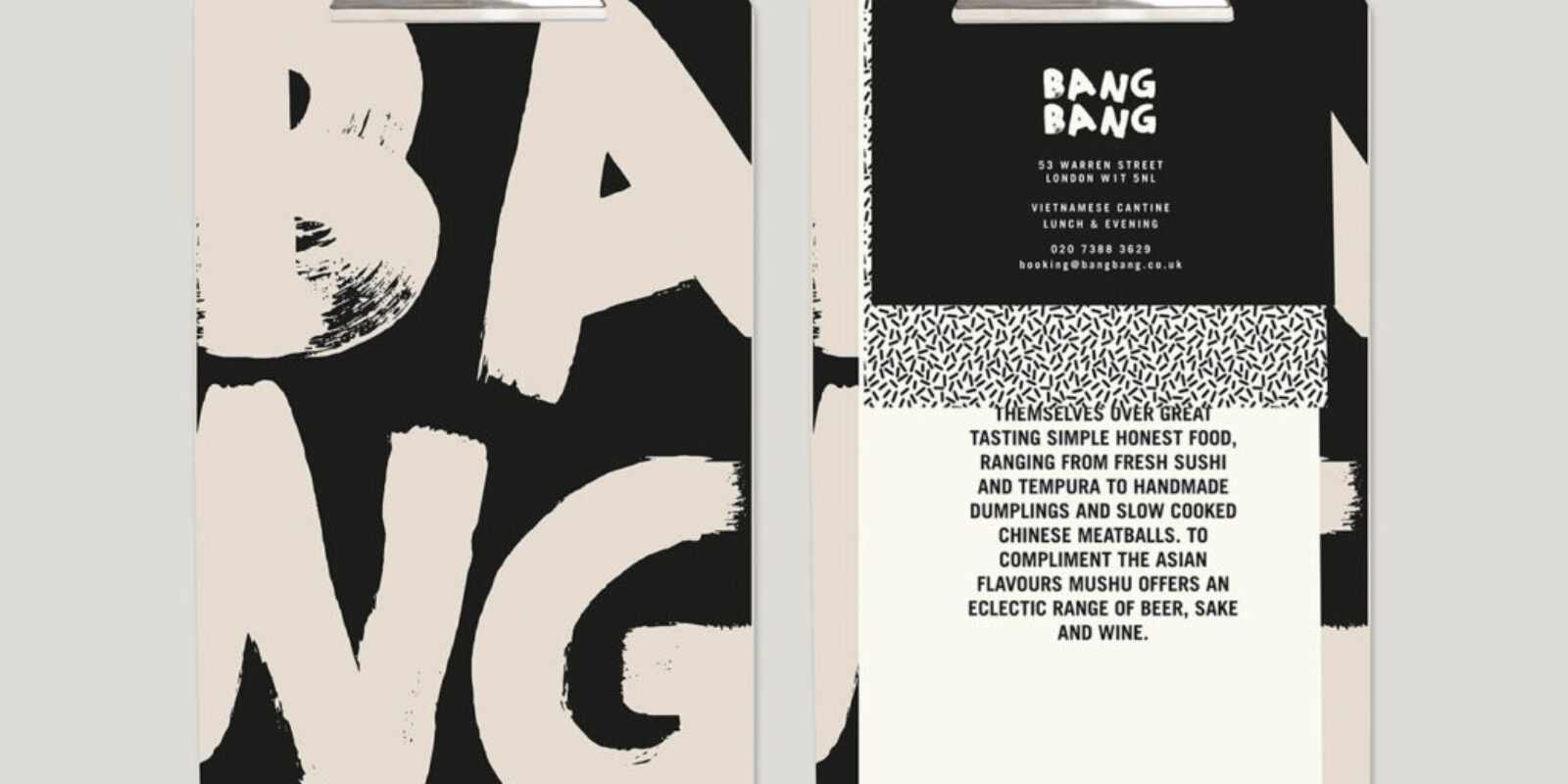
Brand patterns are an important part of a brand’s visual identity, helping to add depth and interest to marketing materials and products.
However, choosing the right pattern for your brand can be a daunting task. In this blog post, we will explore the key considerations for selecting a brand pattern that is aligned with your brand’s personality, core values, and mission. Patterns play a crucial role in reinforcing your brand’s visual identity, contributing to brand awareness and familiarity among users.
From understanding your brand personality to considering the practical applications of your branding pattern, we will provide practical tips and advice to help you choose a brand pattern that enhances your overall branding efforts.
-
 Brand Your Photography Business Like A Pro11,00 $ incl. VAT
 -
 Ebook: Brand Your Etsy Shop Like A Pro11,00 $ incl. VAT
 -
 E-book: The Ultimate Guide to Branding Styles11,00 $ incl. VAT
A brand pattern is a repeatable design solution that can be applied across multiple touchpoints.
A well-crafted brand pattern will reinforce the core elements of your brand identity, making it instantly recognizable and memorable. Using a brand pattern, you can create a cohesive and consistent experience for your customers, no matter where they encounter your brand.
There are many different types of brand patterns, but some common examples include logos, color palettes, typefaces, icons, and taglines. These design elements are crucial in creating a strong brand identity as they communicate the brand’s story and attract the right customers. A logo is perhaps the essential element of any brand pattern; it should be simple, distinctive, and easy to reproduce in various sizes.
Examples of logo design, brand patterns, and brand identities can be found in rebranding case studies, logo design exploration, and brand stationery logo design here.
Your color palette should be carefully curated to reflect your brand’s personality; you should use no more than three or four colors in your palette, and they should work well together.
Your typeface should be legible and appropriate for the tone of your brand; Sans-serif fonts are typically seen as more modern and approachable, while Serif fonts convey tradition and sophistication.
Icons are another vital part of any brand pattern; they should be visually interesting and easy to understand at a glance.
Finally, your tagline should be concise, memorable, and reflective of your brand’s values.
Different types of patterns affect our subconsciousness differently. Using the wrong pattern in the wrong situation may leave your business with a cheap and disappointing impression. Choose colors that fit your business’s color palette tonality.
Combine large and small patterns, do not be afraid to use different patterns: dots, stripes, squares, flowers, geometry, etc., as long as you follow the basic features of your business’s personality group.
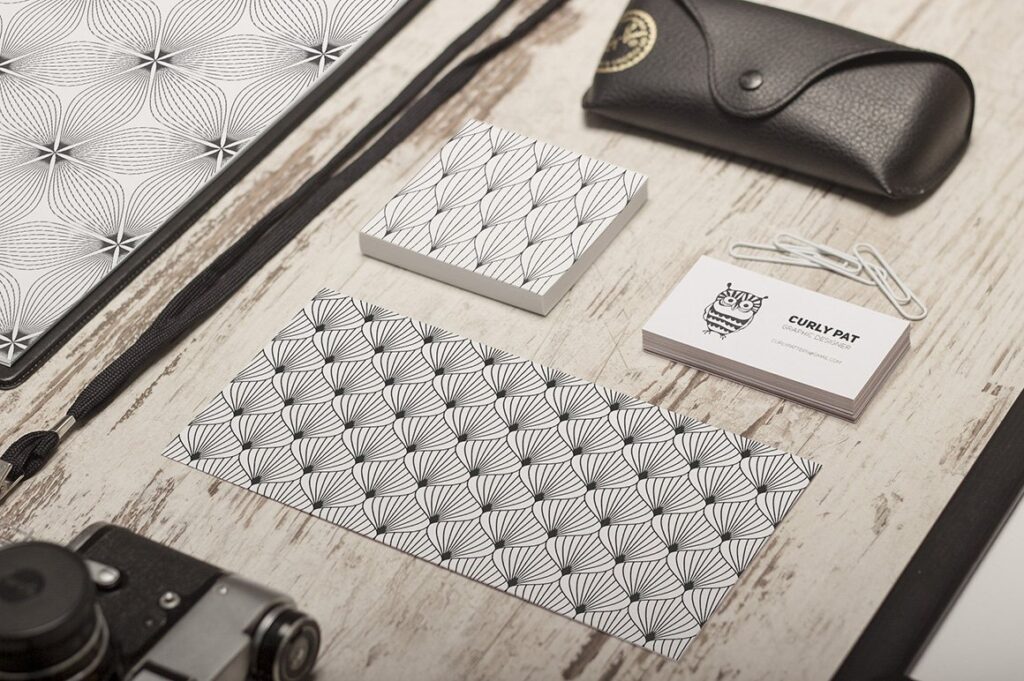
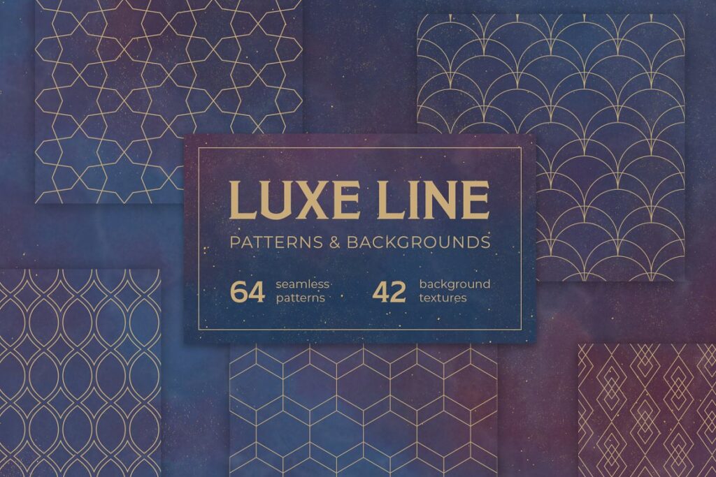
You can find many great patterns in most image stock websites and Creative Market, like the design below, by Curly_Pat.
What Type of Pattern Is Right For YOUR Business?
Determining the right pattern for your business depends on various factors including your industry, target audience, business model, and long-term goals.
Incorporating other elements such as icons, logos, and personal elements can enhance brand visual identity and incorporate unique and meaningful aspects into patterns and brand visuals.
Some businesses or companies may thrive with a disruptive pattern, introducing novel products or services. Others may find a scalable pattern, focusing on consistent growth, more suitable.
Whether it’s innovation, scalability, or a combination of these, understanding your business’s unique needs and the market dynamics will guide you toward the pattern that will maximize your success.
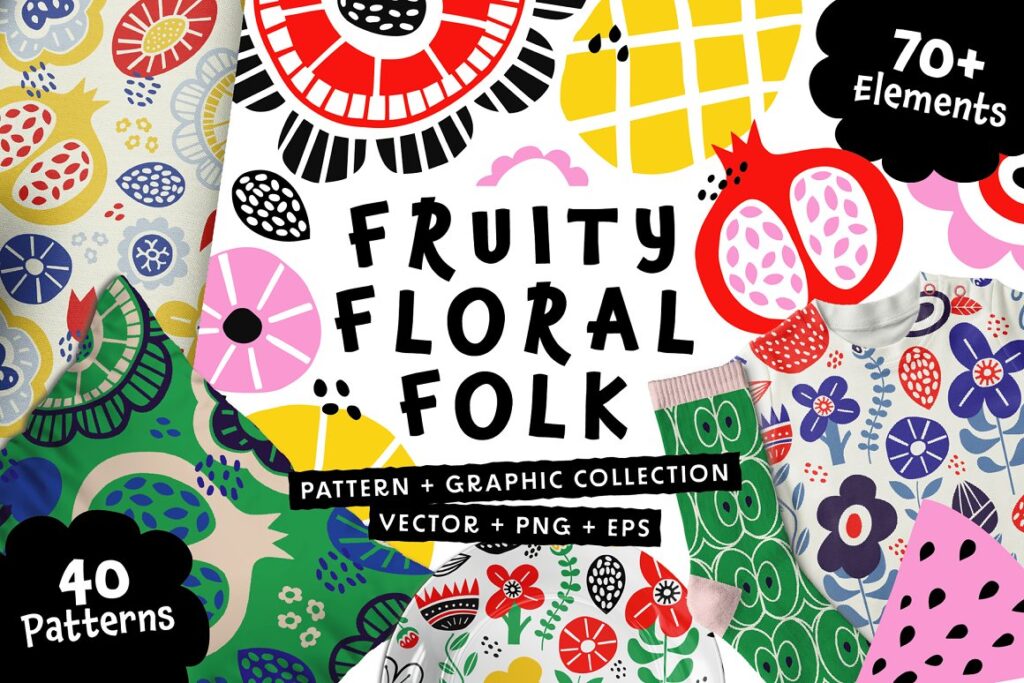
Personality group 1 – patterns for playful and youthful brands:
Brand Design 1: How To Brand a Youthful, Happy Business
Patterns in group 1 are often asymmetrical, bright, and full of movement.
If you can find symmetrical, dotted patterns here, the dots are in different colors. Flowery patterns are abundant and full of life and activity. This gives a warm and open impression and a comfortable and welcoming mood.
In group 1, the brand patterns are characterized by asymmetrical designs, bright colors, and a sense of movement. Flowery patterns are abundant, and often full of activity, conveying a warm and open impression and a comfortable and welcoming mood.
These patterns are ideal for brands that want to create a bold and energetic image, such as sports, entertainment, toddlers’ or lifestyle brands. When creating a brand pattern in this style, consider using a mix of bright and bold colors, such as red, orange, and yellow, to convey a sense of excitement and energy.
Asymmetrical designs can be used to create a sense of movement and dynamism. Incorporating geometric shapes, such as triangles or hexagons, can add a modern and edgy feel to the pattern. Dotted patterns in different colors can also be used to create a fun and playful pattern.
Overall, this style’s brand pattern can convey excitement, energy, and fun. It can be a great fit for brands that want to create a bold and memorable image, while still maintaining a level of warmth and approachability.

Personality group 2 – patterns for feminine and elegant brands:
In group 2, the patterns are calm and finely drawn.
Small florals, pastel romantic, rose patterns: gentle squares, dots, calligraphic decorative text. There is gracefulness in the patterns, even for baby products. Tonality is muted and pastel, and you find no brightness here.
In group 2, the brand patterns are characterized by a calm and delicate feel, with finely drawn details.
Small florals, pastel romantic, and rose patterns are popular choices, along with gentle squares, dots, and calligraphic decorative text. These patterns convey a sense of gracefulness and elegance, even for baby products.
The tonality in this group is muted and pastel, with no bright colors. The use of soft, pastel colors such as pink, peach, and lavender can add to the overall delicate and gentle feel of the pattern. The patterns in this group are ideal for brands looking to create a feminine or romantic image, such as beauty, fashion, or wedding-related businesses.
When creating a brand pattern in this style, consider the use of small and delicate details, such as intricate florals or fine lines. The patterns can be arranged in a repeating pattern or used as an accent on specific brand elements such as packaging or marketing materials.
Overall, a brand pattern in this style can convey a sense of sophistication, refinement, and femininity.
It can be a great fit for brands that want to communicate a gentle and romantic image, while still maintaining a level of elegance and professionalism.

Personality group 3 – patterns for friendly and earthy brands:
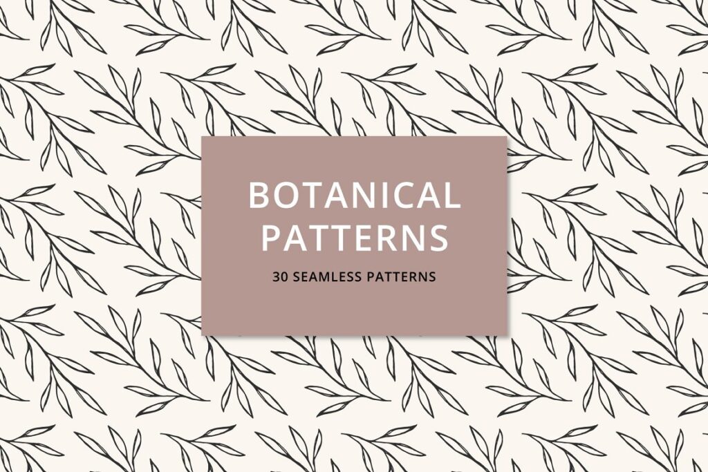
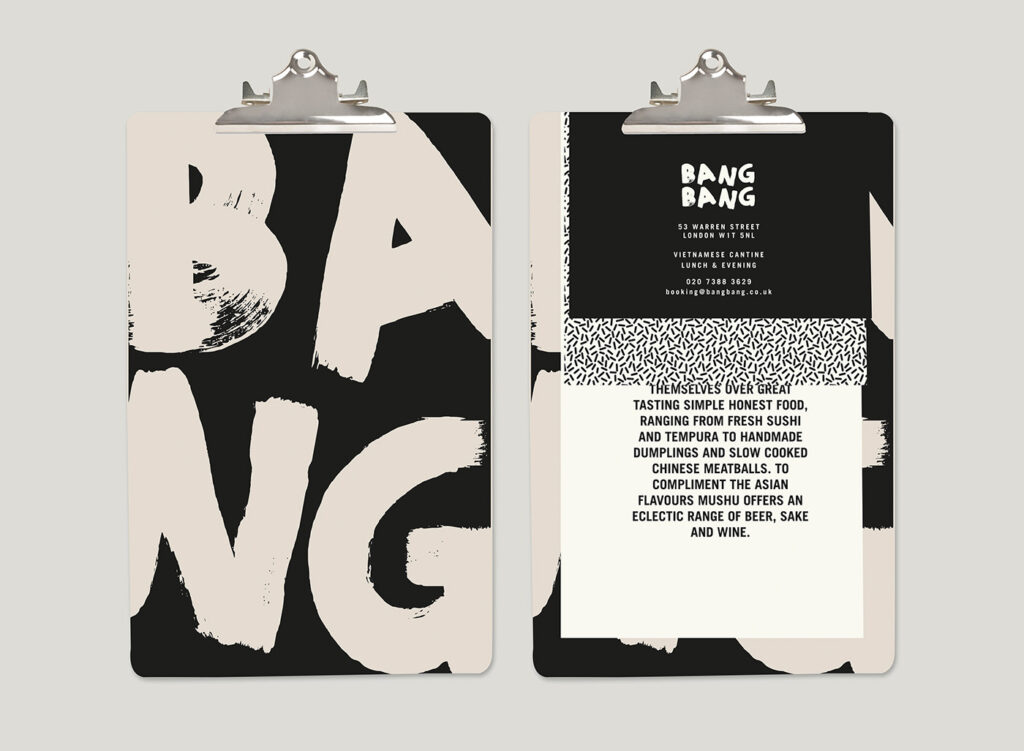
In group 3, you find earthy, nature-reflecting patterns and hand-drawn details with bold lines.
Brand Design 3: How To Style an Earthy, Community-Focused Business
Use large-scale botanical patterns or imitation of natural materials. The colors are subtle and warm.
In group 3, the emphasis is on earthy, nature-reflecting patterns and hand-drawn details with bold lines.
To create a brand pattern in this style, consider using large-scale botanical patterns or imitations of natural materials such as wood, stone, or cork. The colors should be subtle and warm, evoking a sense of calmness and tranquility.
Botanical patterns can include leaves, flowers, or trees, and can be either abstract or representational.
The use of hand-drawn details with bold lines can add a personal touch to the pattern and make it feel more authentic. Incorporating textures and gradients can also enhance the natural feel of the pattern.
When selecting colors, think about earthy tones such as green, brown, and beige, as well as warm tones like orange and yellow. These colors can create a cozy and inviting atmosphere and align with the natural theme of the pattern.
Overall, a brand pattern in this style can convey a sense of harmony, balance, and a connection to nature.
It can be a great fit for brands in the health, wellness, and natural product industries or any brand that wants to communicate a sense of authenticity and closeness and connect to the environment.


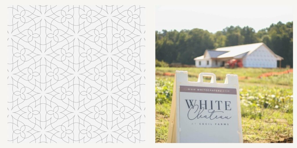
In group 4, the brand patterns are characterized by regularity, geometry, and clarity.
Brand Design 4: How To Brand a High-End, Luxury Business
The use of golden and shiny elements against a dark or white background can create a sense of crispiness and coolness. Sharp angles and confident straight lines are often used, along with overexposed details or relatively tiny objects, creating a sense of extremes and drama.
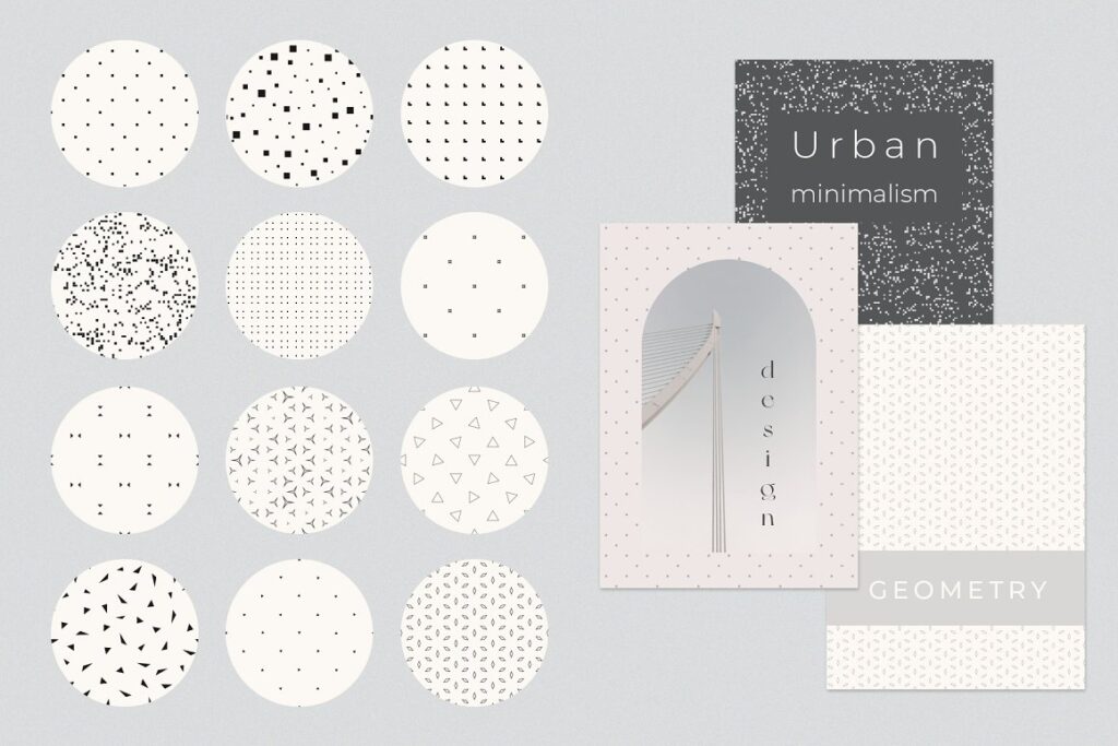
This group also includes patterns with complete minimalism, where the use of negative space is just as important as the pattern itself. The minimalistic approach creates a sense of simplicity, elegance, and sophistication.
When creating a brand pattern in this style, consider the use of geometric shapes such as squares, triangles, and circles. These shapes can be used to create a sense of regularity and clarity, and when combined with shiny and golden elements, the design can create a luxurious and premium feel.
The use of overexposed details or relatively tiny objects as backgrounds can add drama to the pattern, while the use of negative space can create a minimalistic and elegant feel. These patterns are ideal for brands that want to create a bold and memorable image, such as high-end fashion or luxury brands.
Overall, a brand pattern in this style can convey a sense of sophistication, elegance, and luxury.
It can be a great fit for brands that want to create a bold and memorable image, while still maintaining a level of simplicity and clarity.


Pattern Descriptions For Different Types Of Brand Designs
| Personality Group | Key Characteristics | Ideal Brand Types | |
|---|---|---|---|
| 1. Playful and Youthful | Asymmetrical, bright, movement, flowery patterns, warm and open impression, comfortable and welcoming mood | Sports, entertainment, toddlers, lifestyle | |
| 2. Feminine and Elegant | Calm, finely drawn, small florals, pastel romantic, muted tonality, gracefulness | Beauty, fashion, wedding-related businesses | |
| 3. Friendly and Earthy | Earthy, nature-reflecting, hand-drawn, bold lines, subtle and warm colors | Health, wellness, natural products | |
| 4. High-end | Regularity, geometry, clarity, shiny elements, minimalism, simplicity, elegance | High-end fashion, luxury brands |
Learn more about the four personalities and choose the right combinations of colors, typefaces, patterns, and photos for your visual branding:
- Group 1- Brand Design 1: How To Brand a Youthful, Open, and Happy Business
- Group 2- Brand Design 2: How To Brand an Elegant, Feminine Business
- Group 3- Brand Design 3: How To Style an Earthy, Community-Focused Business
- Group 4- Brand Design 4: How To Brand a High-End, Luxury Business
How To Select Patterns That Support Your Brand
In brand design, one of your brand design job’s most important aspects is creating a unique and recognizable brand identity.
You can accomplish this in many ways, but one of the most important is using patterns. The right pattern can convey your brand’s personality and make it instantly recognizable.
But with so many options out there, how do you choose the right one? Let us see how to select patterns that support your brand.
1. Start with your brand’s color palette.
When choosing patterns for your brand, starting with your brand’s color palette is essential.
This will help you narrow down your options and ensure that your selected patterns align with your overall branding.
2. Consider the different applications you’ll need the pattern for.
Will you be using it on printed materials like business cards or brochures, incorporating unique design elements such as woven patterns and letterpress texture to make them visually interesting?
Or will it primarily be used on digital channels like your business card, website, or social media? Keep in mind how the pattern will be used when making your selection.
3. Choose a pattern that conveys the personality of your brand.
Does your brand have a fun and playful personality?
If so, you might want to choose a geometric or floral pattern. Or, if your brand is more conservative, a classic stripe or plaid might be a better option.
4. Make sure the pattern is scalable.
One of the benefits of patterns is that you can use them in various sizes.
But this only works if the pattern is scalable. When selecting a pattern, ensure it looks just as good at small sizes as at large ones.
5. Test it out!
Once you’ve selected a few contenders, it’s time to put them to the test.
Create mock-ups of how they would look in different applications and solicit feedback from colleagues or clients. The best way to choose a pattern is to experiment and see what works best for your brand identity.
Patterns are a great way to add personality to your brand and make it recognizable across all channels.
By following these tips, you can select patterns that will support your overall branding efforts and help you take your business to the next level! A well-designed brand pattern can be an incredibly powerful tool for any business.
By carefully crafting each element of your brand pattern, you can create a consistent and cohesive experience for your customers that will help them remember your brand long after interacting with it.
How To Create a Brand Pattern?
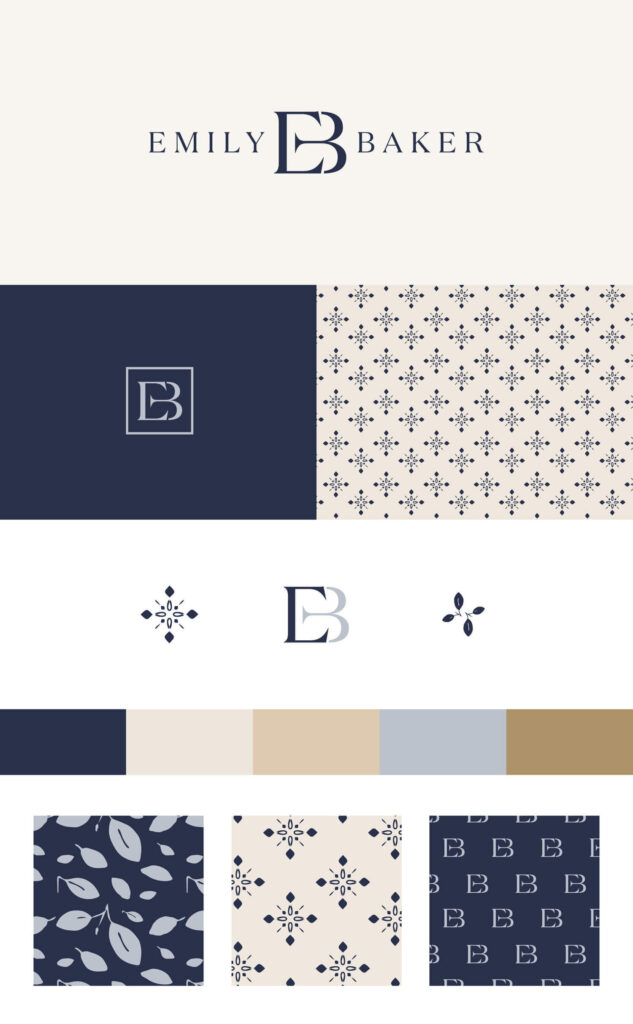
Creating a brand pattern involves designing a cohesive, visually appealing, and memorable graphic element or series of elements that can be used across various brand touchpoints, such as packaging design, marketing materials, and digital platforms.
A well-designed brand pattern can help reinforce brand identity, create a consistent look and feel, and enhance brand recognition. Here’s a step-by-step guide to creating a brand pattern:
- Define your brand identity: Before creating a brand pattern, you need to have a clear understanding of your brand’s identity, including its mission, values, target audience, and visual style. This information will guide your design decisions and ensure that your brand pattern aligns with your overall brand strategy.
- Research and gather inspiration: Look for design inspiration from various sources, such as competitor brands, design blogs, or platforms like Pinterest and Dribbble. Identify patterns that resonate with your brand identity and make note of elements, styles, or themes that could work well for your brand.
- Choose a theme or concept: Based on your research and brand identity, select a theme or concept that will guide the design of your brand pattern. This can be anything from a specific shape or motif to an abstract concept or a representation of your brand’s core values.
- Determine the pattern’s structure: Decide on the structure of your pattern, such as whether it will be a simple repeating pattern, a more complex tessellation, or a free-form design. Consider how the pattern will be used across different applications and ensure that it can be easily scaled and adapted as needed.
- Sketch and refine your design: Begin by sketching out your design ideas on paper or using design software. Experiment with different layouts, shapes, and color combinations, and iteratively refine your design until you have a strong, cohesive pattern that represents your brand.
- Test and adapt the pattern: Apply your pattern to various brand touchpoints, such as packaging, marketing materials, and digital platforms, to see how it works in different contexts. Make any necessary adjustments to ensure that the pattern is visually appealing, functional, and adaptable across different applications.
- Create a style guide: Develop a brand pattern style guide that outlines the proper usage of the pattern, including guidelines for scaling, color combinations, and placement. This will help ensure consistency across all brand touchpoints and make it easier for your team or external partners to implement the pattern correctly.
- Implement and promote the pattern: Incorporate your brand pattern into your brand’s visual assets and promote it across various channels, such as social media, email marketing, and print materials. This will help reinforce your brand identity, create a consistent look and feel, and enhance brand recognition.
Remember that creating a brand pattern is an iterative process that may require ongoing adjustments and refinements as your brand strategy evolves.
Continually evaluate the effectiveness of your pattern and make updates as needed to ensure that it remains aligned with your brand identity and goals.
-
 Ebook: Brand Your Etsy Shop Like A Pro11,00 $ incl. VAT
 -
 The Ultimate Beauty Branding Handbook11,00 $ incl. VAT
 -
 E-book: The Ultimate Guide to Branding Styles11,00 $ incl. VAT
Conclusion
In conclusion, choosing a brand pattern for your branding project is an essential step toward creating a unique and memorable brand identity.
It is crucial to consider your brand’s personality, target audience, and the message you want to convey when selecting a pattern. There are various types of brand patterns to choose from, including geometric, organic, abstract, and illustrative patterns. It’s important to ensure that the pattern you choose aligns with your brand values, mission, and vision.
When implemented effectively, a brand pattern can enhance your brand’s recognition, build trust with your customers, and set you apart from the competition.
Remember to keep it simple, memorable, and timeless for long-lasting success.
Read more about visual branding:
How To Choose Brand Illustration Style For Your Business
How To Choose The Right Brand Designer
Brand Anatomy – What Is It, And What Are Its Key Elements?
What is Visual Branding and How It Can Help Your Business

