How To Create a Color Palette For Your Brand
Creating a color palette is a crucial part of building a strong brand identity.

The colors you choose for your brand can communicate your values, personality, and purpose to your target audience and help you stand out in a crowded market. A well-designed color palette can make your brand more recognizable, memorable, and emotionally engaging to your customers. However, choosing the right colors for your brand can be a daunting task.
In this post, we will provide you with a step-by-step guide on how to create a color palette for your brand that effectively communicates your values, engages your audience, and builds a strong visual identity.
Learn EVERYTHING about seasonal design and much more you will love, HERE: Creative Access.
What is the purpose of a color palette for a brand?
The purpose of a color palette for a brand is to establish a consistent visual identity that helps the brand to be easily recognized and remembered by its target audience.
A color palette can help a brand to communicate its values, personality, and purpose more effectively and can create an emotional connection with its audience. By using a consistent color palette across all brand materials, a brand can establish a strong visual identity and create a sense of cohesiveness and professionalism. A well-designed color palette can also help to differentiate a brand from its competitors and make it stand out in a crowded market.
Overall, a color palette is an essential tool for building a strong brand identity and creating a lasting impression with customers.
The right color palette for your business
Turn back to your big goal and message and look through what’s right for your business and its products and services.
Do you remember those 3-5 power keywords you chose for your branding? When choosing your brand colors, it is time to take those words into practice again. If you have any shade cards available, then it will help. Start picking out the colors you have in your mind.
Remember that you need to find the correct tonalities and avoid mixing tonalities that belong to various personality groups.
Perhaps you have decided to use only one color, as is done by bensasso.com? Or maybe you want to create a broad color selection of 10-20 – in any case, take your time, and have a good reason for every chosen color.
If your business does not belong to a group 4 personality but desires to use black, then find another color with a very dark tonality as a suitable alternative to coal black. These can be, for example, dark blue, dark gray, dark green, brown, and dark purple. When you have made your choices, test them – as your first step, try a black color card beside the other chosen colors for your palette.
Now swap the black card with the dark alternatives – which one looks best?
Seasonal Color Approach
Spring colors– Brand Design 1: How to Brand a Youthful, Open, and Happy Business
Summer colors– Brand Design 2: How to Brand an Elegant, Feminine Business
Autumn colors– Brand Design 3: How to Style an Earthy, Community-Focused Business
Winter colors– Brand Design 4: How to Brand a High-End, Luxury Business
How to create a color palette for a brand
Color palette for a brand is an important step in establishing the brand’s visual identity and ensuring brand recognition.
Here are some steps to follow when creating a color palette for a brand:
- Determine the brand’s values and personality: The color palette you choose should reflect the brand’s values and personality. Consider what emotions and associations you want the brand to evoke, and choose colors that align with these values.
- Research color theory: Understanding color theory can help you select colors that work well together and evoke the desired emotional response. Learn about the meaning of different colors and how they interact with each other.
- Start with a base color: Choose a base color that represents the brand’s primary values and personality. This color will serve as the foundation for the rest of the color palette.
- Choose supporting colors: Once you have a base color, choose two to four supporting colors that complement the base color and add visual interest to the palette.
- Test your palette: Test your palette in different contexts to ensure it works well in different applications. Consider how the colors look together on a website, in print materials, or on social media.
- Document the color palette: Once you’ve finalized your color palette, document it in a style guide or brand book. This will ensure consistency across all brand materials and make it easy for others to use the color palette.
Now you can create a color palette that effectively communicates the brand’s values and personality, while also ensuring brand recognition and consistency across all materials.
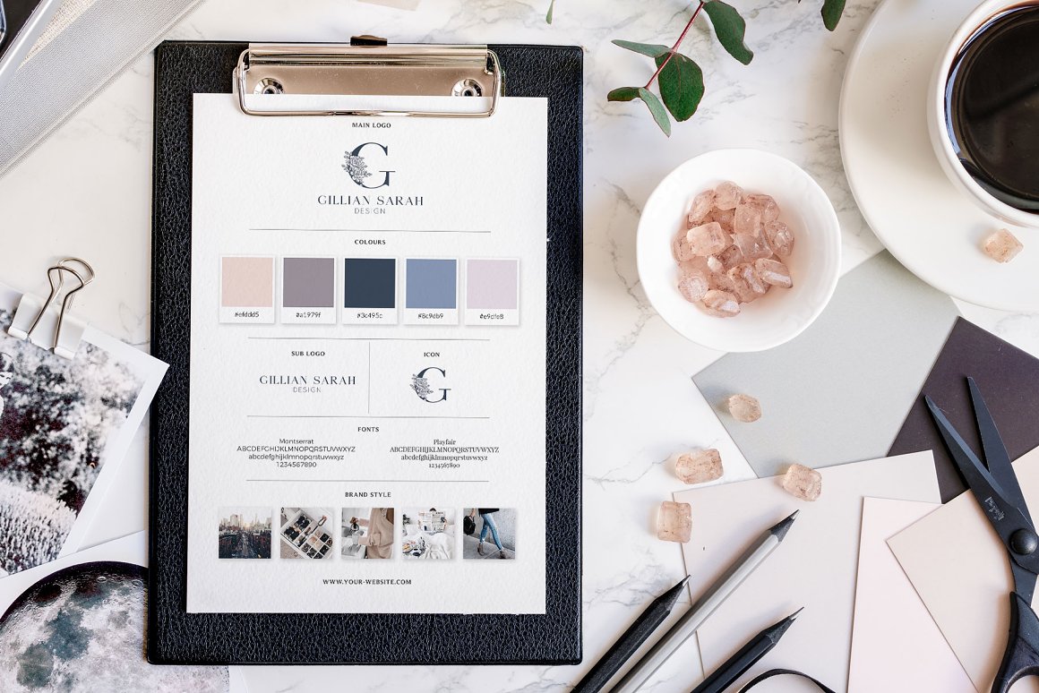
Brand board template with color palette by Gillian Sarah on Creative Market
How many colors should you include in a brand’s color palette?
The number of colors you should include in a brand’s color palette can vary, but typically, it’s best to keep it relatively small, with about 3 to 5 primary colors.
Having too many colors can make your brand look cluttered, confusing, and less memorable. A smaller color palette can create a sense of cohesiveness and consistency across all brand materials and make it easier for your target audience to remember your brand.
However, you can also include secondary or accent colors that complement your primary colors and provide more flexibility in your design.
These colors can be used sparingly to add interest and variety to your brand materials.
When you choose the number of colors to include in your brand’s color palette, it’s important to consider your brand’s values, personality, and target audience, and how the colors can effectively communicate these elements.
How to choose the right colors for a brand?
Color plays a critical role in creating a strong brand identity.
The colors you choose for your brand can communicate your values, personality, and purpose to your target audience and help you stand out in a crowded market. However, choosing the right colors for a brand can be a challenging task. With so many colors to choose from and the need to consider different factors like brand values and psychology, it can be overwhelming.
Choose the right colors for a brand. Here are some steps to follow that can help:
Step 1: Pick the colors that look right for you. Choose colors from the four personality groups: tints, tones, shades, and hues. Use Pinterest to find inspiration and research your color palette.
Step 2: Select the colors that do not seem to fit together with the rest of the chosen colors. Use the exclusion technique until you have reached a harmonious color palette.
Step :3 Create your digital color palette. Use the corresponding color number for Pantone cards, and find the color codes for paint brand color cards using a color picker tool. Create a color palette template with Canva, Adobe Photoshop, or Illustrator.
Step 4: Within your color palette, you will need two core colors, two action colors, and two grounding colors. The core colors can be your brand colors, the action colors provide a pop of attention, and the grounding colors offer balance to your design.
Remember:
- Understand your brand’s values and personality: Think about the message you want to convey to your target audience and how you want them to perceive your brand. For example, if you want to convey a sense of luxury and sophistication, you may want to choose rich, deep colors.
- Consider your target audience: Think about the demographics of your target audience, including their age, gender, and cultural background. Different colors can have different meanings in different cultures, so it’s important to consider this when choosing your color palette.
- Look at your competitors: Research your competitors’ color palettes and think about how you can differentiate your brand while still remaining within your industry’s norms.
- Use color psychology: Color psychology is the study of how colors can affect people’s emotions and behavior. For example, blue is often associated with trust and security, while red is associated with passion and energy. Use this knowledge to choose colors that align with your brand’s values and personality.
- Test your colors: Once you have chosen your colors, test them in different contexts to ensure they work well together and effectively communicate your brand’s message.
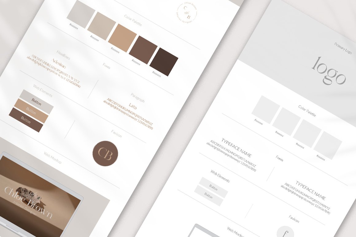
Brand board with color palette by Yuli Studio on Creative Market
How do I ensure that the colors in the palette work well together?
Ensure that the colors in your brand’s color palette work well together.
It is essential for creating a cohesive and visually appealing brand identity.
Here are some tips to ensure that the colors in your palette work well together:
Use color theory: Color theory is the study of how colors interact with each other. You can use this theory to choose colors that complement each other, creating a harmonious color scheme. For example, you can use complementary colors (colors opposite each other on the color wheel) to create a high-contrast, eye-catching palette.
Test your colors in different contexts: It’s important to test your colors in different contexts to see how they work together. Try using them in different applications, such as print materials, digital media, and merchandise, to ensure that they work well together in all scenarios.
Use online tools: There are many online tools available that can help you create and test your color palette. These tools can generate complementary color schemes, help you choose colors that work well together, and simulate how your colors will look in different applications.
Consider accessibility: Ensure that the colors you choose are accessible to everyone, including those with color blindness. Use high-contrast colors and test your colors with accessibility tools to ensure that everyone can easily read and understand your brand materials.
A color palette that brings out feelings that attract your best customers
Colors can give us a certain feeling.
Happy, energetic, flourishing, and creative; calm, balanced, and controlled; passionate, efficient, and self-confident; successful, determined, and grounded.
While color can be a very personal, emotional choice, the principles of our color theory will help you make smarter and more objective choices that deliver your message precisely in the way you want it to happen.
Learn all about all four color psychology personalities:
- Group 1 (tints)- Brand Design 1: How to Brand a Youthful, Open, and Happy Business
- Group 2 (tones)- Brand Design 2: How to Brand an Elegant, Feminine Business
- Group 3 (shades)- Brand Design 3: How to Style an Earthy, Community-Focused Business
- Group 4 (pure hues)- Brand Design 4: How to Brand a High-End, Luxury Business
Tints (base hue + white ), tones (base hue + grey), and shades (base hue + black ) of one color, plus a neutral.
Using color as a communication tool is much more intuitive than it may seem. Colors make us feel certain types of ways that we may find hard to explain but easy to understand. Have fun while creating a color scheme that aligns with your design.
Allow yourself room to play around with your palette, get creative, and feel inspired by what your design is communicating.
Create your own color palettes
As you start a design, think about what colors might be necessary.
Are you creating a design for a brand with a selected color scheme? Are you creating something seasonal, celebratory, or sophisticated? Get inspired with these tools that work as color palette generators – these apps automatically generate color schemes for you to browse:
- Coolors is a super-fast color scheme generator! Create the perfect palette or get inspired by thousands of beautiful color schemes.
- Colormind is a color scheme generator that uses deep learning. It can learn color styles from photos, movies, and popular art.
- Pantone Connect is a tool where you can look for the best Pantone colors to match your CMYK or RGB.
How to create a color palette from a photo
Want a color scheme that perfectly matches your favorite images?
With Canva’s color palette generator, you can create color combinations in seconds. Simply upload a photo, and we’ll use the hues in the photo to create your palette. Upload an image and pick the colors you like: Canva Color Palette Generator.
Here, I have used an image to make a cohesive color palette:
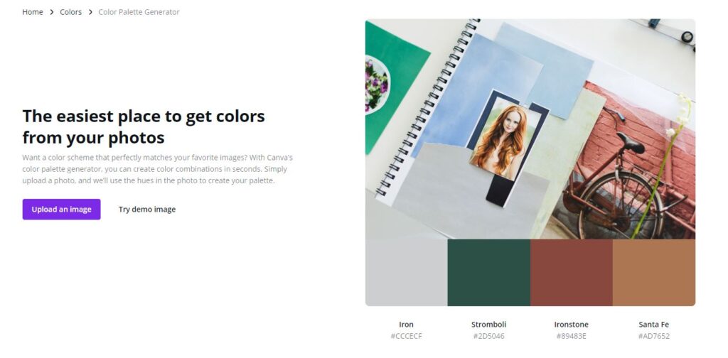
Canva – How to create a color palette from a photo
Or you can use Adobe Color: extract color from an image and save it as a color palette:
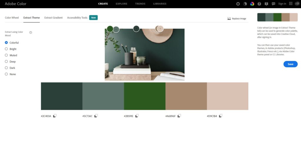
How to create a color palette from a photo – Adobe Images
Step 1 – Pick the colors that look right for you
Choose as many colors as you want, and keep in mind the totality of your chosen personality group:
Group 1 – tints: bright, warm, and light.
Group 2 – tones: soft, pastel, and cool.
Group 3 – shades: intense, subtle, and warm.
Group 4 – hues: clear, crisp, and cool.
Use Pinterest for inspiration and research – enter one of your power keywords + color + palette and see what shows up.
Maybe you pin a few favorite images to a dedicated board for later use. Repeat this process for all your keywords.
Step 2 – Select the colors that do not seem to fit together with the rest of the chosen colors
Use the exclusion technique until you have reached a harmonious color palette.
Fasten the final selection of color cards on a sheet of paper or enter them into your digital color palette.
Step 3 – Create your digital color palette
If you used Pantone cards as a method to create your original palette, you can quickly enter the Pantone system’s corresponding color number and find it on your computer.
If you have used color cards from some paint brand, find the selected colors from the manufacturer’s website and their color codes using a color picker tool in Adobe Photoshop or other similar programs.
Then, create a color palette template with Canva, Adobe Photoshop, or Illustrator (or in some alternative software such as Blogstomp).
Shape and size the template so it is suitable for color palettes, and place the desired colors in it with the color codes you have.
Color palette templates
Color palette templates are pre-designed tools that can help you create a cohesive and effective color palette for your brand.
These templates can be found online and provide a starting point for your color selection process. Many templates include a range of color combinations, from monochromatic to complementary and triadic, which can help you choose the right colors for your brand. Some templates also include color psychology information, helping you select colors that evoke the emotions and moods you want to associate with your brand.
By using a color palette template, you can save time and ensure that your brand’s colors work together in a harmonious and impactful way.
Additionally, many templates are customizable, allowing you to adjust the colors to fit your brand’s unique identity. Using a color palette template can be a valuable tool in creating a brand identity that is consistent and memorable.
You can purchase a ready-made color palette template from the Creative Market brand board selection.
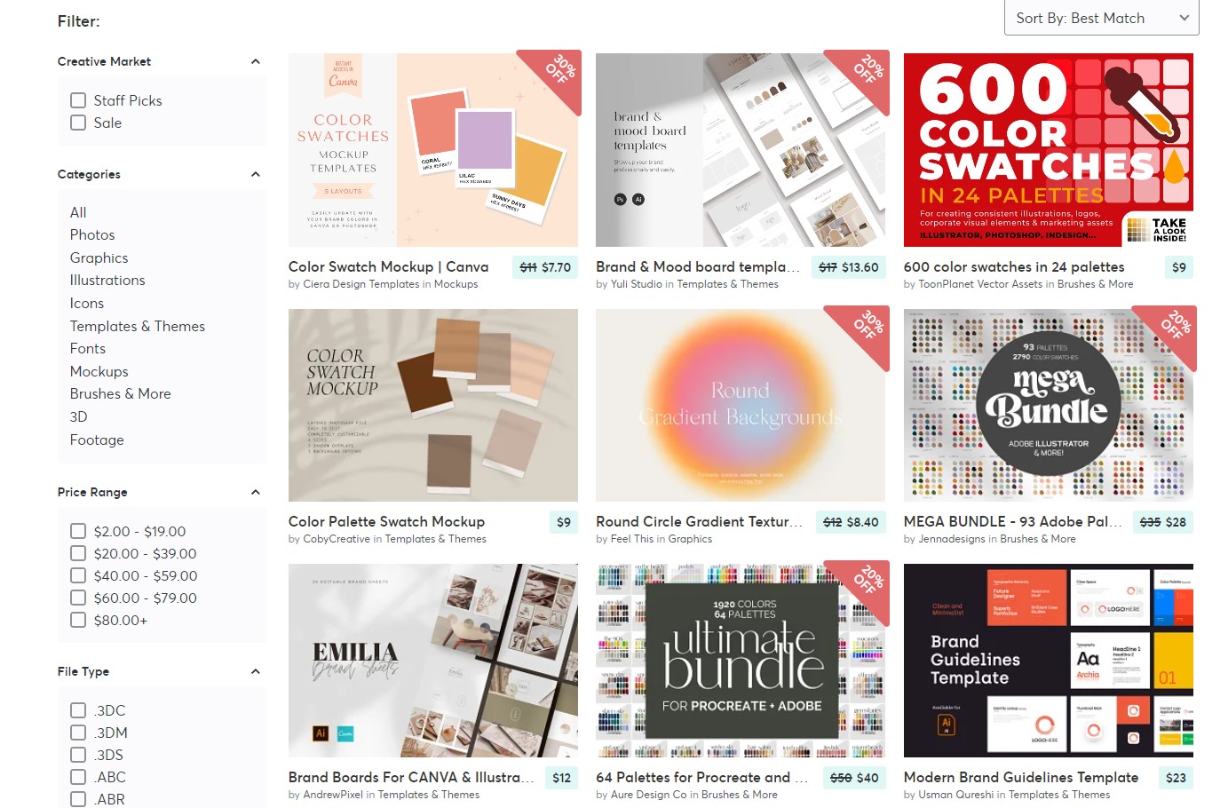
Color palette templates on Creative Market
Ensure consistency across all brand materials when using the color palette
To ensure consistency across all brand materials when using the color palette, there are several best practices to follow:
Use the same color codes: When using digital media, it’s important to use the exact same color codes for your brand colors across all channels, such as your website, social media, and email marketing. This ensures that the colors are consistent and uniform across all platforms.
Provide clear guidelines: Include clear guidelines on how your brand’s colors should be used in your brand style guide. This should include the exact color codes, the usage of each color, and examples of how to use them in different situations. An extremely useful tool is a brand board. Learn more about the usage of brand boards here: Brand Board Basics: A Beginner’s Guide to Crafting Your Own
Train your team: Ensure that all team members who work with your brand materials, including designers, writers, and marketers, understand your brand’s color palette and how to use it effectively.
Use a design system: Implement a design system that includes your brand’s color palette and guidelines. This can help ensure consistency across all design elements, including typography, imagery, and layouts.
Conduct regular reviews: Review all brand materials regularly to ensure that the colors are being used consistently and effectively.
Make updates or corrections as needed.
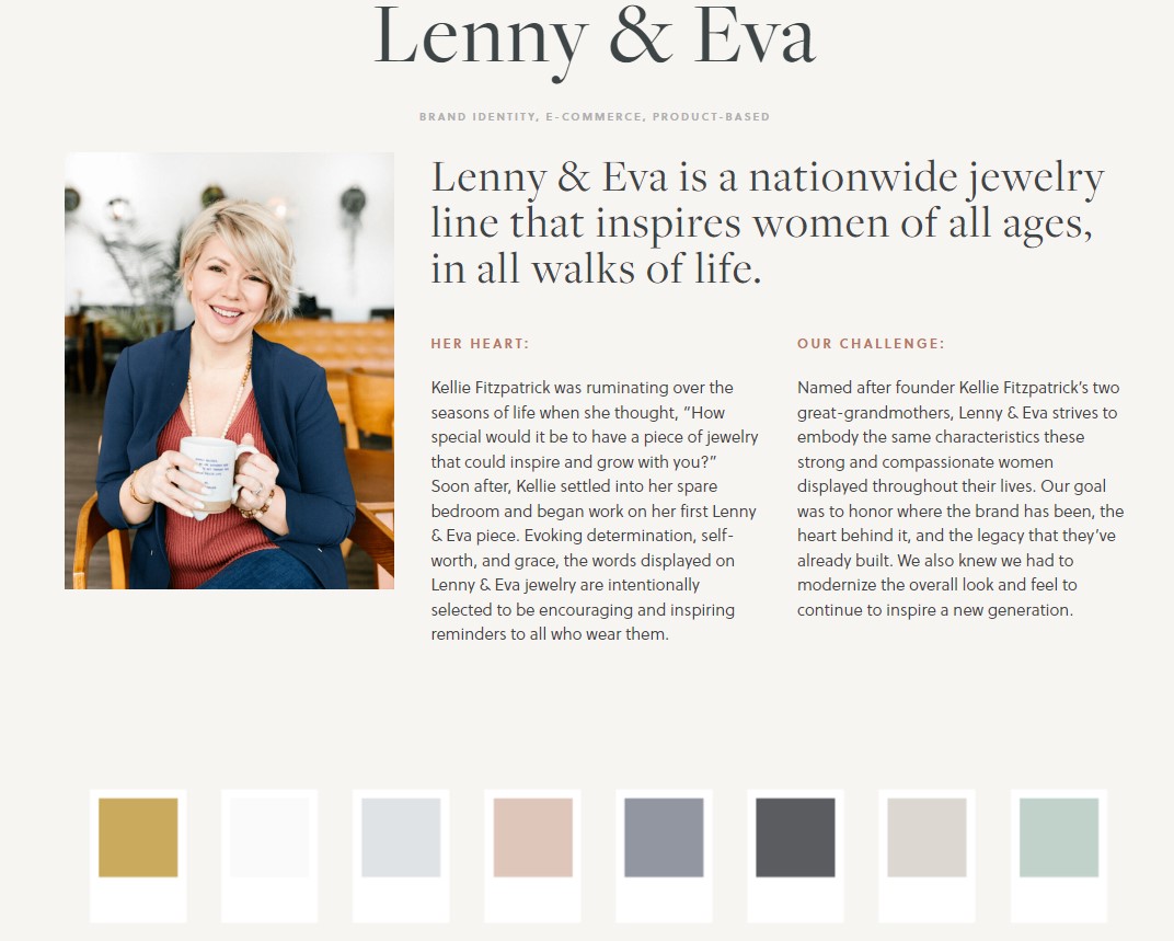
Lenny and Eva brand color palette by Copperheart Creative
What is a brand style guide, and how do I create one?
A brand style guide, also known as brand guidelines or brand book, is a document that outlines the visual and messaging elements of a brand’s identity.
It serves as a reference for anyone who creates or uses brand materials, ensuring that the brand remains consistent and cohesive across all channels.
Read more about it here: What Is Brand Style Guide And How To Create One.
Creating a brand style guide involves the following steps:
Define your brand’s visual identity: This includes elements such as your logo, color palette, typography, imagery, and graphic elements. Define the usage guidelines for each element, such as minimum size and clear space requirements.
Define your brand’s messaging: This includes your brand voice, tone, and messaging guidelines. It’s important to define how you want to communicate with your audience and ensure consistency across all channels.
Provide examples: Use visual examples to show how your brand elements should be used. This can include mockups of business cards, social media posts, and other marketing materials.
Include usage guidelines: Provide guidelines on how your brand elements should be used across different channels, including print, digital, and social media. This can include guidelines for layouts, image sizes, and file formats.
Make it accessible: Ensure that your brand style guide is easily accessible to anyone who needs to use it. This can be done by providing a digital version that can be easily shared, as well as a printed version for reference.
As you can see, a brand style guide helps to establish your brand identity and ensure that it is communicated effectively to your target audience.
How often should you review and update the brand’s color palette?
While it’s important to maintain consistency with your brand’s color palette, there may be times when it’s necessary to update or revise it.
Here are some factors to consider when deciding how often to review and update your brand’s color palette:
Changes in brand identity: If your brand’s identity has undergone significant changes, such as a new logo or messaging, it may be necessary to review and update the color palette to ensure it aligns with the new direction.
Evolution of design trends: Design trends and preferences can change rapidly, and it’s important to stay up-to-date with the latest trends while also maintaining a consistent brand identity. Periodically reviewing your color palette can help ensure that it remains relevant and effective.
Feedback from customers: Customer feedback can provide valuable insights into how your brand is perceived, including the effectiveness of your color palette. Consider soliciting feedback from customers and using it to inform updates to your color palette.
Changes in technology: Changes in technology, such as new digital platforms or advancements in printing technology, may require adjustments to your color palette to ensure consistency across all channels.
In general, it’s recommended to review your brand’s color palette every 1-2 years to ensure it remains relevant and effective.
However, if any significant changes occur with your brand identity, design trends, or technology, you may need to review and update your color palette more frequently.

Conclusion
The right color palette is essential for building a strong and memorable brand.
Pick colors that match your brand’s values, personality, and audience. This helps you send the right message and stand out from the competition.
Start by finding the keywords that capture your brand’s essence. Use those as a guide when selecting your colors. Think about color theory and how different colors make people feel. Whether you choose just a few colors or a full palette, every color should have a clear purpose.
Test your colors in different settings. See how they look in print, online, and on merchandise. Consistency across all uses builds recognition and trust.
Use online tools or color palette generators to help you find colors that work well together. These can be based on images or your brand personality.
Once your palette is set, create a brand style guide. Include rules for using colors, logos, fonts, images, and messages. This keeps everyone on the same page.
Review and update your palette regularly. As your brand grows and design trends change, your colors might need a refresh to stay relevant.
In short, creating the right color palette means understanding your brand and speaking through colors that connect with your audience.
Learn More:
Applying The 12 Brand Archetypes in Visual Branding
The 6 Types of Brands: From Corporate to Personal
Brand Design 4: How To Style A Luxury Branding
Brand Board Essentials: Your Key to Consistent Branding
Last Updated on 30/05/2025 by Victoria Silber


