In this post, we will explore the captivating allure and potential that champagne color holds for creating remarkable brand identities.
Whether you’re a designer, marketer, or business owner, understanding the power of color is crucial in establishing a strong visual presence that resonates with your target audience. Color champagne, with its elegance and sophistication, offers a unique palette to elevate your brand to new heights. Join us as we delve into the art of incorporating champagne color in your branding and design endeavors.
Discover practical tips, gain valuable insights, and unlock the secrets of creating a memorable and impactful brand experience.
-
 Brand Your Photography Business Like A Pro11,00 $ incl. VAT
 -
 The Ultimate Beauty Branding Handbook11,00 $ incl. VAT
 -
 E-book: The Ultimate Guide to Branding Styles11,00 $ incl. VAT
What is the color champagne?
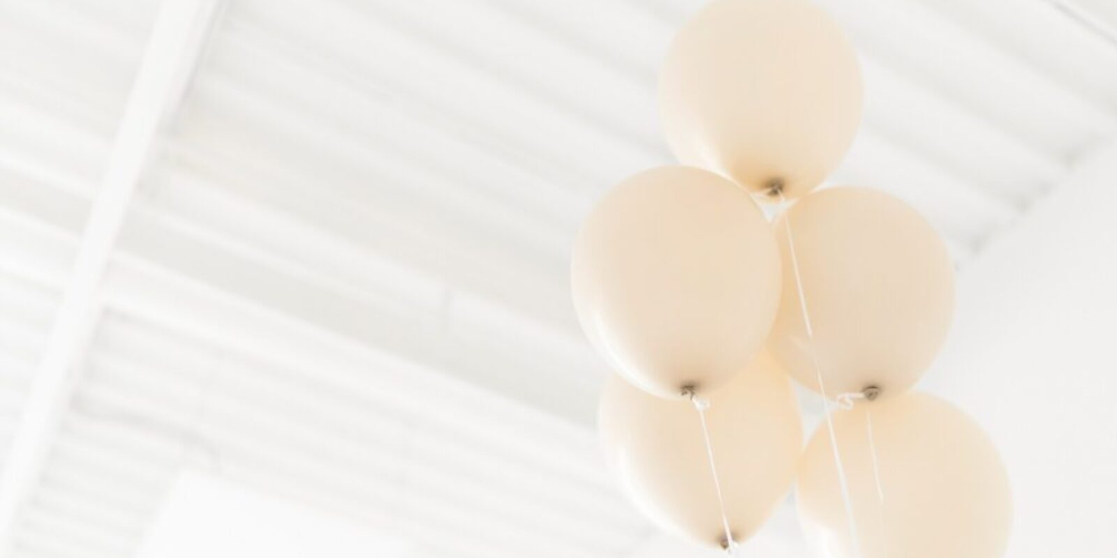
Champagne is a pale, yellowish-beige color with warm undertones.
It is named after the sparkling wine produced in the Champagne region of France and is often associated with luxury, celebration, and sophistication. The champagne color can vary in shade and intensity, but it generally falls within the range of pale gold to light beige. Some champagne colors may have a slightly pink or peach tint, while others may have a cooler, more silvery hue.
The specific shade of champagne can depend on factors such as lighting, texture, and the presence of other colors in the surrounding environment.
Overall, champagne is a versatile and elegant color that can be used in a variety of design contexts, from fashion and beauty to home decor and branding. This blog post will explore the use of this color in branding and provide insights into how it can be effectively used to enhance a brand’s visual identity. We will delve into the psychology of champagne color and examine its various shades, hues, and tones.
Additionally, we will showcase some notable brands that have incorporated champagne color into their branding and provide tips for incorporating this color into your own branding strategy.
Read also: How To Style A High-End, Luxury Brand
How is the color of champagne different from other shades of beige or gold?
The color champagne is a pale, muted shade of beige with hints of yellow or gold.
While beige and gold can also be pale or muted, they have distinct differences that set them apart from champagne. Beige is a neutral color that is created by blending gray and yellow or orange hues. It is a lighter shade of brown and does not have the yellow or gold undertones that champagne does.
Beige can also be cooler or warmer in tone, depending on the undertones used.
Gold, on the other hand, is a metallic yellow color that is typically brighter and more intense than champagne. It has a reflective quality that makes it stand out, whereas champagne is more subdued and muted.
In summary, champagne is a pale, muted beige with subtle yellow or gold undertones, while beige is a neutral color that lacks the yellow or gold tones of champagne, and gold is a bright, reflective metallic yellow that is more intense than champagne.
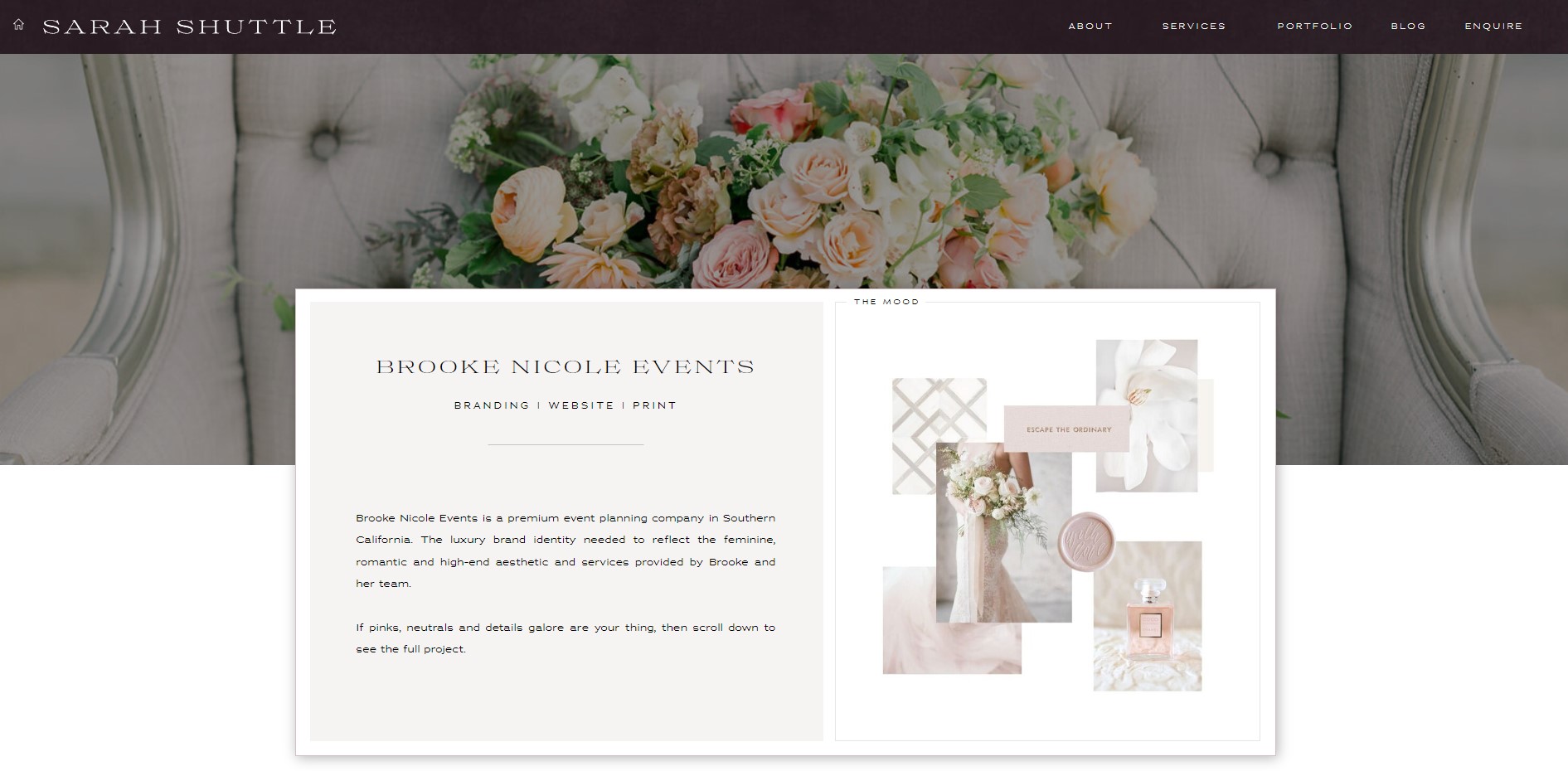
Champagne can be considered a neutral color in branding and design
Neutral colors are typically those that do not strongly lean towards any particular hue or shade on the color spectrum.
They are often used as a base color or background to complement other colors. Champagne can be a great neutral color choice for branding and design. As a soft and muted beige with warm yellow or gold undertones, it can create a sophisticated and luxurious feeling that is perfect for high-end or upscale brands.
In branding, champagne can be used as a primary or secondary color to create a sense of elegance, refinement, and exclusivity.
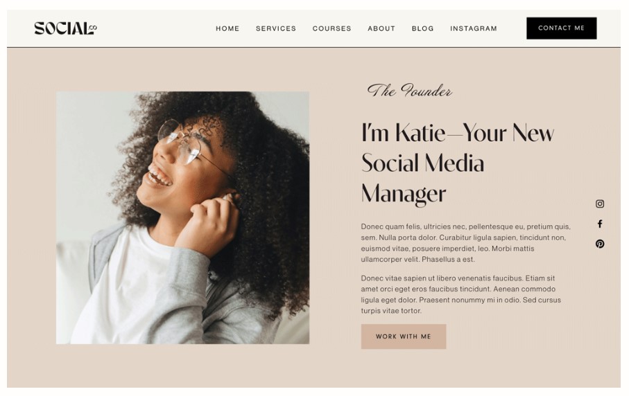
It can be paired with darker, bolder colors like black, navy, or burgundy to create a high-contrast design that catches the eye. Champagne can also be used as a background color for website design or marketing materials, such as business cards or brochures. It provides a neutral base that allows other colors, typography, and graphics to stand out.
In home decor, champagne can be used in a variety of ways, from wall colors to furniture to accessories.
It creates a warm and inviting atmosphere that is perfect for a relaxing and comfortable home environment.
Overall, champagne’s soft and muted qualities make it a versatile neutral color that can be used in a variety of branding and design applications to create a sense of elegance and sophistication.
What emotions or moods are associated with the color champagne?
The color champagne is often associated with elegance, luxury, and sophistication.
It is a soft and muted color with warm yellow or gold undertones that creates a calming and relaxing atmosphere. Some emotions or moods that are commonly associated with the color champagne include:
- Glamour: Champagne is often associated with high-end or upscale events, such as weddings or award ceremonies, and can create a sense of glamour and luxury.
- Celebration: Champagne is also associated with celebration and joy, as it is often used to toast special occasions and milestones.
- Warmth: The warm undertones in champagne create a cozy and inviting feeling that is perfect for creating a welcoming atmosphere in homes or businesses.
- Romance: The soft and muted qualities of champagne can create a romantic and intimate mood, making it a popular color choice for weddings and other romantic events.
- Sophistication: The muted and understated qualities of champagne create a sense of sophistication and refinement that is perfect for high-end branding and design.
Overall, the color champagne creates a sense of elegance and refinement that is perfect for creating a luxurious and inviting atmosphere in a variety of settings.
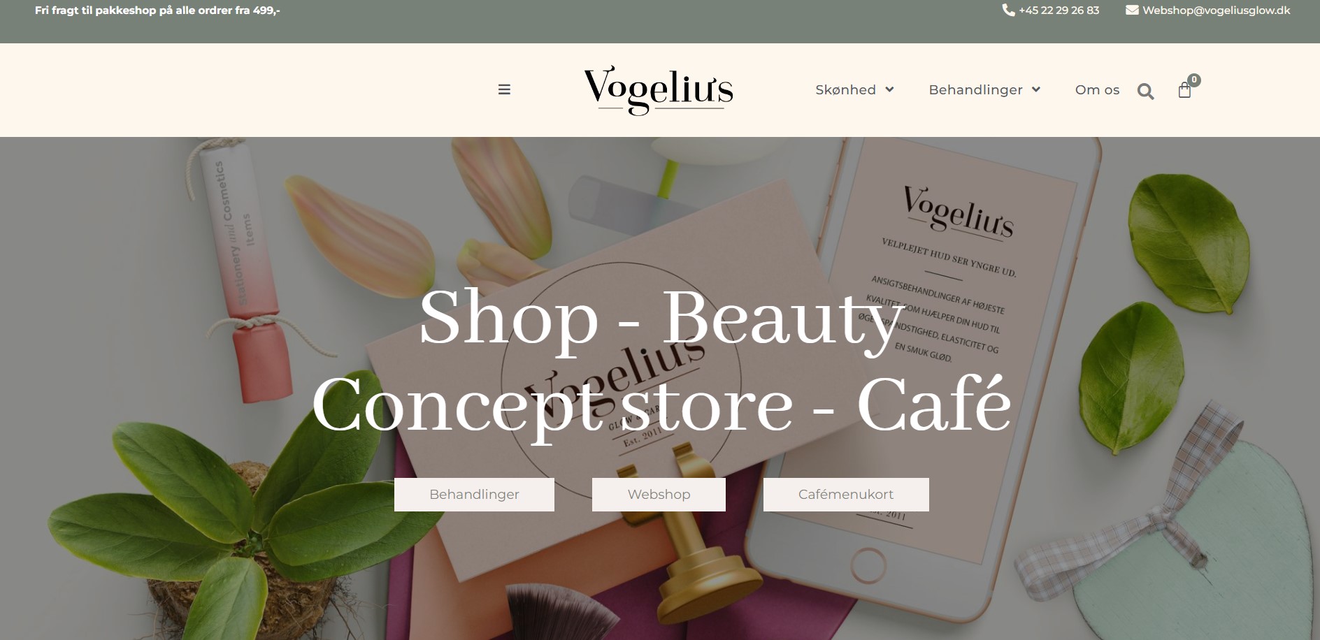
Color champagne in branding
Champagne is a luxurious and sophisticated color that has become increasingly popular in branding.
It is a versatile color that can be used in various industries, from fashion to beauty, food, and beverage. The color champagne represents elegance, opulence, and refinement. It is often associated with celebratory events, such as weddings, New Year’s Eve, and other special occasions.
In branding, the use of champagne color can evoke a sense of exclusivity and luxury, making it an ideal choice for high-end products and services.
It can also be used to convey sophistication and elegance, appealing to consumers who are seeking premium and upscale products.
Whether you’re looking to create a timeless and elegant brand or add a touch of luxury to your existing brand, champagne color can be an excellent choice. So, grab a glass of bubbly, and let’s dive into the world of champagne color in branding.
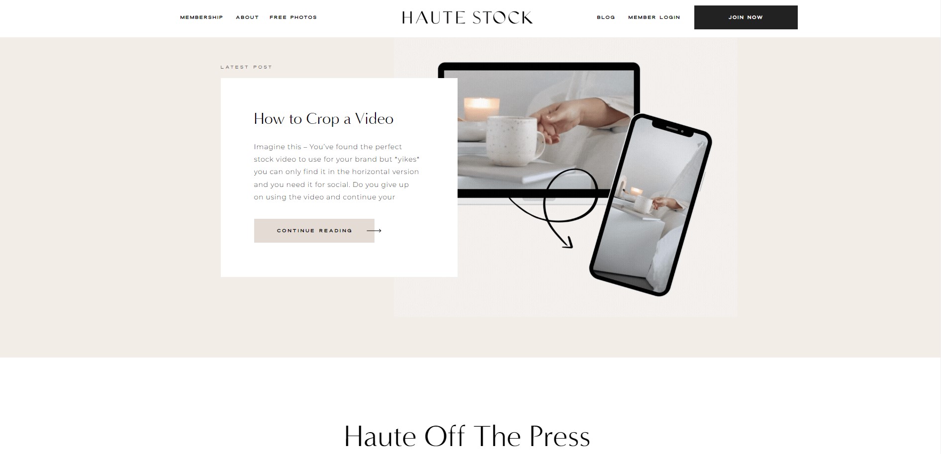
The psychology of champagne color
The color of champagne is often associated with luxury, celebration, and elegance.
It is a sophisticated and subtle shade of beige or light gold with hints of pink or orange undertones. The psychology of champagne color is often linked to feelings of opulence, high-class, and refinement.
Champagne is a color of luxury
In branding, champagne color is commonly used to create a sense of luxury and exclusivity. Brands that utilize champagne color in their branding often aim to evoke a feeling of high-end sophistication and refinement, targeting consumers who value quality and exclusivity.
The psychology of champagne color can also evoke a sense of celebration and festivity, making it a popular choice for brands in the food and beverage industry, particularly in the wine and spirits sector. Champagne color can be seen as an ideal choice for brands that want to convey a sense of prestige and luxury, without being too showy or ostentatious.
Overall, champagne color can be an excellent choice for brands that want to convey a sense of sophistication and exclusivity, while still maintaining a subtle and understated look. Its timeless elegance and versatility make it a popular choice in branding, particularly in industries where luxury and quality are highly valued.
Champagne Color Palettes
Regarding bubbly drinks, champagne is one of the most popular choices.
When most people think of champagne, they think of the bubbly, effervescent drink that is light yellow in color. However, champagne can come in various colors, from pale yellow to rose gold. The color of champagne is determined by the type of grape used, the time the wine ages, and whether it is a Blanc de Blancs or a Blanc de Noirs. In this blog post, we’ll take a closer look at the different hues champagne can take and what makes each one special.
Pale Yellow Champagne
The most common type of champagne is pale yellow in color.
This champagne is made using a blend of white grapes, such as Chardonnay and Pinot Blanc. The wine is then aged for about 18 months before being bottled. Pale yellow champagne is crisp and refreshing, with hints of citrus and green apple. It’s perfect for enjoying on a warm summer day.
Amber Champagne
Amber champagnes using red wine grapes that have been allowed to oxidize slowly over time.
This process gives the wine its unique amber color and flavors of dried fruits and spice. Amber champagnes are less common than pale yellow or rose champagnes but are well worth seeking out if you’re looking for something truly unique.
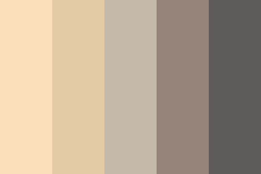
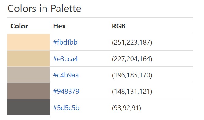
Champagne Gold
Champagne gold is a sophisticated, opulent color often associated with luxury, elegance, and high-end goods in the business world.
What Color Is Champagne Gold?
Champagne gold is a rich, luxurious color that combines the warmth and elegance of gold with a subtle hint of beige.
The result is a muted gold hue, similar to the color of sparkling champagne, that carries an undertone of understated sophistication. This color exudes class and refinement, making it a popular choice for high-end products and designs.

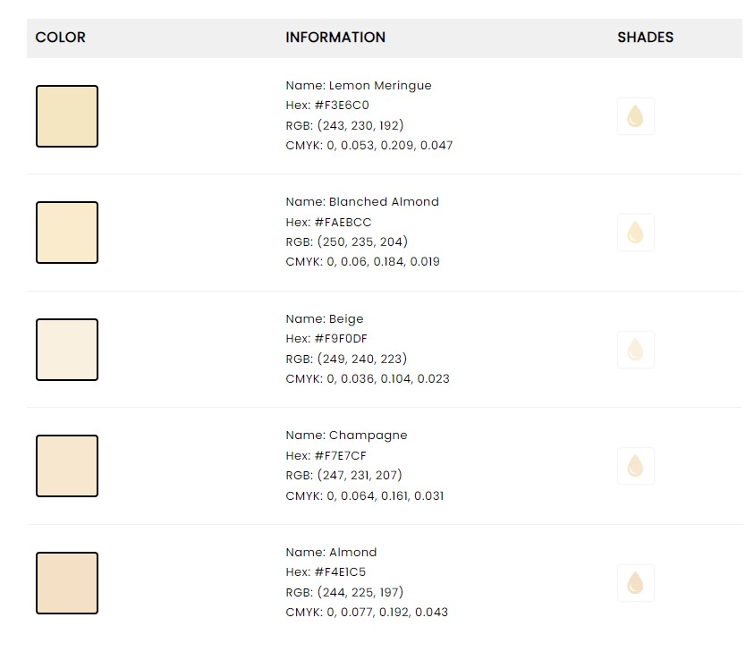
Champagne Gold Color In Design
This rich, muted gold hue mirrors the warm sophistication of sparkling champagne, making it an ideal choice for companies looking to convey an image of class, refinement, and exclusivity.
Businesses across various sectors, from technology to fashion, frequently utilize champagne gold. It’s notably popular in the technology sector, where it’s often used in the design of premium smartphones, laptops, and other devices, adding a touch of class to the sleek, modern technology. The automotive industry also uses this color for luxury vehicles, highlighting their premium quality.
In the fashion and jewelry industries, champagne gold signifies luxury and sophistication. It is commonly used in packaging design for high-end products, branding, and marketing materials. The color exudes a sense of calm elegance that is captivating to customers, amplifying the perceived value and exclusivity of the products.
The color is also a popular choice in interior design and architecture for businesses seeking to create a luxurious and comfortable ambiance. The warm undertones of champagne gold pair well with a variety of palettes, making it versatile and universally appealing.
In essence, the color champagne gold is a business asset, used to subtly communicate luxury, sophistication, and top-tier quality in a multitude of contexts.
Brand Design 4: How To Style A Luxury Branding.

Color Champagne Pink
Rose champagne gets its beautiful pink color by adding red wine grapes.
What Color Is Champagne Pink?
The color champagne pink is a delicate, soft hue that blends the warm, creamy undertones of champagne with the light, rosy shade of pink. It exudes elegant sophistication and is often associated with luxury, romance, and femininity. This color is subtle, yet enchanting, resembling a sparkling rose gold.
Pinot Noir is the most common type of red grape used in rose champagne. This type of champagne tends to be more full-bodied than its pale yellow counterpart and has flavors of berries and stone fruits.
Rose champagne is perfect for enjoying with food or on its own as an aperitif.

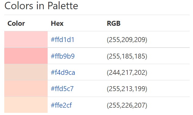
Champagne Pink Color in Design
This delightful hue is often associated with femininity, sophistication, and refinement, making it a popular choice in various business sectors that target a primarily female demographic or aim to convey an aura of luxury and sophistication.
In the fashion industry, champagne pink is frequently used to infuse a touch of elegance and femininity into garments, accessories, and branding. It is particularly popular for wedding dresses, bridesmaid gowns, and other formal attire, imbuing them with an enchanting and timeless appeal.
Beauty and cosmetics companies also often utilize this hue, especially in product packaging, advertising, and branding. The soothing, upscale vibe of champagne pink is perfectly aligned with the self-care and luxury focus of these industries.
In interior design and architecture, champagne pink is used to create warm, welcoming, and chic spaces. Whether it’s used in the design of a boutique, a salon, or a high-end retail space, this color adds an element of elegance and sophistication.
In digital marketing, champagne pink is used to draw the attention of users in a subtle, elegant way. Websites and advertisements with this hue can evoke a sense of calm, warmth, and luxury.
Overall, the color champagne pink is a valuable asset for businesses, helping to establish an image of elegance, sophistication, and high-quality.
Brand Design 2: How To Create a Feminine, Elegant Branding

Why you should use the champagne color in your next design project
Champagne is the perfect color for a wide range of design projects. It’s a sophisticated and timeless color that evokes a sense of luxury. Here are a few reasons to use champagne in your next design project.
1. Color champagne is classic
While trends come and go, champagne is a classic color that will never go out of style. It’s a safe choice for any design project, especially if you aim for a timeless look.
2. It is versatile
Champagne can be used as a neutral or as an accent color. It pairs well with other colors, making it a versatile choice for any project.
3. It adds sophistication
Champagne is a sophisticated color that adds a touch of luxury to any design. Champagne is the perfect color if you want to add an air of sophistication to your project.
What Palettes Go With Champagne Color?
Champagne, which is a pale, delicate, and slightly warm color, pairs well with a variety of hues, from soft pastels to rich jewel tones. Some popular color palettes that complement champagne include:
- Soft pastels: Light, delicate colors like blush pink, pale lavender, and baby blue pair beautifully with champagne, creating an airy and romantic feel.
- Neutral tones: Neutral colors like white, ivory, and beige create a soft and elegant look when paired with champagne. They can be used to create a clean and sophisticated brand image.
- Metallics: Metallic shades like gold, silver, and rose gold work well with champagne, giving a touch of luxury and glamour. The combination of champagne and metallics creates a sense of elegance and refinement.
- Jewel tones: Deep, rich jewel tones like emerald green, sapphire blue, and ruby red create a striking contrast against champagne, making it stand out more. This color palette is perfect for creating a bold and sophisticated look.
- Earthy tones: Earthy tones like olive green, deep brown, and terracotta add warmth and depth to champagne, creating a cozy and welcoming ambiance.
When using champagne as the primary color in branding or design, it is important to select complementary colors that convey the desired message and evoke the desired emotions.
Colors That Go With Champagne
Champagne is a versatile color that pairs well with a variety of hues.
Its warm, understated elegance allows it to blend seamlessly with numerous color palettes. Here are a few examples:
- White: The combination of champagne and white creates a clean, sophisticated look, exuding an aura of luxury and elegance.
- Black: Paired with black, champagne provides a stunning contrast, creating a chic and stylish aesthetic.
- Navy Blue: This deep, cool hue creates an interesting contrast with champagne, resulting in a sophisticated and timeless pairing.
- Blush Pink or Rose Gold: These soft, warm colors complement champagne beautifully, creating a romantic, feminine look that’s perfect for weddings and other formal events.
- Burgundy or Maroon: These rich, deep colors bring out the warmth in champagne, resulting in a luxurious and dramatic color scheme.
- Emerald Green: This bold, vibrant color paired with champagne creates a striking and elegant look, ideal for a high-end, luxurious feel.
- Cream or Beige: These neutral colors harmonize well with champagne, creating a warm, soothing palette that’s easy on the eyes.
Remember, the best color combinations depend on the specific shade of champagne and the ambiance you aim to create.

-
 The Ultimate Beauty Branding Handbook11,00 $ incl. VAT
 -
 E-book: The Ultimate Guide to Branding Styles11,00 $ incl. VAT
Elegant Color Combinations
Experiment with different color combinations to find the perfect palette that best reflects your brand personality and identity. Some specific color combinations that can work well with champagne include:
- Ivory or cream: These neutral colors pair well with champagne and create an elegant and sophisticated look.
- Pale pink: A pale pink complements the warmth of champagne, creating a soft and romantic look.
- Light gray: This subtle and sophisticated color combination can create a calm and soothing atmosphere.
- Navy blue: The contrast between the deep blue and the soft champagne creates a classic and timeless look.
- Sage green: The muted, earthy tones of sage green can complement champagne, creating a natural and calming palette.
- Metallics: Champagne can also pair well with metallic colors such as silver or gold, creating a luxurious and glamorous look.
It’s important to keep in mind that color combinations are a matter of personal preference, so it’s always a good idea to experiment and find the combination that works best for your individual style and taste.
Get more inspiration from Pinterest:

List of brands that use the champagne color in their branding
Here are some brands that use champagne as their brand colors:
- Tiffany & Co.: This luxury jewelry brand is known for its iconic Tiffany blue color, which pairs perfectly with champagne accents.
- Burberry: The British fashion house incorporates champagne hues into their classic plaid pattern, giving their brand a sophisticated and elegant feel.
- Kate Spade: This popular fashion and lifestyle brand often incorporates champagne colors into their designs, giving them a playful yet glamorous look.
- MAC Cosmetics: The makeup brand uses champagne tones in its packaging and advertising, giving its products a sleek and sophisticated vibe.
- Jimmy Choo: The luxury shoe and accessories brand often uses champagne hues in its designs, adding a touch of elegance to its products.
- Tory Burch: The fashion and lifestyle brand uses champagne tones in their designs, giving their products a timeless and classic look.
- Vera Wang: The bridal and fashion designer often incorporates champagne hues into her designs, giving them a soft and romantic feel.
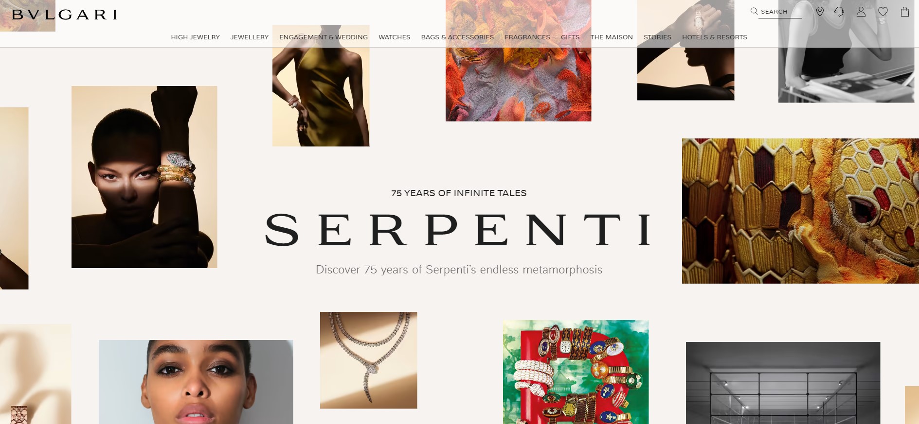
- Bvlgari: The Italian luxury brand incorporates champagne tones into their iconic B.zero1 collection, adding a touch of elegance to their jewelry designs.
One reason why brands use champagne as their brand colors is that it pairs well with other colors, particularly dark hues such as black, navy, and burgundy. This makes it a popular choice for fashion and beauty brands looking to create a sense of sophistication and elegance in their branding.
Conclusion:
If you’re looking for a classic, versatile, and sophisticated color, look no further than champagne.
Champagne is the perfect choice for any design project. If you’re working on a project celebrating a special occasion, use champagne as one of the colors in your palette. If you’re designing for a more somber context, choose lighter shades of champagne or avoid it altogether. Remember that less is more when it comes to this color.
Use it sparingly to achieve the desired effect, and let its luxurious connotations elevate your designs above the rest.
-
 Brand Your Photography Business Like A Pro11,00 $ incl. VAT
 -
 The Ultimate Beauty Branding Handbook11,00 $ incl. VAT
 -
 E-book: The Ultimate Guide to Branding Styles11,00 $ incl. VAT
Read more about colors in design and branding
How to Use Neon Or Fluorescent Colors In Branding & Design
How To Brand A Beauty Business
Building a Strong Brand: The Basics of Branding 101
Green Color Psychology In Business & Design

