One effective way to differentiate your winery is through branding, which significantly influences how consumers buy wine.
Creating a strong brand identity that reflects your winery’s personality, values, and unique selling proposition can help attract customers and build loyalty.
In this response, we will explore some key steps to creating a successful branding strategy for wineries.
-
 Ebook: Brand Your Etsy Shop Like A Pro11,00 $ incl. VAT
 -
The Ultimate Beauty Branding Handbook11,00 $ incl. VAT
-
E-book: The Ultimate Guide to Branding Styles11,00 $ incl. VAT
What Is Wine Branding?
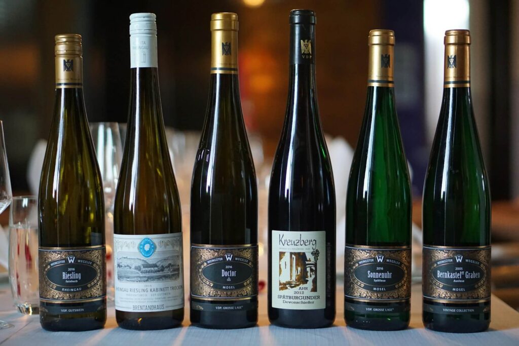
Wine branding refers to the process of creating a unique identity, image, and perception for a specific wine product or range of wines.
It involves using various marketing strategies, such as labeling, packaging, advertising, and storytelling, to differentiate the wine from others in the market and establish a connection with consumers.
How To Make Your Own Wine Brand?
To start a wine brand, follow these key steps:
1. Define Your Unique Selling Proposition
Defining your unique selling proposition (USP) is a crucial step in creating a strong brand for your winery.
Your USP should be the foundation of your branding and marketing strategy and set you apart from other wineries in the market. Here are some steps to help you define your USP:
- Determine what makes your winery unique: Start by identifying what sets your winery apart from others. This could be your location, the grapes you use, your winemaking process, your history, or your sustainability practices. For example, focusing on a specific type of wine like cabernet sauvignon can help define your unique selling proposition.
- Understand your target audience: Consider who your target audience is and what they value. What are their preferences, tastes, and habits? This will help you tailor your USP to appeal to them.
- Conduct a competitive analysis: Look at other wineries in your area and identify their USPs. This will help you differentiate yourself and find gaps in the market that you can fill.
- Focus on a specific niche: Consider specializing in a particular type of wine or winemaking technique. This can help you stand out and become known as an expert in that area.
- Use market research: Conduct surveys or focus groups to gather feedback from potential customers. This can help you understand what they are looking for and what sets your winery apart in their eyes.
2. Develop Your Brand Identity
This includes your winery’s name, logo, color scheme, typography, and overall visual style.
It’s important to choose elements that reflect your winery’s personality and unique selling proposition. For instance, using bubbly imagery and lighter colors for a label representing a sparkling wine can ensure it stands out from other varietals within the brand.
Developing a strong brand image is essential for creating a memorable and recognizable brand for your winery. It encompasses various elements, including your winery’s name, logo, color scheme, typography, and overall visual style.
Choosing these elements carefully and thoughtfully can help you create a brand identity that accurately reflects your winery’s personality and unique selling proposition.
3. Establish A Consistent Brand Voice
Establishing a consistent brand voice is essential for creating a strong brand image for your wine business.
Your brand voice should reflect your winery’s personality, values, and unique selling proposition, and should be consistent across all marketing channels.
- Define your brand personality: Consider what personality traits you want your brand to convey. Is your brand serious and informative, or playful and approachable? Once you have defined your brand personality, use it as a guide for all communication.
- Create a brand style guide: A brand style guide outlines your brand’s visual and messaging standards. It should include guidelines for tone, language, and messaging, as well as guidelines for visual elements such as logos, colors, and typography. Learn more here: Brand Style Guide: How to Write One for Your Brand
- Train your staff: Make sure all staff members are trained in your brand voice and understand how to communicate it. This includes everyone from your tasting room staff to your social media team.
- Promote events and tastings in a wine tasting room: Utilize your wine tasting room to organize tastings and events. Leverage the power of social networks to promote these events and stand out in the market.
- Use consistent language: Use consistent language across all marketing channels, including your website, social media, and email communications. Make sure your brand voice is reflected in everything you do.
- Be authentic: Your brand voice should be authentic and reflect your winery’s values and personality. Avoid using trendy or gimmicky language that doesn’t feel genuine.
- Listen to feedback: Listen to feedback from customers and adjust your brand voice if necessary. Pay attention to how customers respond to your messaging and adjust accordingly.
How To Develop Your Brand’s Tone Of Voice.
4. Use Social Media Presence To Your Advantage
Social media platforms like Instagram and Facebook are great ways to showcase your brand and connect with customers.
Using social media to your advantage is a powerful way to increase brand awareness and engage with customers for your winery. Social media platforms like Instagram and Facebook provide a way to showcase your brand, build a community, and promote your offerings.
You can share photos of your winery, provide behind-the-scenes glimpses of the winemaking process, and keep customers updated on upcoming events.
5. Build Relationships With Influencers
Building relationships with wine influencers and bloggers can be an effective way to expand the reach of your winery and generate buzz about your brand.
Here are some ways to build relationships with influencers:
- Identify relevant influencers: Look for influencers and bloggers who are relevant to your winery and have a following that aligns with your target audience. This could include wine bloggers, food bloggers, lifestyle influencers, and travel bloggers.
- Reach out to influencers: Contact influencers through email or social media and introduce yourself and your winery. Offer them the opportunity to visit your winery for a tasting or invite them to a special event.
- Provide an exceptional experience: When influencers visit your winery, provide them with an exceptional experience. This could include a personalized tasting or a tour of your winemaking process. Make sure they have a memorable experience that they will want to share with their followers.
- Offer value: Consider offering influencers exclusive access or discounts on your wines, or provide them with samples they can use in their content. This can incentivize them to share their experience with their followers.
- Follow up: After the visit or event, follow up with influencers to thank them for their time and ask if they have any questions or need additional information. Stay in touch with them and continue to build the relationship over time.
By building relationships with influencers, you can leverage their reach and credibility to spread the word about your winery and build your brand.
Just make sure to choose influencers who align with your brand values and personality, and provide them with an exceptional experience that they will want to share with their followers.
6. Consider Partnerships
Partnering with other local businesses can help expand your reach and reinforce your own brand and identity.
For example, partnering with a local cheese shop to offer wine and cheese pairing events can be a great way to showcase your wines while also providing an exceptional customer experience.
By working together with other businesses, you can create unique opportunities that increase visibility for your winery and strengthen your relationship with the local community.
Craft A Comprehensive Marketing Strategy
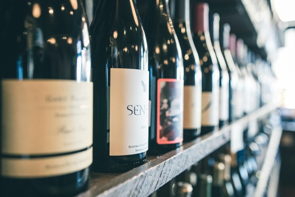
Crafting a comprehensive marketing strategy is crucial for any wine brand looking to thrive in a competitive market.
A well-rounded strategy begins with understanding the target audience and market trends to tailor the brand’s message effectively. Determining how much wine to produce and managing inventory turnover rates is essential to ensure a steady supply and meet market demand. Utilizing various selling channels, including wholesale distributors and other selling platforms, maximizes brand visibility and accessibility.
Engaging and persuasive marketing materials play a pivotal role in capturing consumers’ attention and conveying the brand’s unique story.
Embracing digital platforms, social media, and influencer partnerships can amplify brand exposure and foster meaningful connections with wine enthusiasts.
Additionally, creating exclusive tasting experiences, organizing events, and participating in industry-related activities further contribute to brand loyalty and recognition.
Private Label Wine Brand: A Taste of Uniqueness
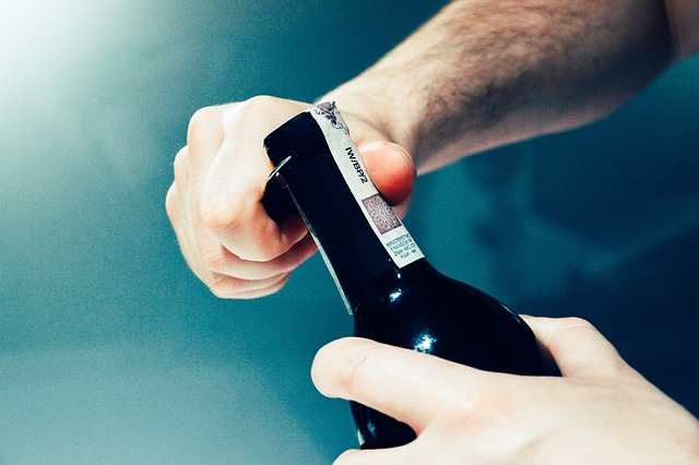
In the ever-evolving world of wine brands, private-label wines have emerged as a captivating niche, offering a distinct experience for both producers and consumers.
Also known as “own wine label” or simply “wine label,” private label wines are produced and marketed by retailers, restaurants, or individuals instead of traditional wineries or vineyards.
The private label wine business model allows for greater control over the branding and production process, from grape selection to packaging, leading to a truly unique and personalized product.
1. The Freedom of Expression: Crafting Your Identity
Private-label wine sales provide an unparalleled opportunity for businesses and individuals to express their creativity and distinctiveness.
With private-label wine companies the freedom to choose grape varieties, winemaking techniques, and labeling design, they can curate a product that aligns perfectly with their brand image and target market.
This level of customization enables the private label wine service owners to cater to specific tastes and preferences, setting them apart in a competitive market.
2. Building Trust: Quality Assurance and Control
One of the significant advantages of owning a private-label wine brand is the ability to maintain strict quality control.
Owners can carefully select reputable winemakers or wineries to produce their wines, ensuring that the final product meets their standards and exceeds customer expectations.
This hands-on approach to quality assurance helps build trust among consumers, as they come to associate the private label with consistency and excellence.
3. Targeting the Niche: Meeting Consumer Demands
Private-label wines often target niche markets that might be underserved by mass-produced wines.
Whether it’s a restaurant offering its exclusive house wine or a boutique retailer curating a specialized selection, these premium wines cater to the preferences of a specific clientele.
This targeted approach to designing wine labels can lead to increased customer loyalty and word-of-mouth referrals, fostering a dedicated community around the private label.
4. Private Label Wines – A Cost-Effective Business Model
For retailers and businesses, launching a private-label wine brand can be a cost-effective venture.
Rather than investing in establishing a vineyard and winemaking facility from scratch, they can collaborate with established wineries or winemakers to create their signature blends.
This streamlined process reduces initial investment costs and allows for quicker market entry, making it an appealing option for entrepreneurs seeking to enter the wine industry.
5. The Journey to Recognition: Marketing and Distribution
Establishing a private-label wine brand requires effective marketing and distribution strategies.
While the product’s exclusivity can be a selling point, effective promotion is vital to a private wine label gaining recognition and reaching the target market.
Leveraging social media, engaging storytelling, and strategic partnerships can enhance custom wine labels brand visibility and attract discerning consumers seeking unique wine experiences.
Visual Wine Brand Design
Visual psychology helps to…
✓ Reflect your message clearly
✓ Reflect the character of your brand
✓ Forward emotions
✓ Connect with the right customers
✓ Become more self-secure
✓ Become even more creative
✓ Look professional
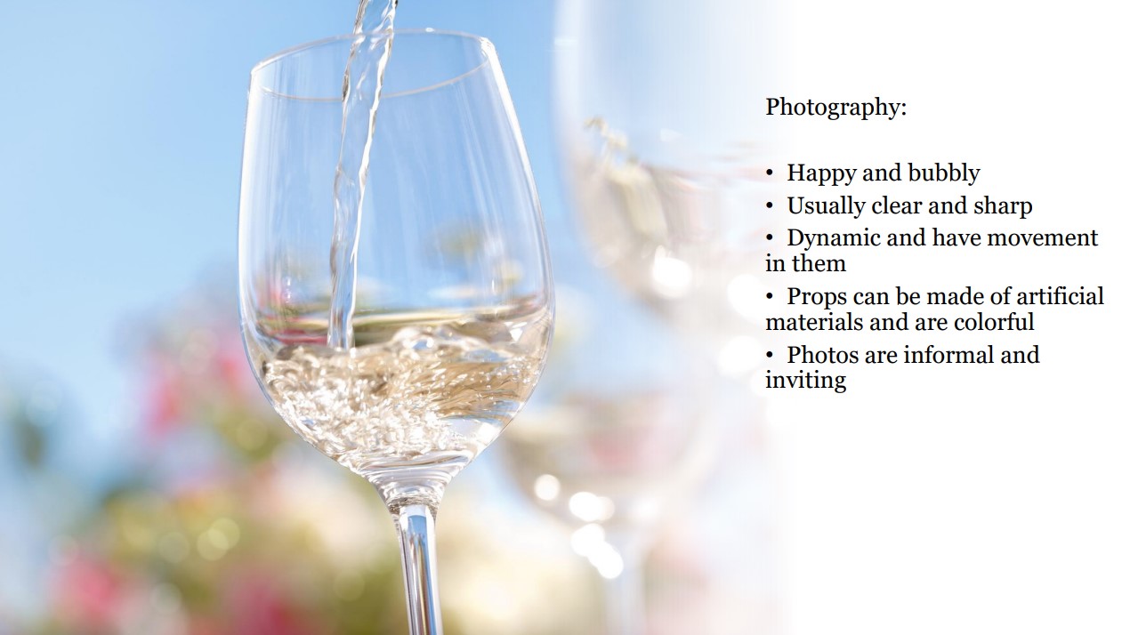
Playful and Youthful Branding
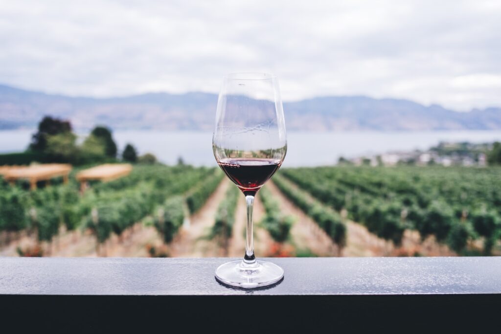
Personality 1 wine brands are defined by their playful and youthful aesthetic.
Youthful Wine Label Design
Personality 1 label designs often showcase a contemporary and whimsical style, incorporating vibrant colors, bold fonts, and playful illustrations.
Embracing a carefree and youthful approach, the labels capture the attention of a fun-loving audience. Illustrations of fruits, berries, and other graphics are arranged spontaneously and dynamically, reflecting the lively and spirited nature of the wine.
Personality 1 wine identity design radiates a playful and youthful aura, making it an excellent choice for wine products and businesses aiming to connect with a fun and energetic audience.
By skillfully employing a bright and energetic color palette, fonts, illustrations, and photography, wine producers can create a captivating visual identity that exudes joy and excitement.
Embracing the exuberance of Personality 1 branding allows wine brands to stand out in the market, appealing to a youthful and spirited consumer base seeking delightful and cheerful wine experiences.
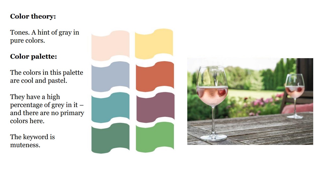
Personality 2: Elegant and Formal Branding
Personality 2: wine company branding has a captivating style characterized by elegance, class, and understated quality.
We will uncover the art of utilizing colors, fonts, illustrations, and photography to create an atmosphere of calmness, sophistication, and romance that perfectly suits the wine industry.
Group 2 Wine Label Design
Elegant wine labels often feature finely detailed illustrations, showcasing a sense of flow and meticulous attention to detail.
Opting for dark grays, browns, greens, or purples over stark black maintains the desired atmosphere of elegance and relaxation.
Examples of Personality 2 wine labels exhibit fine line illustrations, cursive handwriting, and elegant script fonts.
Muted red and rustic colors, accompanied by sophisticated border designs, contribute to a refined and graceful appearance.
Conclusion
Personality 2 branding embodies elegance, some formality, and understated quality through its carefully curated color palette, fonts, and design elements.
By understanding and effectively utilizing these characteristics, wine producers can craft a captivating and sophisticated visual identity, appealing to consumers seeking refinement and grace in their wine choices.
Embracing Personality 2 branding enables wine brands to stand out in a competitive market, attracting a dedicated audience of connoisseurs who appreciate the artistry and allure of a truly elegant wine experience.
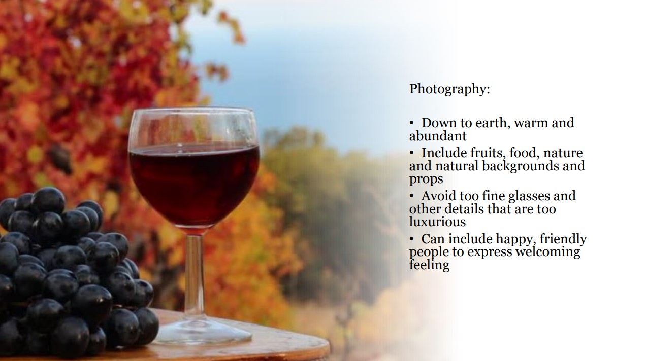
Personality 3: Rustic and Down-To-Earth Branding
Personality 3 wines are generally affordable, enjoyable wines for a broader customer group. This brand identity is defined by its rustic and nature-inspired aesthetic.
Discover how to effectively utilize colors, fonts, illustrations, and photography to create an inviting atmosphere of warmth, friendliness, ambition, and authenticity.
Perfect for products and businesses that prioritize community, family, history, and organic or fair trade offerings, Personality 3 branding offers a unique and earthy appeal.
Personality 3 Wine Label Design
Examples of Personality 3 wine label designs often showcase a retro or nostalgic style, incorporating somewhat masculine, casual, and natural elements.
Abundant, rough, and simple illustrations prevail, complemented by a color palette featuring subtle and deep shades. Fonts may be slightly heavier, and hand-lettered styles lean towards a more robust appearance, contributing to the rustic and down-to-earth appeal.
In conclusion, Personality 3 branding offers an inviting and authentic experience, resonating with consumers who appreciate the warmth and down-to-earth charm of nature-inspired aesthetics.
By skillfully applying the color palette, fonts, illustrations, and photography, wine producers can create a captivating visual identity that emphasizes community, family, history, and organic or fair trade offerings.
Embracing Personality 3 branding allows wine brands to connect with a diverse audience seeking an earthy and heartfelt wine experience, making it a compelling choice for those looking to stand out in the competitive wine market.
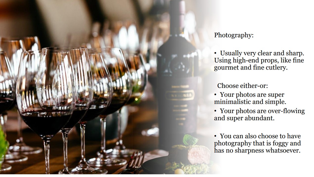
Personality 4: Luxurious, High-End Wine Brand Development
High-end Wine Label Design
Personality 4 wine label designs exude elegance and luxury, often incorporating regal colors, intricate illustrations, and bold fonts.
The labels capture the attention of discerning consumers seeking a wine experience that reflects the grandeur and prestige of winter.
Illustrations inspired by the dramatic landscape of the season and elements of technology contribute to an intriguing and edgy allure.
Photography for Luxury Branding
Photography for Personality 4 branding should be sophisticated, alluring, and evocative, capturing the essence of winter’s drama and allure.
Rich and moody shots of wintry landscapes or the bustling city streets during winter nights add a touch of mystique.
Including images of technology can create a sense of modernity and sophistication, appealing to consumers who appreciate a contemporary twist on luxury.
Conclusion
In conclusion, high-end wine identity exudes an aura of luxury and sophistication, capturing the dramatic essence of winter and the allure of modernity.
By skillfully utilizing a cool and opulent color palette, fonts, illustrations, and photography, wine producers can create a captivating visual identity that appeals to discerning consumers seeking a refined and indulgent wine experience.
Embracing the drama and allure of winter aesthetics allows wine brands to stand out in the market, offering a luxurious and captivating option for those seeking an elevated and opulent wine journey.
Wine Brand Positioning
Wine brand positioning refers to how a wine brand is perceived in the marketplace relative to other wine products and brands.
A brand’s positioning is determined by various factors, including its product characteristics, price, target customers, messaging, and distribution channels.
- Identify your audience to target: Determine the specific segment of consumers you want to appeal to with your wine brand. Are you targeting budget-conscious wine drinkers, wine enthusiasts, or luxury wine consumers?
- Differentiate your brand: Determine how your wine brand is unique compared to other wine brands. This could include characteristics such as the grape varietal, the region where the wine is produced, the winemaking process, or the packaging.
- Develop a clear message: Create a clear and concise message that communicates the key benefits of your wine brand. This message should resonate with your target market and differentiate your brand from competitors.
- Choose the right distribution channels: Determine the best distribution channels to reach your target market, whether that’s through wine stores, restaurants, or online retailers.
- Consider pricing: Determine the price point that aligns with your target audience and the value that your wine brand offers. The price should also be competitive with similar wines in the market.
- Build a strong brand image: Develop a strong visual identity, including branding and packaging, that aligns with your brand’s positioning and appeals to your target customers.
By considering these factors, you can develop a strong wine brand positioning that stands out in the whole wine distribution market and appeals to your target market.
Conclusion
In conclusion, branding is essential in any business, including the wine industry.
To create a successful wine brand, you need to consider various factors such as the type of wine, target market, and brand personality.
In this article, we discussed the importance of color and tone in creating a brand’s visual identity and provided examples of suitable fonts, illustrations, and photo styles.
Overall, by following these guidelines and paying attention to the details, you can create a compelling visual branding strategy that will help your wine business stand out in a crowded market.
-
 Ebook: Brand Your Etsy Shop Like A Pro11,00 $ incl. VAT
 -
The Ultimate Beauty Branding Handbook11,00 $ incl. VAT
-
E-book: The Ultimate Guide to Branding Styles11,00 $ incl. VAT


