Anatomy Of A Logo
When you think about a brand, one of the first things that comes to mind is its logo.

A logo is a visual representation of a company or organization and plays a significant role in creating a brand identity. While we often recognize logos based on their design elements, such as color and shape, the anatomy of a logo is much more complex. The various components of a logo work together to create a distinct and recognizable image that represents the brand.
Understand the anatomy of a logo to appreciate the design process and create a more effective logo for your own brand.
In this post, we’ll explore the different parts of a logo, their functions, and how they work together to create a cohesive visual identity.
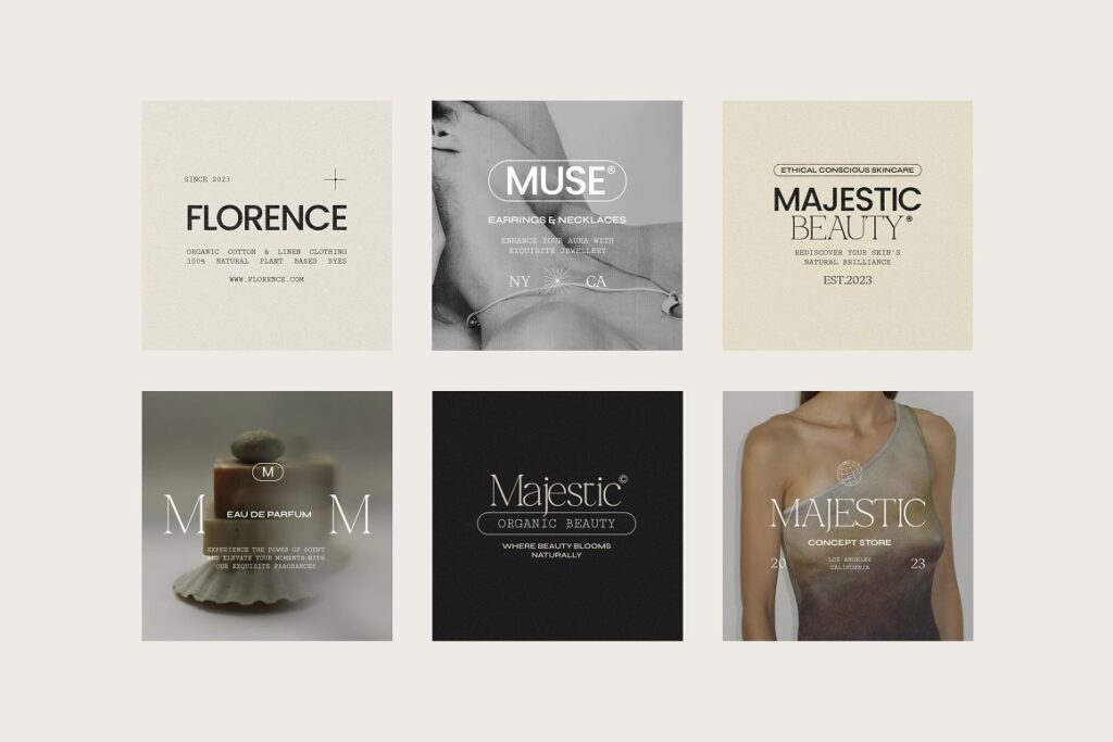
The key aspects of logo anatomy
The anatomy of a logo refers to the various elements that make up a logo and contribute to its overall design and effectiveness.
Here are some of the key components of a logo:
- Icon or symbol: This is the graphic or symbol that represents the brand visually. It may be an abstract shape, a recognizable object, or an illustration of a character or animal.
- Typography: This refers to the font or typeface used in the logo. Typography can convey a certain mood or tone and can help establish the brand’s identity.
- Color: The color or color scheme used in a logo can have a significant impact on its effectiveness. Different colors can evoke different emotions and associations and can help a logo stand out from others in its industry.
- Shape: The shape of a logo can also contribute to its overall impact. A logo may be designed to be round, square, or rectangular, or may incorporate geometric shapes that convey a certain message or feeling.
- Tagline: Some logos include a tagline or slogan, which is a short phrase that helps clarify the brand’s message or values.
- Negative space: This refers to the empty space around and within the logo design. Skilled designers can use negative space creatively to create visual interest and make a logo more memorable.
Overall, the anatomy of a logo is all about how these different elements work together to create a memorable and effective brand identity.
Let’s look at each component separately.
Icon or symbol of a logo
The icon or symbol is one of the most critical components of a logo.
It is the visual representation of the brand and serves as a memorable and recognizable image that can be used across various platforms. It can take many forms, ranging from an abstract shape to a recognizable object, or an illustration of a character or animal. A well-designed icon or symbol can communicate a brand’s values and personality while also creating an emotional connection with its target audience.
An abstract shape can be used to represent a brand that is modern, innovative, or forward-thinking.
For example, the Nike swoosh is an abstract shape that has become synonymous with the brand’s commitment to athleticism and innovation. A recognizable object, on the other hand, can be used to represent a brand that is more traditional or established. For example, the Apple logo features a simple illustration of an apple, which has become an instantly recognizable symbol of the brand’s focus on simplicity and innovation.
An illustration of a character or animal can also be used to create a memorable and engaging symbol.
For example, the Twitter logo features a simple blue bird that has become synonymous with the brand’s mission to connect people and facilitate communication. Similarly, the Lacoste logo features an illustration of a crocodile, which has become a symbol of the brand’s commitment to quality and sophistication.
Designing an effective icon or symbol requires careful consideration of the brand’s identity and values.
A skilled designer will work to create an image that is visually appealing, memorable, and relevant to the brand’s target audience. When executed correctly, an icon or symbol can become an instantly recognizable image that communicates a brand’s message and values with just a glance.
Typography of a logo
Typography plays a crucial role in the design of a logo, as it can convey a specific mood or tone and help establish a brand’s identity.
It refers to the font or typeface used in the logo, and skilled designers can use typography to create a unique and memorable visual identity for a brand. Choosing the right typography requires careful consideration of the brand’s personality, target audience, and the message it wants to convey.
Different fonts can create vastly different moods and tones, which is why it’s essential to choose a font that aligns with the brand’s personality and values.
For example, a serif font like Times New Roman can create a sense of elegance and formality, making it a good choice for luxury brands. In contrast, a sans-serif font like Helvetica can convey modernity and simplicity, making it a popular choice for tech companies and startups.
Another important aspect of typography is legibility
A logo’s typography must be easily readable and recognizable, even in small sizes.
A font that is too thin or too bold can make the logo difficult to read, especially from a distance. It’s also essential to consider the spacing between the letters and the overall composition of the typography. Skilled designers can use kerning and tracking to adjust the spacing between letters to create a balanced and visually pleasing logo.
The typography used in a logo should also be consistent with the brand’s visual identity across all marketing materials.
Using the same font for all brand messaging, including websites, business cards, and other materials, creates a cohesive brand identity and makes the brand more recognizable. Overall, typography is a critical component of logo design, and choosing the right font requires careful consideration of the brand’s personality, legibility, and consistency across all marketing materials.
Well-designed typography can create a unique and memorable visual identity for a brand, making it easier for customers to recognize and connect with the brand.
Color of a logo
Color is an essential aspect of logo design and can have a significant impact on a logo’s effectiveness.
The right color or color scheme can help a logo stand out from competitors and create an emotional connection with customers. Different colors evoke different emotions and associations, and skilled designers can use this to their advantage when creating a logo.
For example, red is often associated with energy, passion, and urgency, making it a popular choice for brands in the entertainment, sports, and food industries.
Blue, on the other hand, is associated with trust, stability, and intelligence, making it a popular choice for brands in the finance and technology industries. Green is associated with nature, growth, and health, making it a popular choice for brands in the healthcare, beauty, and eco-friendly industries.
The psychological impact of color when designing a logo
Warm colors like red and yellow are considered attention-grabbing and energetic, while cool colors like blue and green are considered calming and soothing.
Bright, bold colors can create a sense of excitement and urgency, while muted or pastel colors can create a more subtle, sophisticated impression. The color scheme used in a logo should also be consistent with the brand’s overall visual identity. Using the same color scheme across all marketing materials creates a cohesive brand identity and makes the brand more recognizable.
It’s also essential to consider how the logo will look in different contexts, such as on a website or on a product label, and to choose colors that will stand out in those contexts.
The color or color scheme used in a logo is a critical aspect of its design. Different colors can evoke different emotions and associations and can help a logo stand out from others in its industry.
A skilled designer will carefully consider the brand’s personality, target audience, and overall visual identity when choosing a color scheme for the logo.
Shape of a logo
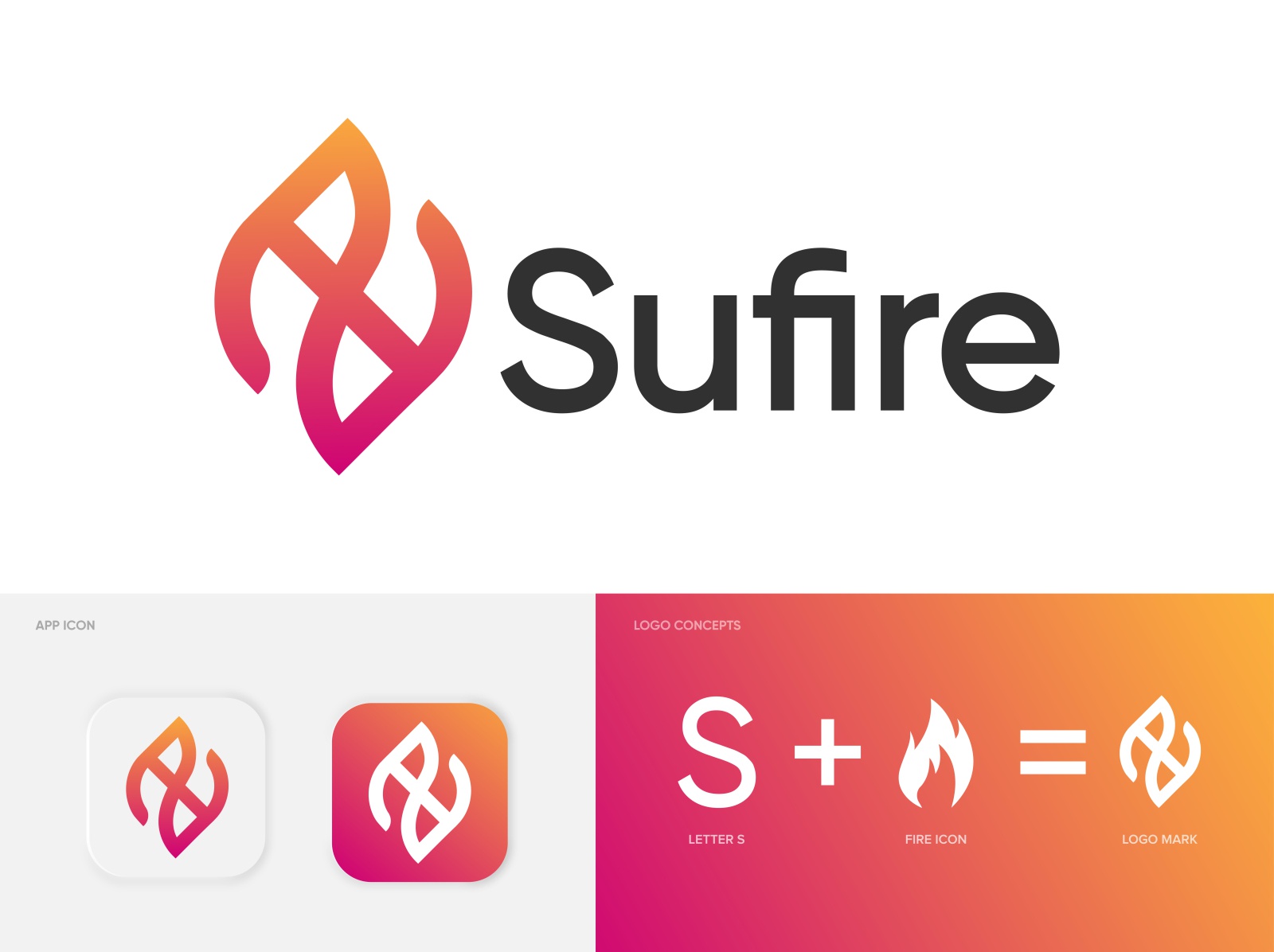
The shape of a logo is a critical element that can contribute to its overall impact.
A logo’s shape can help create a recognizable and memorable visual identity for the brand. The shape of a logo can be round, square, or rectangular, or may incorporate geometric shapes that convey a certain message or feeling.
- Circles are often associated with unity, community, and completeness.
- Squares and rectangles convey stability, reliability, and order.
- Geometric shapes like triangles can create a sense of movement, energy, and direction, making them a popular choice for brands in the tech and automotive industries.
In addition to the overall shape, the proportions of the logo are also essential to consider.
A logo that is too tall or too wide may not be easily recognizable, and the proportions should be balanced to create a visually pleasing logo. The negative space, or the space around and between the elements in the logo, can also be used to create a memorable shape that stands out from competitors.
The shape of a logo is an important element that can contribute to its overall impact. A well-designed shape can create a recognizable and memorable visual identity for the brand, and skilled designers will carefully consider the shape’s proportions and use of negative space to create a visually pleasing logo.

Tagline of a logo
Taglines or slogans are brief and memorable phrase that accompanies a logo and helps clarify the brand’s message or values.
A well-crafted tagline can make a logo more memorable and enhance its impact. A tagline can help communicate the brand’s unique selling proposition, evoke emotions, or provide a call to action. It can be a simple and direct statement, a clever play on words, or a catchy rhyme.
Taglines can be particularly useful for newer brands or those entering a crowded market.
In these cases, the tagline can help differentiate the brand from its competitors and create a stronger brand identity. For example, Nike’s tagline “Just Do It” has become synonymous with the brand and conveys the idea of empowerment and action. McDonald’s tagline “I’m Lovin’ It” is another example of a catchy phrase that has become part of the brand’s identity.
Taglines can also be updated or changed over time to reflect shifts in the brand’s message or positioning.
For example, Apple’s tagline “Think Different” was used from 1997 to 2002 before being replaced with “Designed by Apple in California” in 2016. The new tagline highlights the brand’s focus on design and manufacturing in California. It can help clarify the brand’s message, differentiate it from competitors, and create a stronger brand identity.
Skilled designers will carefully consider the tagline’s wording and how it complements the visual elements of the logo.

Negative space of a logo
Negative space is the empty space around and within the logo design.
While it may seem like a non-essential element, skilled designers can use negative space creatively to create visual interest and make a logo more memorable. Negative space is also known as white space, and it is an important element in creating a visually pleasing and balanced logo.
In logo design, negative space can be used to create hidden meanings or visual illusions.
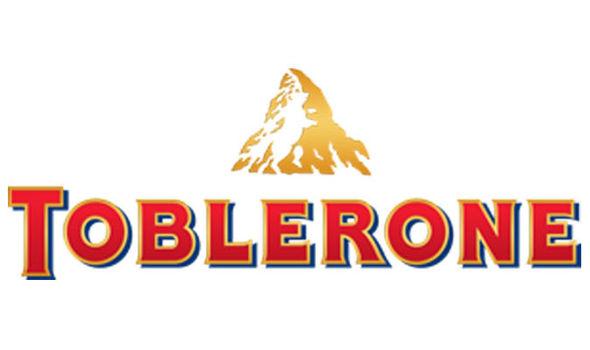
One famous example is the FedEx logo, which uses negative space between the letters “E” and “X” to create an arrow shape. This arrow shape suggests speed, forward motion, and delivery, which aligns perfectly with the company’s brand message. Similarly, the Toblerone logo uses negative space to create the shape of a bear, which is a nod to the brand’s origin in the Swiss city of Bern, also known as the “City of Bears.”
Negative space can also be used to create a sense of depth and dimension in a logo. For example, a logo with a layered design can use negative space to create the illusion of shadows or highlights, which adds visual interest and makes the logo more memorable.
Negative space can also be used to create contrast and balance within the logo design, ensuring that the logo is easy to read and visually appealing.
What is logomark
Logomark is an essential aspect of logo design that plays a critical role in brand recognition.
It is a visual representation of a company, product, or service and helps establish a strong brand identity. Logomarks are often used to create a visual association with the company or brand and can be used in various forms of marketing materials such as business cards, websites, packaging, and advertisements. A logomark can be a simple graphic or a more intricate design, but it should be memorable, unique, and easy to recognize.
A well-designed logomark can communicate the essence of a brand with just a glance, making it a valuable asset to any company.
It should be versatile enough to be used across different mediums and should be scalable to work across different sizes without losing its clarity or effectiveness. A successful logomark should not only be aesthetically pleasing but also convey the brand’s personality and values. Some well-known examples of logomarks include the Apple logo, the Nike swoosh, and the Twitter bird.
When designing a logomark, it’s essential to consider the brand’s target audience, industry, and competition to ensure it stands out and communicates the brand’s unique attributes.
With a well-designed logomark, a brand can establish a strong and recognizable identity that sets them apart from its competitors.

Wordmark
The wordmark is a simple yet effective way of branding a company. It uses typography to create a unique design that represents the brand.
The choice of font, style, and color can be used to convey the brand’s personality, values, and tone. A well-designed wordmark can be easily recognized, memorable, and timeless. It can also be versatile enough to be used in a variety of mediums, from print to digital.
When creating a wordmark, designers consider the legibility and readability of the font.
They also take into account the kerning, tracking, and leading to ensure the text is balanced and easy to read. The choice of font is also significant as it can evoke different emotions and associations. For example, a serif font can be seen as traditional and trustworthy, while a sans-serif font can be perceived as modern and approachable.
Wordmarks can be either horizontal or vertical in orientation, and they can be used alone or in combination with a logomark.
The use of negative space and color can also be incorporated into the wordmark design to create visual interest and enhance brand recognition. The Nike wordmark, for example, uses a bold and simple font with a swoosh symbol, making it one of the most recognizable logos worldwide.
A well-designed wordmark can make a lasting impression on customers and help establish brand recognition. It is an essential element of a brand’s visual identity and should be carefully crafted to effectively represent the brand’s message and values.
An example:
What is the importance of color in logo design?
Color is one of the most important elements of logo design, as it can have a significant impact on how the logo is perceived by the audience.
Different colors can evoke different emotions and associations and can help a logo stand out from others in its industry. When choosing colors for a logo, designers should consider the brand’s personality, target audience, and industry trends.
Color can be used to convey different meanings and emotions in logo design.
For example, red is often associated with passion, energy, and excitement, while blue is associated with trust, calmness, and professionalism. Green is associated with growth, nature, and health, while yellow is associated with optimism and friendliness.
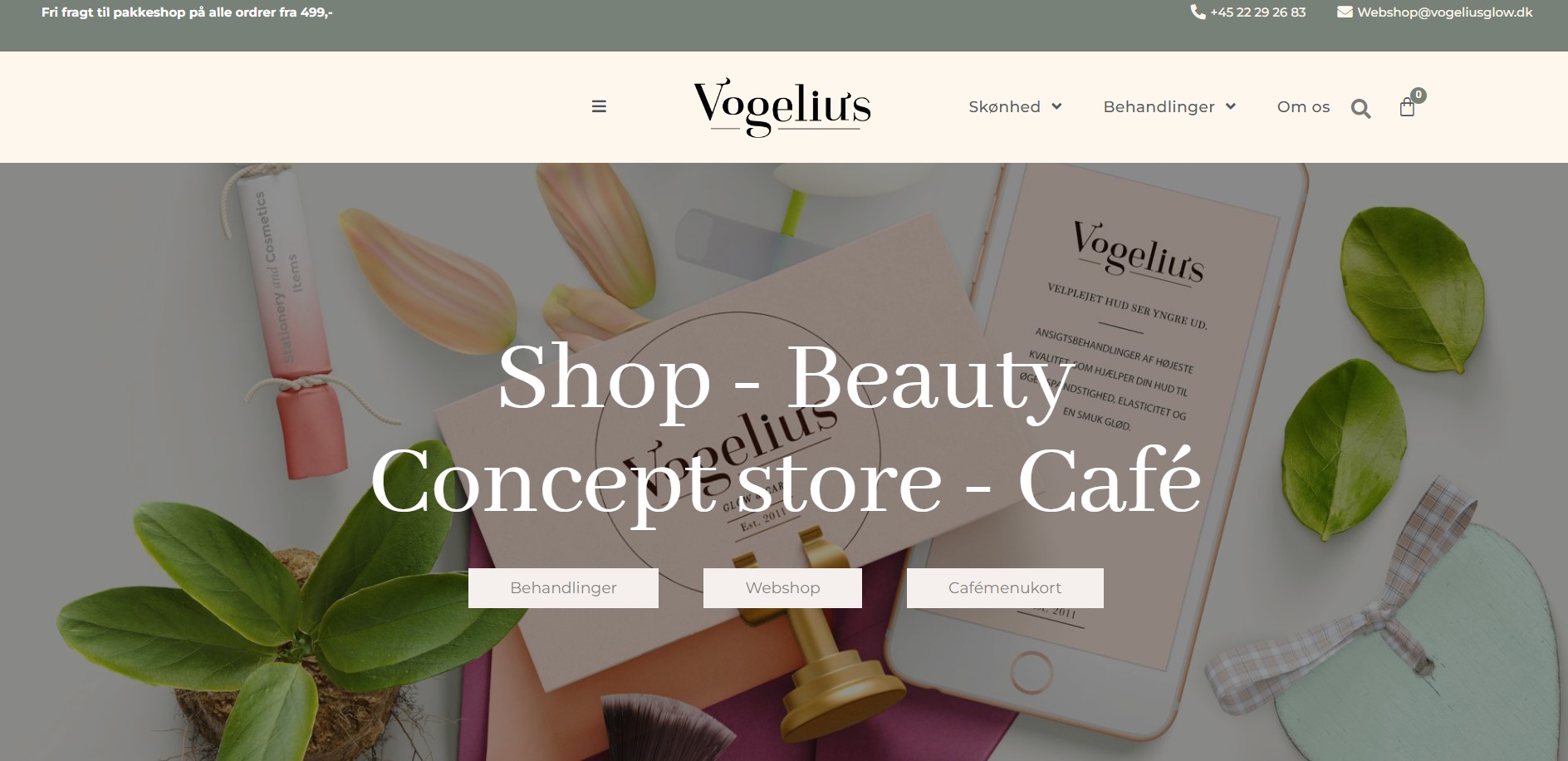
Black and white are classic and timeless, often used to convey sophistication and simplicity.
The color scheme of a logo can also help establish the brand’s identity and set it apart from competitors.
For example, a bold and vibrant color scheme may be more suitable for a brand targeting younger audiences, while a more subdued and elegant color scheme may be better suited for a luxury brand.
How can a logo be adapted or modified over time to reflect changes in the brand’s message or positioning?
As a brand evolves over time, it’s important that its logo evolves along with it to reflect the changes in the brand’s message or positioning.
A logo that no longer represents the brand’s values or identity can confuse customers and dilute the brand’s message. However, modifying a logo can be a delicate process, as it’s important to maintain brand recognition and consistency.
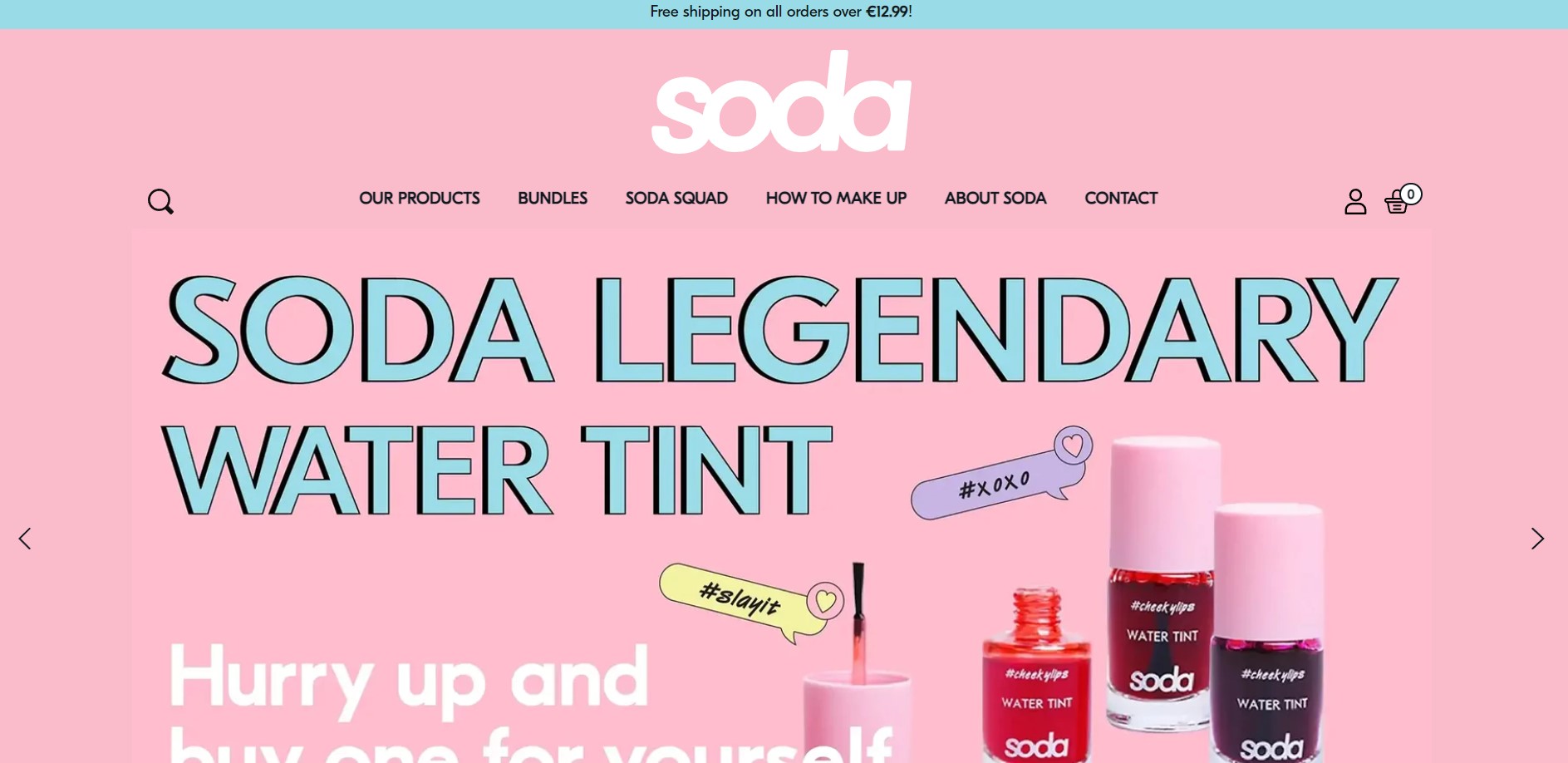
One way to adapt a logo over time is to make minor tweaks to the existing design. For example, adjusting the color palette, updating the typography, or simplifying the design can give the logo a refreshed look without completely overhauling it. These subtle changes can help modernize the logo while still maintaining its core elements and brand recognition.
Another approach to modifying a logo is to create different variations of the design to be used in different contexts.
A simplified version of the logo may be used in social media profiles, while a more complex version may be used on print materials or packaging. By creating different versions of the logo, the brand can maintain consistency while still adapting to different platforms and contexts.
Learn more about it here: Brand Refresh: How Often Should You Update Your Brand?
Typography in a logo
Typography plays a vital role in conveying the mood and tone of a logo.
It is an essential aspect of designing a business’s visual identity, as it is the first point of contact between the potential customer and the brand. Typography has the power to create an emotional connection with the audience and evoke specific feelings and emotions. It can communicate the personality, values, and message of the brand, making it critical to choose the right typeface.
Different typefaces have distinct personalities and characteristics, which can influence the perception of the logo.
San serif fonts are straightforward and easy to read, making them an ideal choice for conveying simplicity and ease of use.
Serif fonts, on the other hand, convey a more formal and traditional feel, making them a suitable choice for businesses that want to create an impression of authority and professionalism.

The choice of typography
The choice of typography can also help to communicate the intended mood or tone of the brand.
- Bold, open, and friendly scripts, such as handwriting or retro-style letterheads, evoke a sense of nostalgia and earthiness, making them ideal for brands that want to convey a sense of warmth and approachability.
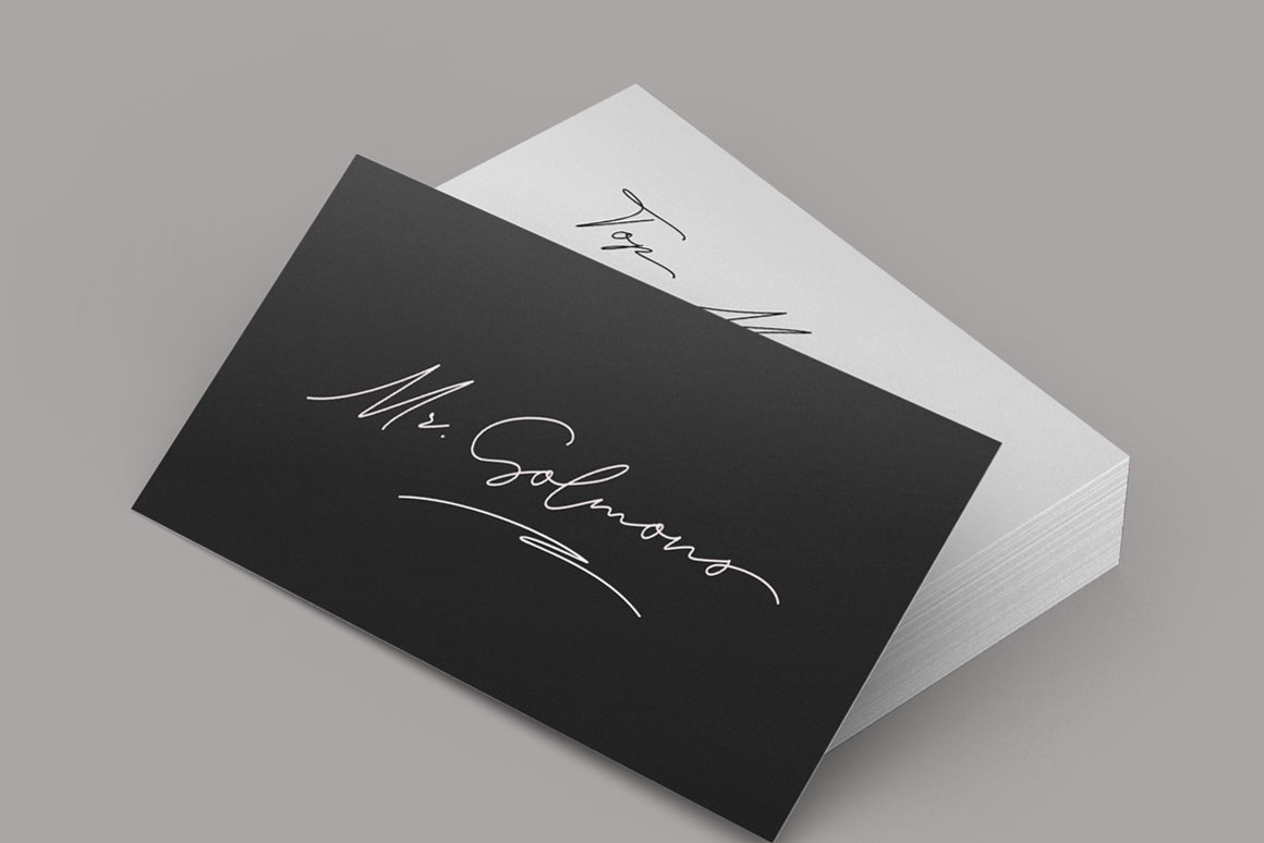
- Delicate and modest scripts, such as elegant calligraphy or feminine, flowing handwriting, are ideal for brands that want to create an impression of elegance and sophistication.
The size, weight, and spacing of the typography
- A bold, oversized script can create a sense of drama and self-confidence, making it ideal for brands that want to make a bold statement.
- A smaller, delicate script, on the other hand, can evoke a sense of subtlety and refinement, making it ideal for brands that want to create a sense of understated elegance.
When designing a logo, it is essential to choose a unique and prominent typeface that is not used anywhere else in the brand’s materials.
This creates a sense of consistency and coherence in the brand’s visual identity and helps to establish a strong brand identity in the minds of the audience. Additionally, combining different texts in the logo can create a sense of contrast and dynamism, making the logo more visually appealing and memorable.
More aspects of logo anatomy to keep in mind
There are several lesser-known aspects of logo anatomy that people may ask about, but which are not always covered in discussions about logo design.
Some of these include:
- Kerning: This refers to the spacing between individual letters in a word or phrase. Proper kerning is essential for a clean and visually appealing logo. Designers may adjust the kerning of a logo to make it more readable, balanced, and visually pleasing.
- X-height: The x-height is the height of the lowercase letters in a font. A higher x-height can make a logo appear more modern and bold, while a lower x-height can create a more classic or traditional look.
- Ligatures: Ligatures are special characters that combine two or more letters in a font into a single glyph. They are used to improve readability and visual appeal in some fonts. Designers may choose to include or exclude ligatures in a logo, depending on the desired look and feel.
- Baseline: The baseline is the imaginary line upon which the letters in a font sit. A level baseline is important for creating a clean and balanced logo design.
- Tracking: Tracking refers to the overall spacing between the letters in a word or phrase. Adjusting the tracking can help create a more cohesive and visually appealing logo design.
- Color theory: The use of color is an important aspect of logo design, but it goes beyond simply choosing the right colors for a brand. Understanding color theory and how colors interact with each other can help designers create more effective and impactful logos.
- Shape psychology: The shapes used in a logo can also convey a certain mood or tone, and understanding shape psychology can help designers choose the right shapes for a brand. For example, circles and curves can create a sense of softness and approachability, while sharp angles can convey a sense of strength and power.
Breaking down the anatomy of a logo design
Watch this amazing video by Design99 and learn more about the anatomy of a logo design:
Best books about logo design
- Logo Design Love: A Guide to Creating Iconic Brand Identities by David Airey
- The Logo Brainstorm Book: A Comprehensive Guide for Exploring Design Directions by Jim Krause
- Marks of Excellence: The History and Taxonomy of Trademarks by Per Mollerup
- Logo Modernism by Jens Müller and Julius Wiedemann
- Designing Brand Identity: An Essential Guide for the Whole Branding Team by Alina Wheeler
- Logo Creed: The Mystery, Magic, and Method Behind Designing Great Logos by Bill Gardner
- Logo Lounge: 2,000 International Identities by Leading Designers by Bill Gardner and Catharine Fishel
- Symbol by Angus Hyland and Steven Bateman
- Identity Designed: The Definitive Guide to Visual Branding by David Airey
- The Elements of Logo Design: Design Thinking, Branding, and Making Marks by Alex W. White
Conclusion
In conclusion, the anatomy of a logo is an important aspect of its design.
It includes various elements such as color, typography, shape, negative space, and tagline. Each of these elements plays a vital role in communicating the brand’s message and values to its audience.
The choice of color, for instance, can evoke certain emotions and convey the brand’s personality. Typography can also help set the tone and mood of the logo design, conveying a message in a formal or playful way. Additionally, the use of negative space can help create visual interest and make the logo more memorable.
Finally, a tagline or slogan can clarify the brand’s message and values to its audience.
A skilled designer can adapt or modify a logo over time to reflect changes in the brand’s message or positioning while still maintaining its essential elements. Ultimately, a well-designed logo is a crucial part of a brand’s visual identity and can help it stand out in a crowded marketplace, making a lasting impression on its audience.
Read more about brand and design here:
Learn all about all four color psychology personalities:
- Group 1- Brand Design 1: How To Brand a Youthful, Open, and Happy Business
- Group 2- Brand Design 2: How To Brand an Elegant, Feminine Business
- Group 3- Brand Design 3: How To Style an Earthy, Community-Focused Business
- Group 4- Brand Design 4: How To Brand a High-End, Luxury Business
Last Updated on 17/05/2025 by Victoria Silber


