Colorful Brands – How To Create One
Colorful brands influence people by making the products they sell more visually appealing. Colors can also convey different messages, such as feelings of happiness or relaxation. In some cases, colorful branding can subconsciously influence people’s emotions and behavior.

For example, studies have shown that people are more likely to purchase food items packaged in colorful wrappers. Similarly, colorful branding can also be used to attract attention to a particular product or service.
This is often done using contrasting colors or bright, eye-catching colors. Ultimately, colorful branding can increase sales and encourage customers to engage with a product or service.

Benefits of a colorful branding
There are several benefits to having a colorful brand, including:
- Increased brand recognition: Using bold, vibrant colors can help your brand stand out from competitors and be more memorable to your audience.
- Improved emotional connection: Colors can evoke certain emotions and associations in people. By using colors that align with your brand’s personality and messaging, you can establish a stronger emotional connection with your audience.
- Enhanced brand personality: Colors can help communicate your brand’s personality and values. For example, using bright, playful colors can communicate a fun and lively personality, while more muted colors can communicate sophistication and professionalism.
- Differentiation from competitors: Using a unique color scheme can help your brand stand out from competitors and establish a more distinct identity in a crowded marketplace.
- Increased brand loyalty: By using consistent, recognizable colors across all touchpoints, you can create a more cohesive and memorable brand experience for your audience. This can help build brand loyalty and encourage repeat business.
Overall, a colorful brand can help businesses establish a more memorable, recognizable, and emotionally engaging brand identity that resonates with their target audience.

How to use color in branding
Colors are everywhere and have a massive impact on how we perceive the world around us. Different colors can evoke different emotions, and when used correctly, they can be a powerful tool in branding. As a designer, it’s essential to understand how to use color effectively in branding to create a strong and cohesive brand that speaks to your target audience.
Color is a powerful tool that businesses can use to create a strong brand identity and establish an emotional connection with their target audience. Here are some tips on how to use color effectively in branding:
- Understand the psychology of color: Different colors can evoke different emotions and associations in people. For example, blue is often associated with trust and reliability, while red can symbolize passion and excitement. It’s important to consider your brand’s personality and target audience when choosing colors for your brand.
- Choose a color palette: Selecting a color palette can help create consistency across all of your brand’s touchpoints, including your logo, website, social media channels, and marketing materials. Consider using no more than three to five colors that complement each other and align with your brand’s messaging.
- Use color to differentiate: Using a unique color scheme can help your brand stand out from competitors and be more memorable to your audience. Consider using colors that aren’t commonly used in your industry or pairing unexpected color combinations.
- Be consistent: It’s important to use your brand’s color consistently across all touchpoints to help reinforce your brand identity and make it more recognizable to your audience.
- Test and iterate: Don’t be afraid to experiment with different colors and monitor how they perform with your target audience. You can conduct surveys or A/B testing to determine which colors resonate best with your audience and make adjustments as needed.
Using color effectively in branding can help your business establish a strong brand identity, create an emotional connection with your audience, and stand out in a crowded marketplace.
Use color for communication
First, it’s important to consider what message you want your brand to communicate. Different colors can convey different messages—for example, blue is often seen as trustworthy and calming, while red is seen as energetic and exciting.
Second, you’ll want to ensure that your colors work well together. You don’t want to use too many colors in your branding because that can be overwhelming and cluttered (think about all those websites from the early 2000s that were just a mishmash of every color under the sun!). Instead, stick to one or two main colors and one or two accent colors.
And lastly, make sure your colors are consistent across all platforms—you don’t want your website to be one color and your social media accounts to be another!

How to build a colorful brand
Colorful or happy brands are a way to call brands that feel playful, youthful, and friendly. To achieve this kind of impression, you need to combine the right colors of a correct value with suitable typefaces, patterns, icons, and other brand elements.

Building a colorful brand can be a fun and creative process. Here are some steps to help you build a colorful brand:
- Understand your brand’s personality and values: Before choosing colors for your brand, it’s important to understand your brand’s personality and values. Consider what your brand stands for, the emotions you want to evoke, and how you want your brand to be perceived by your target audience.
- Research your target audience: Understanding your target audience can help you choose colors that will resonate with them. Consider their age, gender, interests, and cultural background, as well as any industry trends.
- Choose a color palette: Selecting a color palette can help create consistency across all of your brand’s touchpoints, including your logo, website, social media channels, and marketing materials. Consider using no more than three to five colors that complement each other and align with your brand’s messaging.
- Use color to differentiate: Using a unique color scheme can help your brand stand out from competitors and be more memorable to your audience. Consider using colors that aren’t commonly used in your industry or pairing unexpected color combinations.
- Create a style guide: A style guide can help ensure consistency in your brand’s color palette across all touchpoints. Include details such as the hex codes for each color, how and where to use each color, and any variations of the color palette.
- Test and iterate: Don’t be afraid to experiment with different colors and monitor how they perform with your target audience. You can conduct surveys or A/B testing to determine which colors resonate best with your audience and make adjustments as needed.
Bright and colorful branding is called brand personality 1 – fresh, bright, and fun!
Have fun designing this type of branding!
- The color palette should consist of tones – bright, dynamic colors where pure hues are mixed with white.
- The photos you use are full of movement, lack symmetry, and are bright and lively.
- Illustrations are relatively simple and roundish, without too many fine details.
- Headers and titles are written with bold and round typefaces, and the body text in sans serifs is roundish and easy to read.
- The impression you give is bold, impactful, and welcoming.
- Keywords: open, creative, contemporary, clarity, bubbly, optimistic, quick thinking
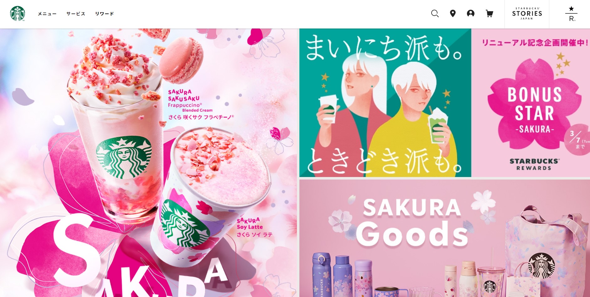
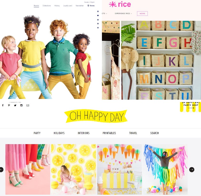
Some examples of colorful brands: okaidi.com, rice.dk, ohhappyday.com

Learn more about colorful brand elements here: How To Build A Youthful, Happy Business
Can you use too many colors in your brand?
Yes, it is possible to use too many colors in a brand, which can lead to confusion and dilution of the brand’s message. While using a range of colors can create a visually appealing brand, it’s important to ensure that the colors work well together and do not overwhelm the audience.
As a general rule of thumb, it’s recommended to use no more than three to five colors in a brand’s color palette. This helps to create consistency across all brand touchpoints and ensures that the colors are easily recognizable and memorable to the audience.
When choosing colors for a brand, it’s important to consider the brand’s personality, target audience, and industry. A professional services firm, for example, may want to use more muted, sophisticated colors to convey a sense of professionalism and trustworthiness, while a children’s toy brand may want to use brighter, more playful colors to appeal to children and parents.
Overall, while using a range of colors can be effective in creating a memorable and visually appealing brand, it’s important to use them strategically and ensure that they work well together to convey the brand’s message and personality.
Conclusion
In conclusion, creating a colorful brand is a great way to stand out in a crowded marketplace and capture the attention of potential customers. To create a successful colorful brand, businesses need to carefully consider their target audience, brand personality, and industry trends. By choosing the right colors, font, and imagery, businesses can create a brand that is visually appealing, memorable, and meaningful to their customers.
It’s important to keep in mind that a colorful brand should be consistent across all touchpoints, from the logo and website to social media and advertising campaigns. By investing time and resources in creating a vibrant, colorful brand, businesses can establish a unique identity and build a loyal customer base that resonates with their values and messaging.
Read more about colors in branding here:
- Group 2- Brand Design 2: How To Brand an Elegant, Feminine Business
- Group 3- Brand Design 3: How To Style an Earthy, Community-Focused Business
- Group 4- Brand Design 4: How To Brand a High-End, Luxury Business
Last Updated on 05/03/2025 by Victoria Silber


