Visual Brand Strategy – What Is It?
Visual branding is an essential aspect of any successful business or organization.

A strong visual brand strategy creates a cohesive and consistent brand identity that effectively communicates a company’s values, personality, and unique selling points to its target audience. From logo design to color schemes and typography, every aspect of a brand’s visual identity should be carefully crafted to align with its overall strategy. In this guide, we’ll explore what a visual brand strategy is, why it’s important, and how businesses and organizations can develop a comprehensive plan for their visual identity.
Whether you’re a small business owner or a marketing professional, understanding the key elements of visual branding can help you establish a distinct identity, build trust and loyalty with your customers, and ultimately drive sales.

What is visual brand strategy?
A visual brand strategy refers to the use of visual elements to create a cohesive and consistent brand identity.
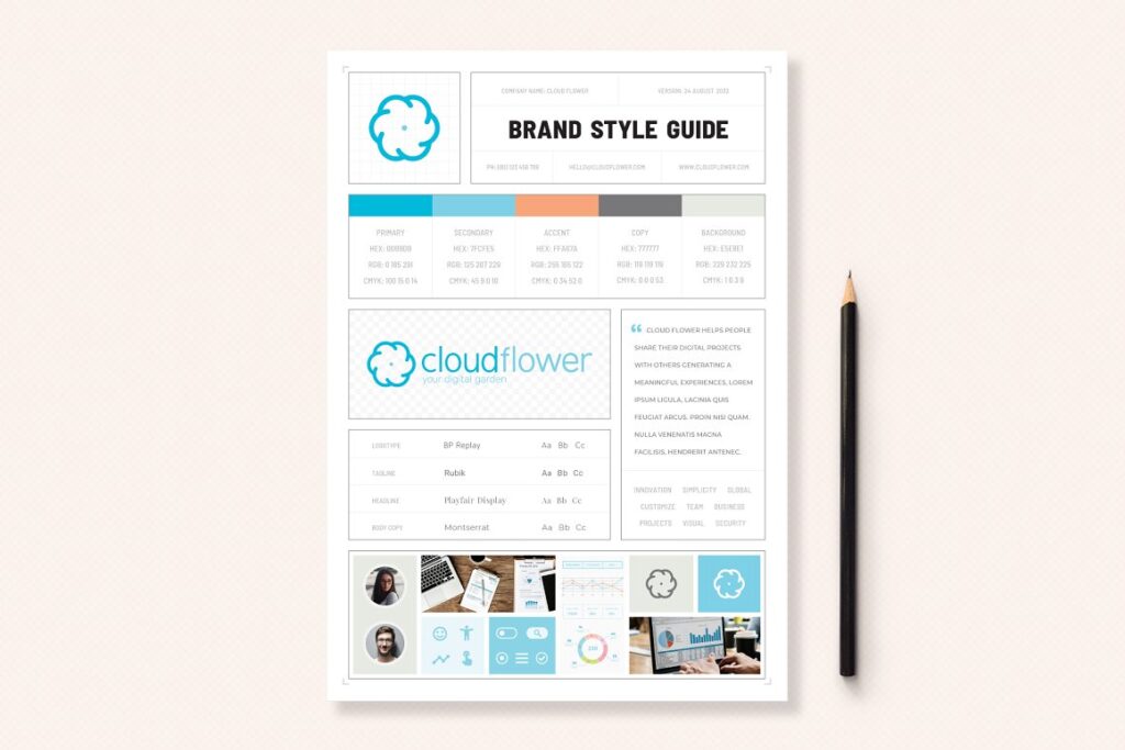
This includes elements such as logo design, typography, color schemes, imagery, and overall design aesthetics.
A strong visual brand strategy is essential for businesses and organizations to effectively communicate their values, personality, and unique selling points to their target audience. It helps create a memorable and recognizable brand identity that can enhance brand recognition, build trust and loyalty with customers, and ultimately drive sales. A visual brand strategy should be developed with a clear understanding of the target audience, industry trends, and overall business objectives. It should also be consistent across all channels, including website design, social media, advertising, and packaging.
By developing a comprehensive and well-crafted visual brand strategy, businesses and organizations can establish a distinct identity that sets them apart from the competition and resonates with their customers.
How important is it to have a clear brand strategy?
If the project has no defined strategy, you see endless revisions, redesigns, and general despair that’s a nightmare for both sides. That’s why your strategy is vital – the action plan around achieving your goals most effectively.
Brand strategy is an extension of the business plan, which is why the creative partner needs to understand how the company operates and what it wishes to achieve. Even if those in charge of the company wrote the strategy, they should still be open to the brand designers they are working with questioning it. The client and the creatives should design a brand strategy to create the best possible work outcome.
Brand strategy shapes effective company communication through identifying its audience, tone of voice, brand messaging, and market positioning; Defining the brand values and purpose; and showing its personality. All the visuals support that key messaging and augment the message you send to people about what you believe in, how you do what you do, and who you are.
Plan the creation of the brand’s visual identity carefully
This part of the creative process is the most important of them all.
Everyone should be on the same side of the argument to get the brand’s visual identity to work successfully across the finish line. The research and planning during these stages provide the answer that underscores the creative brand brief.
The entire visual language – from the brand color palette suggestions to ideas around the logo lockup – can be debated openly and gently to propel both sides together as one solid team. Everyone involved must sideline their egos and subjectively and focus on objective logic.
The brand strategy stage is pursued by creating the design strategy, where the graphics become the focus, and designers can discuss how best to achieve the brand’s goals.

How to create a visual branding strategy
Creating a brand identity comes in many stages from the client’s side: finding the right creative partner for the task, agreeing on the scope of the design package and price, signing contracts and NDAs (Non-Disclosure Agreements), and so on.
This is all part of the planning stage, as in discovery workshops, to establish the right brand and design strategy that sets it apart and speaks to consumers through its personality and purpose. Then, the brand brief is created as the foundation of the next stage of the work.
This entire process happens before any design work can begin.
While the creative team will lead the process, this should be collaborative and democratic. Trust on both sides is crucial. This process shapes the components of the brand identity: what it looks like, sounds like, and feels like through naming, logo lockup design, typography, color palette, tagline, and tone of voice. It’s only at the final stage – application, when these emerge across print, digital spheres, and real-world sites – that they become a living, breathing brand, ready for launch.
The identity will naturally evolve with gradual modifications informed by consumer interactions, usage, and other interjections, but this is the starting point.

Stand out from the crowd!
Branding is crammed with jargon that can feel irritating.
Mastering brand identity terminology is a little like learning a second language: when you pick up a few simple words, you can make a fundamental change, but the more extensive your vocabulary, the better the conversation will be.
These things come with time and experience.
One of the critical challenges with developing a brand strategy is to define how the design will create a solid and unique identity. You need a transparent visual communication system to attract the target customer and distinguish the brand from its competition.
For branded packaging, the competition is vast, with more and more new products competing for attention, especially in supermarkets. When a new brand is launched, catching the consumer’s eye is equally challenging. So how can a new brand cut through the visual noise and make itself seen?
The first thing that attracts the consumer tends to be color, followed by shapes and symbols. The text or the brand is usually the final component to be comprehended.
What are the four main components of visual brand identity?
Logo
The logo’s role in brand identity.
A logo can transcend language and cultural barriers to make a brand a global household name. Many of the big brands in the world are symbolized by marks that seem so simple that everyone thinks they could redraw them from memory. However, these symbols are always supported by vast amounts of unrecognized logistics, not marketing budgets. Every brand needs to reflect the right blend of originality, functionality, and design flair.
A new identity might consist of a logotype, often accompanied by a tagline to form a logo lockup.
But we can only create this once we fully comprehend the brand and how we can apply it. A logo serves as an umbrella for many different brand activities -it’s far from merely a shape the rest of the brand is created around. For many, the logo might be the first or last thing they see in their product experience.
The planning and brief stages should have formed the basis of your ideas for a word mark – whether the type is a serif, sans serif, hand-drawn, or custom-written lettering. If you’re working with an existing brand, does it even need a local device?
If the answer is yes, then what drives its meaning and, therefore, its aesthetic?
A brand mark
It should be possible to turn a brand mark into a tangible element: a batch, coin, closing tag, etc. For designers creating such pieces, they should generate all logo files and output in vector format to ensure they work perfectly across all scales.
There will naturally be developmental variations of the idea until the outcome is attained – and this should never rely on trends or lazy, tried and tested solutions.
A logo, brand mark, or icon is a deceptively simple device. It can consist of a combination of set colors, symbols, sets, and maybe words or letters in a simple design that represents the quality, values, and promises offered by the manufacturers of products or services. A logo can take almost any form. Some logos use words made unique by a bespoke typeface, and others use pure symbols; Many use a combination of the two.
They can be defined according to several general categories, including:
- Pictorial marks
- Word marks
- Badge marks
- Symbolic letterforms
- Brand accessories
- Abstract or symbolic marks
Brand color palette
The brand strategy ultimately shapes brand colors too.
How we view specific colors -liking some, disliking others – is subjective. But designers and brands should work objectively in favor of what’s suitable for the brand and set it apart from competitors.
While your core color might overlap with those used by brands in a similar field, its accents and the nuances of how the color palette is applied can set it apart.

Brand typefaces
Initially, designers are likely to take the art direction research and test out options for serif and/or sans serif type through freely available system fonts before widening the search to online type foundries.
Many of these are freely available, thanks to the likes of Google fonts and Adobe Creative Cloud subscriptions, while those available for purchase often offer a unique look and feel to default system fonts.
So while it’s not the cheapest option, clients could consider having a custom typeface drawn for the brand.
That way, it’ll be bespoke and might ultimately save money in the long term since it saves on licensing fees associated with existing fonts.
Name of the brand
Choosing the right name for your brand is a critical decision that can impact your business’s success.
Your brand name should be memorable, easy to pronounce and spell and reflect your brand’s values and personality. It should also be unique and not too similar to other existing brand names in your industry to avoid confusion.
When selecting a brand name, it’s important to consider how it will look and sound when used in various contexts, such as on social media, advertising materials, and website URLs.
You may also want to consider conducting market research to test different name options and ensure they resonate with your target audience.
Ultimately, a strong brand name can help you establish a distinct identity, stand out in a crowded marketplace, and make a lasting impression on your customers.
Supporting visual elements of brand identity: shapes, and symbols
On average, shoppers only take five seconds to find and decide on a product at a span of 1 to 2 meters (3 to 6 feet).
It shows that the appropriate use of color can increase brand recognition by some 80% while also serving as an essential brand identifier. Symbols are excellent tools for communicating meaning, as with McDonald’s golden arches, the Mercedes star, and the Nike swoosh.
The associations emanated from symbols that are also imprinted in consumers’ minds through repeated exposure.
Brand words
Packaging cluttered with too much text battles for attention and often builds confusion.
It is nearly always a good idea to keep the design simple, concentrating on one competitive topic of difference that differentiates a brand from its primary competitors. While colors, shapes, and symbols tend to enhance on-shelf visibility, generally, the more text used in a design, the less valuable these other aspects become.
Brand’s unique selling point (USP)
American adman Rosser Reeves first coined the term “unique selling point” in the 1940s.
At that time, it was an advertising and marketing concept. Advertisers used it to describe a practice among thriving advertisement campaigns, where unique propositions were made to clients, persuading them to change from their regular brands to the ones promoted.
The USP – or “unique selling proposition” or “point of difference” (POD) – is all critical in determining a brand’s competitive benefit over its rivals and essential to a successful branding technique. In addition to providing clear differentiation from the current market, the USP must also contain features or advantages that customers will positively, firmly, and uniquely associate with the new brand.
Determining the USP for a product or service requires significant study of the matter, existing market, customer requirements, and tendencies. Brands use environmental concerns, authentic food miles, sustainability, and healthy lifestyles or problems to help them define their unique qualities. But to design powerful consumer commitment and appreciate ongoing success, the brand must be genuine and capable of delivering the promise. When studying the brief, the creative team will develop an emotional selling proposition or ESP.
This is used widely in advertising and is comparable to USP but concentrates on the emotional stimuli to purchasing.
Semiotics in visual branding
“What does it all mean?”
Semiotics is the science of understanding signs. Creating a successful brand relies not only on great design, but it also needs to mean something. How we build meaning into the brands, we make complex art involves designing three key elements: the brand name, the icon, and often a strapline or slogan. In our graphic toolbox, we use typography, color, image, and style, and our choices will be decided by the message we communicate.
The critical objective of branding design is to appreciate and manipulate the meaning contained within brand identity and the consequential subliminal effect this has on consumers and their buying decisions.
This can be explored effectively by studying the layers of meaning captured within an existing brand. Such “brand analysis exercises” play a vital role in the early stages of the design process.
Visual brand strategy
Brand identities
A great example of a “brand family” is the identities created by the British Broadcasting Corporation.
Key to the success of the branding strategy has been maintaining the strength of the parent brand by seamlessly integrating it within the range of sub-brands. The bold, uppercase sans serif typeface, with each of the three letters of the BBC brand contained in a separate box, gives the parent brand a robust and fundamental identity. The strength of this icon ensures it maintains its dominance in the hierarchy when applied to the sub-brands, even though it appears in smaller font sizes.
Each sub-brand is created to keep its unique identity by using a range of typefaces and colors.

In some cases, a brand can become even more than a family, developing its own dynasty, as with Virgin. In this case, a consistent visual identity covers various categories, from music to financial services and air travel.

Conclusion
In conclusion, a strong visual brand strategy is a critical component of any successful business or organization.
By developing a comprehensive plan for your visual identity, you can effectively communicate your brand’s values, personality, and unique selling points to your target audience. From logo design and typography to color schemes and marketing materials, every aspect of your visual identity should be carefully considered and aligned with your brand’s overall strategy.
By investing in a well-crafted visual brand strategy, businesses can enhance their brand recognition, build trust and loyalty with their customers, and ultimately drive sales.
Whether you’re starting a new business or rebranding an existing one, taking the time to develop a strong visual brand strategy is a worthwhile investment that can pay off in the long run.
Which direction to take?
Get a very clear overview of your business’s visual identity needs here:
- Group 1- Brand Design 1: How To Brand a Youthful, Open, and Happy Business
- Group 2- Brand Design 2: How To Brand an Elegant, Feminine Business
- Group 3- Brand Design 3: How To Style an Earthy, Community-Focused Business
- Group 4- Brand Design 4: How To Brand a High-End, Luxury Business
Last Updated on 26/04/2025 by Victoria Silber


