How To Choose Brand Illustration Style For Your Business
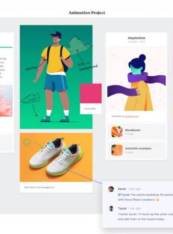
Brand illustrations allow businesses to appear memorable and engaging. Hand-drawn visuals can create impressions that most other visualization tools can not provide. In this brand illustration guideline, you can learn about different approaches to illustrations in branding.

Brand illustrations are visual representations of a brand’s identity, values, and personality. They can include various elements such as logos, typography, colors, and graphics, and are designed to create a consistent and memorable image of a brand.
Illustrations can tell stories and show abstract concepts. Thus, through the illustrations, we can create a fantasy world that is not as related to reality as photography is. The tiny details often show the level of thought in the finished design. Take, for example, a hairdresser salon for men. Illustrations in the interior and windows can lead customers into a new world where everyday worries disappear, and the client enjoys being in the moment.
Or, for example, illustrated packaging: this can be a unique experience for the client. The graphic design of the package’s outer side can give an idea of the product’s nature. By opening the box, the customer can discover the reflective layer on the package’s inner side, which, when removed, reveals the product. The flexibility of illustrations allows you to create unique solutions you can tailor to suit every dimension and shape.
You can find excellent illustrations for budget prices from Creative Market, like these by Lisima:

Benefits of brand illustrations
Brand illustrations play an important role in establishing a brand’s visual identity and differentiating it from its competitors. They can also communicate a brand’s story, values, and personality in a unique and engaging way, making it easier for consumers to connect with and remember the brand.
Choosing the right brand illustration style is key to creating a strong and effective brand identity. The style should be appropriate for the brand’s industry and target audience while also being distinctive and memorable. For example, a minimalist illustration style might be suitable for a tech startup, while a hand-drawn style might be more fitting for a children’s brand.
It’s important to ensure that the chosen illustration style is consistent across all touchpoints, including websites, social media, packaging, and advertising. Consistency helps to reinforce the brand’s image and create a strong and cohesive identity.
Brand illustrations can also be updated or adapted to stay relevant and fresh. This can be done by incorporating new design trends or updating the brand’s message or values. By keeping the brand’s illustration style flexible and adaptable, it can evolve alongside the brand and continue to resonate with consumers over time.
Illustrations can set the mood of the brand
Illustrations help you bring up the right personality group for your business and make it even more perfect in harmony. For example, a company that wants to appear amusing and playful; can use hand-drawn funny characters. If a business attempts to appear calm, self-confident, and elegantly understated, it can use botanical-style drawings with fine lines and watercolor coloring.
A business that offers organic products and wants to appear serious, open, and friendly can use warm, bold, and subtle illustrative style—using strong and precise lines and very few details, maybe? On the other hand, a brand that wishes to underline its high-end position can use rich and detailed art pieces representing traditions and classics.
Where should brand illustrations be used?
Brand illustrations can be used in a variety of ways to enhance your visual identity and communicate your brand personality. Here are some examples of where you can use brand illustrations:
- Logo: Incorporate your brand illustration into your logo design to create a unique and memorable visual identity.
- Packaging: Use brand illustrations on your product packaging to make your products stand out on the shelves and communicate your brand personality.
- Advertising: Create eye-catching advertisements by incorporating brand illustrations into your print or digital ads.
- Social media: Use brand illustrations to create engaging social media graphics that communicate your brand message and personality.
- Website: Incorporate brand illustrations into your website design to create a cohesive and memorable visual experience for your audience.
- Marketing collateral: Use brand illustrations in your marketing collateral, such as brochures, flyers, or presentations, to communicate your brand message in a visually appealing way.
It’s important to use brand illustrations consistently and appropriately across all of your branding materials to create a strong and cohesive visual identity. By incorporating brand illustrations into your branding strategy, you can differentiate your brand from the competition and create a memorable and engaging visual experience for your audience.
Styling matters – your brand illustration guideline
When developing your brand illustration guideline, consider your brand’s personality and values. What emotions do you want to evoke in your audience? What visual elements best represent your brand? This can help you choose a suitable color palette, typography, and illustration style.
It’s important to establish guidelines for how your illustrations will be used, such as where they will appear and how they will be sized and cropped. This ensures that your illustrations are used in a consistent and appropriate way.
Your brand illustration guideline should also provide examples of different types of illustrations and how they can be used. This can include product illustrations, icons, infographics, and more. Providing examples helps to clarify the style and tone of your illustrations and ensures that they are being used in the most effective way possible.
It’s important to keep your brand illustration guideline flexible and adaptable, allowing for changes and updates as your brand evolves over time. However, it’s also important to maintain consistency in your brand illustrations, as this helps to create a strong and memorable visual identity for your brand.
In conclusion, creating a brand illustration guideline is an essential step in developing a strong and consistent visual identity for your brand. By considering your brand’s personality and values, establishing guidelines for how illustrations will be used, and providing examples, you can create a guideline that effectively communicates your brand’s story, values, and personality to your audience.
The four brand personalities and illustrations
As with other elements in visual brand identity, styling is crucial. Choose a style that fits with your brand’s personality group.
- Group number one works well with rounder forms, clean lines, and movement.
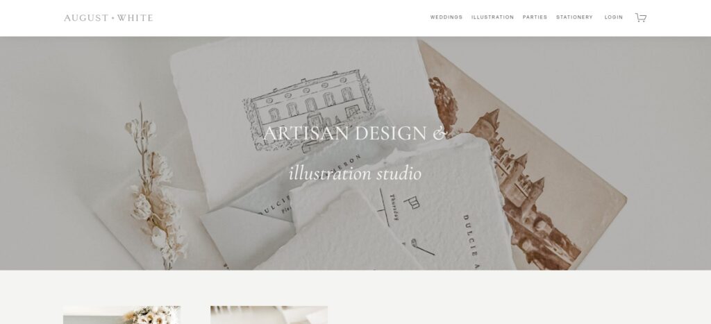
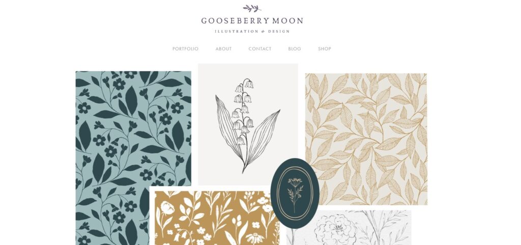
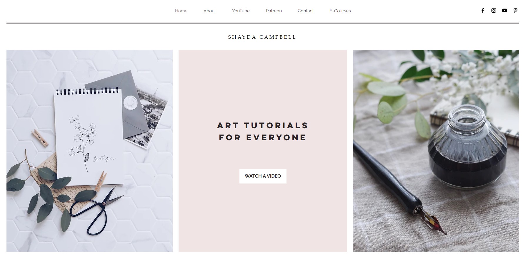
- Group number two needs a more reserved approach with drifting quality in it. Fine lines, attention to detail, maybe ink or watercolor.
- Group three is all about friendliness and abundance. Bold lines, not necessarily very detailed.
- Group four goes for high-end and drama – a robust and characterful style that leaves a strong impression and is instantly recognizable.
Personality group 1:
Group 1 illustrations are playful and full of movement, expressing youthfulness and lightness. The tonality is bright and light.
Group 1 illustrations are characterized by their playful and energetic style, expressing youthfulness and lightness. They are designed to evoke a sense of fun and excitement, making them particularly well-suited for brands targeting a younger audience or those that want to convey a more playful personality.
The tonality of Group 1 illustrations is bright and light, with a focus on vivid and cheerful colors. The use of bold lines and shapes creates a sense of movement and dynamism, further emphasizing the energetic and lively nature of these illustrations.
This illustration style can be effective for a variety of purposes, such as creating eye-catching product packaging or designing engaging social media graphics. However, it may not be as suitable for brands that want to convey a more serious or sophisticated image.
Overall, Group 1 illustrations are a great choice for brands that want to inject a sense of fun and playfulness into their visual identity. By incorporating these illustrations into your branding, you can create a vibrant and energetic image that resonates with your audience and helps to differentiate your brand from the competition.


Personality group 2:
Minimalistic use of group 2 illustrations is in a refined, understated style. They are detailed and usually have fine lines.
Group 2 illustrations are characterized by a minimalistic and refined style that emphasizes simplicity and understated elegance. These illustrations typically feature fine lines and intricate details, giving them a sense of sophistication and elegance.
The use of negative space is also an important feature of Group 2 illustrations, with a focus on creating a sense of balance and harmony between the elements of the illustration. The tonality of these illustrations is often muted and subtle, with a focus on neutral or pastel colors that add to the overall sense of refinement.
Group 2 illustrations are particularly well-suited for brands that want to convey a sense of sophistication and elegance. They can be used to create minimalist packaging designs, sophisticated advertising campaigns, or refined social media graphics.
However, it’s important to use Group 2 illustrations in a consistent and appropriate way. Overuse or misuse of these illustrations can result in a visual identity that feels overly simplistic or lacking in personality.
Overall, Group 2 brand illustrations are a great choice for brands that want to convey a sense of refined elegance and sophistication. By incorporating these illustrations into your branding, you can create a visual identity that is both timeless and contemporary, helping to differentiate your brand from the competition and appeal to a sophisticated audience.
Personality group 3:
Illustrations for group 3 personality: the natural-looking product is presented using earthy, bold, open, and warm illustrations.
Group 3 illustrations are characterized by an earthy and warm aesthetic that emphasizes natural beauty and organic elements. These illustrations often feature bold lines and shapes, creating a sense of depth and texture that adds to the overall organic feel.
The use of warm, earthy colors is also an important feature of Group 3 illustrations, with a focus on shades of brown, green, and other natural tones. This color palette evokes a sense of warmth and comfort, making it particularly well-suited for brands that want to create a sense of natural beauty and relaxation.
Group 3 illustrations are often used to promote natural and organic products, such as skincare, food, or supplements. They can also be effective for brands that want to promote an eco-friendly and sustainable message.
When using Group 3 illustrations, it’s important to maintain a sense of openness and space. These illustrations often feature negative space and an open composition, creating a sense of lightness and airiness that adds to the overall organic feel.
Overall, Group 3 illustrations are a great choice for brands that want to promote a natural and organic image. By incorporating these illustrations into your branding, you can create a visual identity that is both warm and inviting, helping to differentiate your brand from the competition and appeal to a conscious audience.
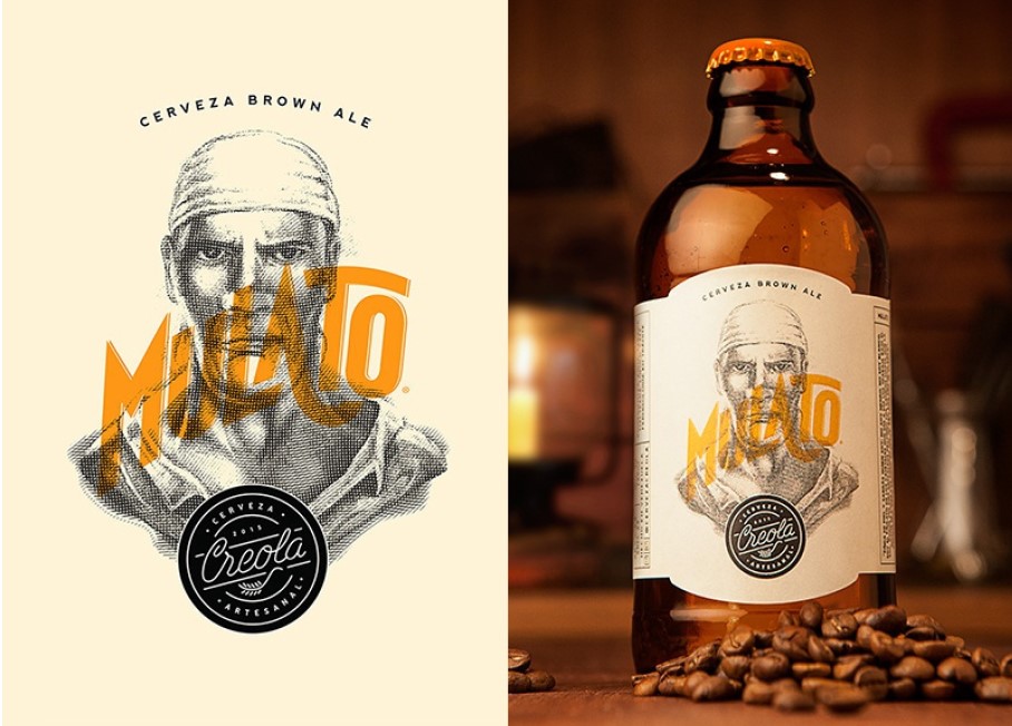

Personality group 4:
Group 4 illustrative style is a blend of minimalism and, on the other hand, drama in dominating, dramatic color splashes.
Group 4 illustrations are characterized by a unique blend of minimalism and drama, creating a visual identity that is both simple and bold. These illustrations often feature a minimalist style with clean lines and shapes, while also incorporating dramatic color splashes that add a sense of energy and excitement.
The use of bold, dramatic colors is a key feature of Group 4 illustrations, with a focus on vivid, eye-catching hues that create a sense of drama and intensity. This color palette is often used to create a sense of urgency or excitement, making it well-suited for brands that want to grab their audience’s attention and make a strong impression.
Group 4 illustrations can be used in a variety of ways, such as creating striking advertising campaigns, designing bold product packaging, or creating dynamic social media graphics. However, it’s important to use these illustrations in a way that feels appropriate for your brand’s personality and messaging.
Overall, Group 4 illustrations are a great choice for brands that want to create a bold and impactful visual identity. By incorporating these illustrations into your branding, you can create a sense of drama and excitement that resonates with your audience and helps to differentiate your brand from the competition.

Conclusion
In conclusion, choosing the right brand illustration style is an important decision for your business. It can help to convey your brand message, personality, and values to your audience.
By considering factors such as your brand’s target audience, industry, and competition, you can identify the most suitable illustration style for your brand. Whether you choose a minimalist, abstract, or hand-drawn style, it’s important to ensure that your brand illustration style is consistent across all touchpoints.
This will help to create a cohesive brand identity and reinforce your brand’s message in the minds of your audience. Remember to keep your brand’s illustration style flexible enough to adapt to evolving trends and styles while staying true to your brand’s core identity. With the right brand illustration style, your business can effectively communicate its unique story and stand out in a crowded marketplace.
Learn more about each personality group and create cohesive, compelling designs:
- Group 1- Brand Design 1: How To Brand a Youthful, Open, and Happy Business
- Group 2- Brand Design 2: How To Brand an Elegant, Feminine Business
- Group 3- Brand Design 3: How To Style an Earthy, Community-Focused Business
- Group 4- Brand Design 4: How To Brand a High-End, Luxury Business
- Brand Anatomy – What Is It, And What Are Its Key Elements?
Last Updated on 13/03/2023 by Victoria Silber


