Brown Color Meaning In Business
Brown. From Old English brūn, similar to Dutch bruin, German braun, Old Norse brūnn, related to Lithuanian brùnas.

Brown is a complex color. It is a mix of other colors. A of brown can vary dramatically when pushed towards warm, cool, dark, or light tones. For a designer, this is the difference between a color that communicates an earthy, solid, sensual massage and one related to baby diapers.
When accompanied by green, brown reads as a natural color.
This combination is typically overused with branding related to “organic” and “sustainability.” Brown and orange were popular colors in the 1970s, again communicating a return to the natural world and rejection of synthetic. A palette of shades of brown, from tan to grey-brown, can read as sophisticated and solid.
Different Shades Of Brown Color
There are many shades of brown, which can vary in hue, saturation, and lightness.
The concept of different shades of brown refers to the vast range of hues within the brown color family. From light, creamy tones like beige, to dark, rich hues like espresso or mahogany, brown encompasses a wide spectrum.
These variations are influenced by different balances of colors, primarily red, yellow, and blue, along with the level of darkness or lightness. Each shade carries its own distinct vibe and emotional connotation.
For instance, lighter browns like tan can evoke feelings of warmth and comfort, while darker shades like chestnut can elicit a sense of depth and sophistication.
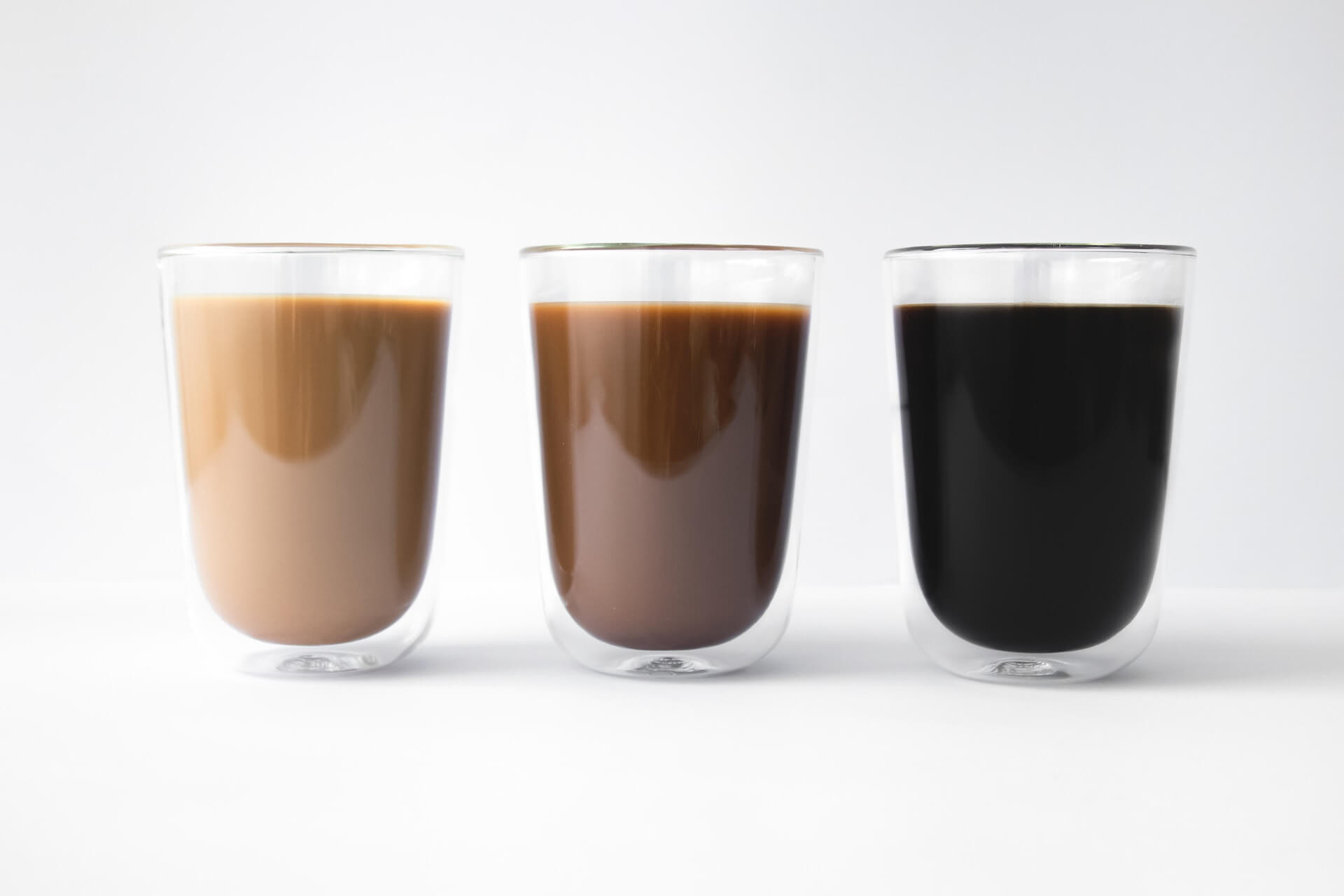
Here are some popular shades of brown:
Beige:
Beige is a light, neutral brown color with a touch of gray or yellow.
It is a versatile and understated shade that can be used in a wide range of settings and styles. Beige is often considered a “safe” or “conservative” color in interior design and fashion, as it can work well with many other colors and create a calm, harmonious atmosphere.
In interior design, beige can be used as a wall color, in furniture, or as an accent to establish a soothing and inviting ambiance. Its neutral tone allows it to pair well with a wide range of colors, from bold hues to other neutrals, serving as a balanced base for various color palettes.
In fashion, beige-colored clothing or accessories can convey a sense of effortless elegance and timeless style. The color is adaptable, pairing well with various shades, and suitable for both formal and casual settings.
Tan:
Tan is a light to medium brown color with yellow or orange undertones.
It is often associated with the natural color of tanned leather, which is achieved through the process of treating animal hides. Tan is a versatile, neutral color that can be used in a wide range of settings and styles, lending an earthy, warm, and unpretentious feel to various applications.
In interior design, tan can be used as a wall color, in furniture, or as an accent to create a soothing and inviting atmosphere. Its neutral tone allows it to work well with a wide range of colors, from bold hues to other neutrals, providing a harmonious base for different color combinations.
In fashion, tan-colored clothing or accessories can convey a sense of casual elegance and timeless style. The color is adaptable, pairing well with various shades and working equally well in formal and informal settings.
Taupe:
A grayish-brown color, often considered a neutral shade.
Taupe is a versatile, neutral color that lies at the intersection of gray and brown. It is characterized by its subtle, muted tones and can vary in shade from light to dark. Some variations of taupe may lean more towards gray, while others may have warmer, more brownish undertones.
The name “taupe” comes from the French word for “mole,” which refers to the small burrowing mammal known for its soft, grayish-brown fur. This association highlights the color’s earthy, natural qualities.
Because of its neutral and understated nature, taupe is a popular choice in interior design, fashion, and various artistic applications. It can be used as a base color to create a calm, harmonious atmosphere or as an accent to complement and balance bolder colors in a palette.
Taupe’s versatility makes it a timeless and sophisticated choice for a wide range of settings and styles.

Chestnut:
Chestnut is a warm, medium to dark reddish-brown color, named after the outer shell or seed of the chestnut tree.
The color chestnut typically has a rich, earthy tone, with a subtle hint of red or orange, which distinguishes it from other shades of brown.
The chestnut brown color is often associated with nature, warmth, and a sense of coziness. It is a popular choice for various applications in interior design, fashion, and art, as it evokes a sense of comfort and earthiness. In interior design, chestnut-colored wood or furniture can add warmth and depth to a space, while in fashion, chestnut-colored clothing or accessories can create a timeless, classic look.
Chestnut can be used as a stand-alone color or in combination with other colors, as its warm undertones can complement a wide range of color palettes, from neutral to bold.

Sienna:
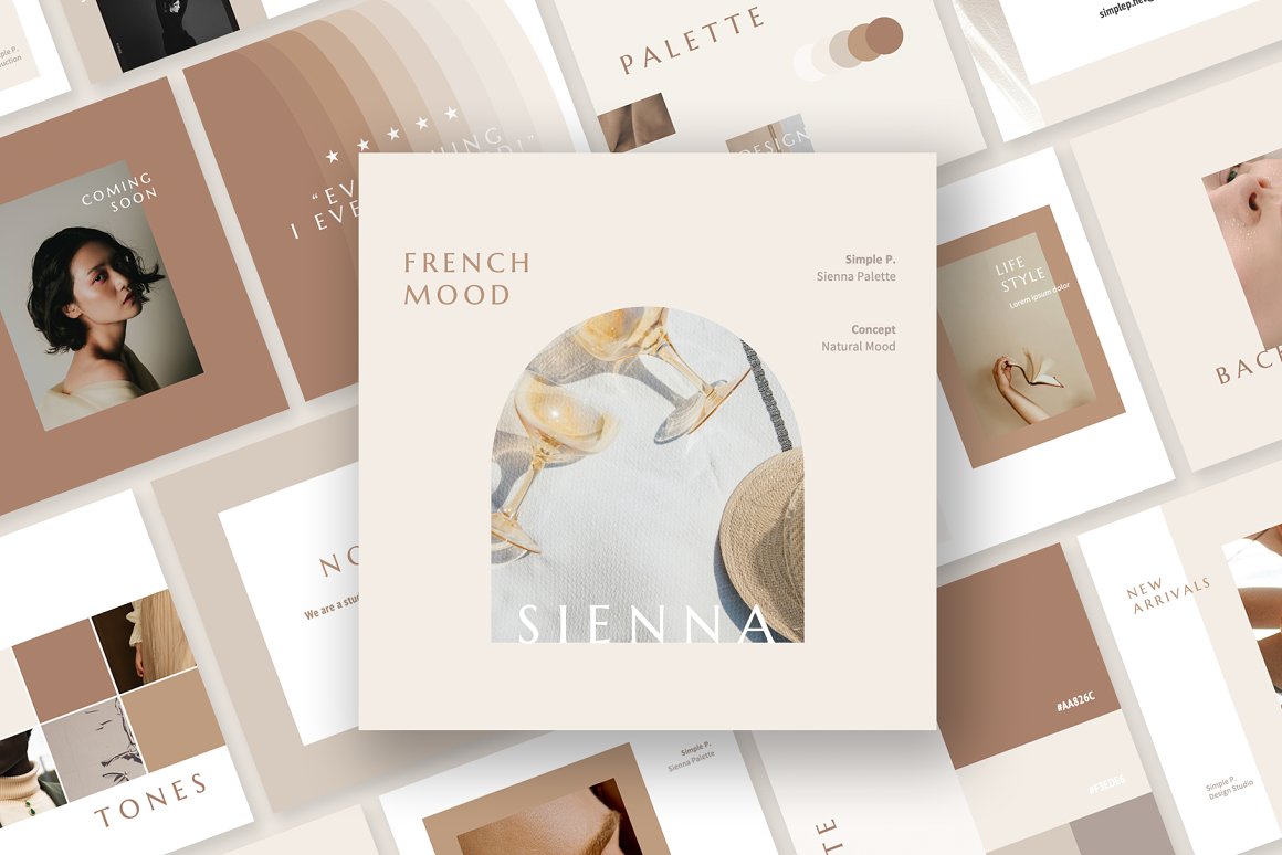
Sienna is a warm, earthy, yellowish-brown color with a reddish-orange hue.
The name “sienna” originates from the Italian city of Siena, where the natural pigment was first sourced from the surrounding clay-rich soil. The pigment has been used in art for centuries, particularly in painting, for its rich, earthy tones.
There are two main types of sienna pigments: raw sienna and burnt sienna. Raw sienna is the natural, unprocessed form of pigment, which has a more yellowish-brown hue. Burnt sienna is created by heating raw sienna, which deepens the color and brings out the reddish-orange tones.
The color sienna is often associated with nature, warmth, and rustic charm, making it a popular choice for interior design, fashion, and various artistic applications.
It can be used to create a cozy, inviting atmosphere, as well as to add depth and warmth to a color palette.
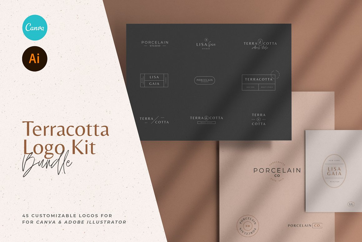
Terracotta
Terracotta color is a warm, earthy shade of reddish-brown, reminiscent of the natural clay material known as terracotta.
The name “terracotta” comes from the Italian words “terra” (earth) and “cotta” (cooked), referring to the process of baking the clay to make it hard and durable. Terracotta is often used to create pottery, sculptures, and architectural elements such as bricks and tiles.
The color terracotta captures the essence of this material, with its rich, earthy tones, and is often used in interior design, fashion, and various artistic applications.
Umber:
Umber is a dark, earthy, reddish-brown color with a rich, warm tone.
The name “umber” is derived from the natural pigment found in certain types of clay and soil. This pigment has been used for centuries in art, particularly in painting, as a way to create depth and shadow in artworks.
Umber can be found in various shades, from a medium brown to a deep, almost black hue, depending on the level of iron oxide and manganese in the pigment. Raw umber is the natural, unprocessed form of the pigment, while burnt umber is created by heating raw umber to achieve a darker, more intense color with a greater emphasis on the red tones.
The color umber is often associated with nature, earthiness, and warmth, making it a popular choice for interior design, fashion, and various artistic applications.
Burnt Umber:
Burnt Umber is a dark, rich color that resembles the hue of darkened, toasted clay.
It’s characterized by strong, warm red tones complemented by a deep brown base, similar to a well-roasted coffee bean. The color exudes an earthy, natural vibe, often associated with wood, leather, and autumn foliage. Burnt Umber is valued in visual arts for its versatility in creating shadows and depth, and in interior design, it offers a warm, cozy feel.
This rich, rustic color also often appears in fashion and textile design, providing a mature, sophisticated touch to the palette.

Sepia:
Sepia is a rich, warm, brown color with a grayish or slightly reddish tint.
The name “sepia” comes from the Latin word for cuttlefish, a marine creature that produces a dark brown ink as a defense mechanism. This ink was historically used as a pigment in drawing and writing, giving rise to the association between the color and its name.
In photography, sepia refers to a monochromatic, brown-toned effect that was originally created by treating black-and-white photographs with a sepia-toned solution. This technique was popular in the late 19th and early 20th centuries, and it is often used today in digital photography to create a nostalgic, vintage, or antique appearance.
The color sepia evokes a sense of warmth, history, and timelessness, making it an appealing choice for various applications in art, design, and fashion. It can be used as a neutral, earthy color or as an accent to complement other colors in a palette.

Chocolate:
Chocolate is a deep, rich, and warm brown color that resembles the shade of chocolate, particularly dark chocolate.
The color is often associated with indulgence, luxury, and comfort due to its connection with the popular sweet treat. It has a cozy and inviting quality, making it a popular choice for various applications in interior design, fashion, and art.
In interior design, chocolate-colored accents, such as furniture or wall paint, can create a sense of warmth and depth in a space. In fashion, chocolate-colored clothing or accessories can evoke a sense of sophistication and timelessness, while also being versatile enough to complement a wide range of other colors.
The color chocolate can be used as a stand-alone color or in combination with other colors to create various palettes and atmospheres. It pairs well with neutrals, earth tones, and even bold colors, making it a versatile choice for different settings and styles.

Mocha:
Mocha is a medium brown color with a slight grayish tint, named after the Mocha coffee bean.
The color is warm and earthy, evoking a sense of coziness and comfort, making it a popular choice for interiors, fashion, and other design applications.
In interior design, mocha can be used as a wall color, in furniture, or as an accent to create a soothing and inviting atmosphere. Its neutral tone allows it to work well with a wide range of colors, from bold hues to other neutrals.
In fashion, mocha-colored clothing or accessories can convey a sense of timeless elegance and sophistication. The color is versatile, pairing well with various shades and serving as a harmonious base for different color combinations.

Mahogany:
Mahogany is a dark, reddish-brown color that closely resembles the hue of mahogany wood, a highly valued tropical hardwood known for its beauty, strength, and durability.
The color mahogany has a rich, warm, and sophisticated feel, making it a popular choice in furniture, interior design, and fashion.
In interior design, mahogany-colored wood or accents can lend an air of elegance and luxury to a space, creating a classic and timeless atmosphere. Mahogany is often used for high-quality furniture, cabinetry, and flooring, as well as for decorative elements like moldings and paneling.
In fashion, mahogany-colored clothing or accessories can evoke a sense of refinement and style. The color works well in both formal and casual settings, and its rich undertones can complement various other shades, from neutrals to jewel tones.

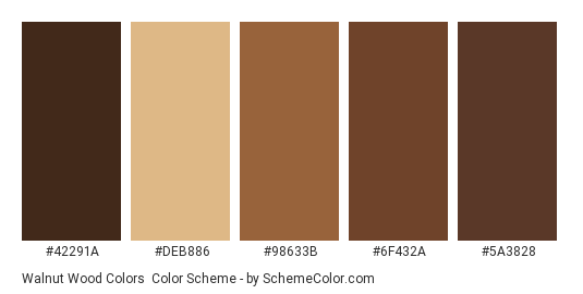
Walnut:
Walnut is a medium-dark brown color with a slight reddish hue, resembling the color of walnut wood.
Walnut wood is known for its fine grain, durability, and rich color, making it a popular choice for furniture, cabinetry, and other woodwork. The color walnut carries a sense of depth, warmth, and sophistication, which makes it a popular choice for various applications in interior design, fashion, and art.
In interior design, walnut-colored wood or accents can create an inviting and cozy atmosphere, adding a touch of elegance and richness to a space. Walnut is often used in flooring, furniture, and paneling, as well as in decorative elements like moldings and picture frames.
In fashion, walnut-colored clothing or accessories can convey a sense of timeless elegance and versatility. The color is adaptable, pairing well with a wide range of other shades, from neutrals to bolder hues.
Cultural Meaning Of Brown Color
Most cultures connect brown with the earth.
It is wholesome and stable. In the United States, brown and orange are the colors of Thanksgiving. In India, brown is the color of mourning, as it relates to dying leaves. The early Nazi party used brown uniforms, referred to as “brown shirts”.
Brown is a rich, earthy color often associated with nature and stability. Here are some cultural meanings associated with the color brown:
- Earthiness and grounding: Brown is often associated with the earth and soil, and is therefore seen as a grounding and stabilizing color. In many cultures, brown is seen as a symbol of stability, security, and reliability.
- Warmth and comfort: Brown is also associated with warmth and comfort, as it is often seen in natural materials like wood, leather, and fur. Brown can create a cozy and inviting atmosphere, making it a popular choice for home decor and fashion.
- Humility and simplicity: In some cultures, brown is associated with simplicity and humility. It is seen as a color that is down-to-earth and unpretentious.
- Seriousness and reliability: Brown can also be associated with seriousness and reliability, as it is often used in business settings. Brown is seen as a color that is trustworthy, dependable, and responsible.
- Natural beauty: Brown is often used in nature photography and artwork, as it can be seen in the earth, trees, and animals. Brown can be used to convey a sense of natural beauty and harmony.

Meaning Of The Color Brown In Business
The brown color makes us think of nature, soil, and trees, giving us a calm and good feeling.
This color brings out a sweet chocolate flavor or coffee with a deep, bitter smell.
Brown is also an excellent alternative to black, and it’s a natural choice for a business that wants to keep an image as an organic and natural brand. Try accompanying it with green and you will get a beautiful, natural-looking palette.
When the styling is done elegantly, brown looks calm and confident. If you mix deep brown with metallic or mint, you will get a luxurious and stylish palette. Put brown together with bright orange and yellow, and you will achieve something substantial and confident.
Brown is statistically the most unpopular color for both men and women, but in the right place and with the right tonality, brown can appear irresistible.
In business, the color brown is often associated with stability, reliability, and authenticity. Here are some meanings of the color brown in a business context:
- Trustworthiness: Brown is seen as a dependable and trustworthy color, making it a popular choice for financial institutions and other businesses that deal with money.
- Professionalism: Brown can convey a sense of professionalism and seriousness, making it a good choice for companies that want to project a no-nonsense image.
- Sustainability: Brown is often associated with natural materials and the environment, so it can be a good choice for companies that prioritize sustainability and eco-friendliness.
- Heritage: Brown can also be used to convey a sense of tradition and heritage, making it a good choice for businesses that have a long history or want to emphasize their roots.
- Comfort: Brown can create a warm and inviting atmosphere, making it a good choice for businesses that want to create a cozy and comfortable environment for their customers. This could be especially relevant for businesses in the hospitality and food industries.

What Emotions Does The Color Brown Evoke In Customers And Clients?
The color brown can evoke a range of emotions in customers and clients, depending on the context and the shades used.
Here are some of the emotions and feelings that brown can evoke:
Warmth
Brown is often associated with warmth and comfort, especially when used in rich, earthy tones. This can create a welcoming and inviting atmosphere for customers.
Reliability
Brown is often associated with stability and reliability, which can be reassuring to customers. It can convey a sense of dependability and trustworthiness, which is especially important for businesses in finance, insurance, and other industries that deal with money.
Natural Beauty
Brown is often associated with nature, as it is the color of the earth, trees, and animals. This can create a sense of natural beauty and harmony, which can be appealing to customers who are looking for products or services that are eco-friendly or sustainable.
Simplicity
Brown can also be associated with simplicity and humility, especially when used in muted or neutral tones. This can create a sense of authenticity and down-to-earthiness, which can be appealing to customers who are looking for products or services that are honest and straightforward.
Comfort
Brown can create a cozy and comforting atmosphere, which can be especially important for businesses in the hospitality, food, or home goods industries. It can convey a sense of home and heart, which can make customers feel relaxed and at ease.
Brown Can Be A Good Color For Logos And Branding
Brown can be a good color for logos and branding, depending on the industry and target audience of the business. Here are some factors to consider:
- Industry: Brown can be a good fit for businesses in industries that are associated with natural materials, such as wood, leather, or earthy products. This could include industries like furniture, outdoor gear, or organic food products.
- Target audience: Brown may be more appealing to older or more traditional audiences, who may associate color with stability and reliability. However, younger or more urban audiences may see brown as dated or boring.
- Contrast: Brown is a low-contrast color, which means it can be difficult to read or see from a distance. Businesses should make sure to pair brown with a high-contrast color, such as white or bright green, to ensure that the logo is easily readable.
- Shade: Different shades of brown can have different connotations. Rich, warm tones can convey a sense of luxury or comfort, while muted or cool tones can be more understated and professional.
- Competitors: Businesses should also consider the branding and logos of their competitors. If many businesses in the industry are already using brown, it may not be a good choice for standing out or differentiating the brand.
Brown can be a good color for logos and branding in certain contexts, but businesses should carefully consider their target audience, industry, and competitors before selecting it as a primary color.
And remember, brown color can be an excellent replacement for black which is way too dramatic and reserved for most businesses (that are not in a luxury sector).
Examples Of Businesses With Brown Logos Or Branding
There are many companies that use brown in their logo, often to convey a sense of stability, warmth, or naturalness.
Here are some examples:
- UPS: United Parcel Service (UPS) uses brown as its primary color, which is meant to evoke a sense of reliability and dependability. The brown color is also associated with the company’s history of delivering packages by horse and carriage when brown was a common color for such vehicles.
- M&M’s: The popular candy brand M&M’s uses brown as the color of one of its candy shell coatings, which is meant to represent chocolate. The brown color is also used in the brand’s logo and packaging.
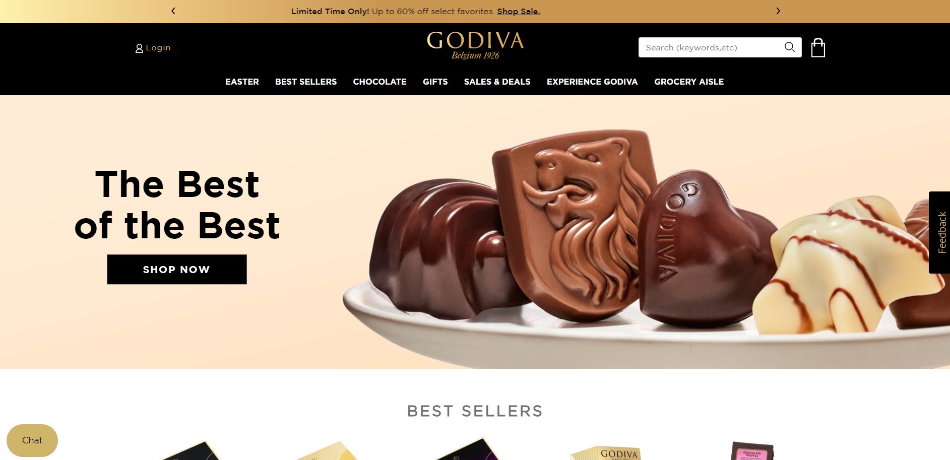
- Godiva: The luxury chocolate brand Godiva uses brown in its logo and packaging, as it is associated with the richness and warmth of chocolate. The brand’s logo is also often paired with gold, which conveys a sense of luxury and sophistication.
- Timberland: The outdoor clothing and footwear brand Timberland uses a muted shade of brown as its primary color, which is meant to convey a sense of ruggedness and naturalness. The brand is also known for its commitment to sustainability and eco-friendliness, which is reflected in its use of natural materials and earthy colors.
- John Deere: The agricultural equipment company John Deere uses a dark shade of green and a muted shade of yellow-brown in its logo, which is meant to evoke a sense of nature and stability. The green represents the fields where the company’s equipment is used, while the yellow-brown represents the soil and earth.
These are just a few examples of companies that use brown in their branding and logos. Many other businesses in industries such as food, fashion, and home goods also use brown to convey a sense of naturalness, warmth, or dependability.
Should I Use Dark Brown Color, Light Brown, Or Any Brown At All…?
Remember, as with almost any other color, green works in any branding.
imply don’t forget to pay attention to the colors’ value – is the brown a shade, tone, tint, or pure? Is the yellow more of a mustard or bright lemon? These details make a huge difference and are a massive part of color psychology in business.
Learn all about all four color psychology personalities:
- Group 1- Brand Design 1: How To Brand a Youthful, Open, and Happy Business
- Group 2- Brand Design 2: How To Brand an Elegant, Feminine Business
- Group 3- Brand Design 3: How To Style an Earthy, Community-Focused Business
- Group 4- Brand Design 4: How To Brand a High-End, Luxury Business
As a tool for creating your own color palette, I recommend Adobe Color. It has a wide variety of features that help you find the colors that work best for you.
How Can Businesses Use The Meaning Of Brown In Marketing And Branding?
Businesses can use the meaning of brown in their marketing and branding efforts in a number of ways to connect with customers and strengthen their brand.
Here are some strategies:
Emphasize naturalness:
Brown is often associated with nature and the earth, so businesses in industries such as food, beauty, or fashion can use brown to emphasize their use of natural or organic ingredients. For example, a natural skincare brand could use brown in its packaging to convey a sense of naturalness and purity.
Convey warmth and comfort:
Brown is also associated with warmth and comfort, so businesses in industries such as hospitality or home goods can use brown to create a cozy and inviting atmosphere. For example, a coffee shop could use brown in its branding to create a sense of warmth and comfort for its customers.
Emphasize reliability:
Brown is often associated with stability and reliability, so businesses in industries such as finance or insurance can use brown to create a sense of dependability and trustworthiness. For example, a financial services company could use brown in its branding to convey a sense of reliability and stability to its clients.
Use contrasting colors:
Because brown is a low-contrast color, businesses should pair it with high-contrast colors such as white or bright green to ensure that their branding is easily readable. For example, a brand could use a bright green accent color to create contrast and draw attention to its brown logo or packaging.
Incorporate different shades:
Businesses can also incorporate different shades of brown to convey different emotions or feelings. Rich, warm tones can convey a sense of luxury or comfort, while muted or cool tones can be more understated and professional.
By using the meaning of brown in their marketing and branding efforts, businesses can connect with customers on an emotional level and strengthen their brand identity.
Color Theory: Warm Brown Vs. Cool Brown
Discover how the color brown is created, plus learn the difference between cool brown and warm brown.
That knowledge is beneficial when deciding the mood of your brand and if you’d like to include brown in your color palette.
When choosing a color scheme for your brand, there are many factors to consider. One crucial decision is whether to go with a warm or cool brown. While both colors can create a rich and inviting atmosphere, they affect a design’s overall look and feel differently.
Warm browns tend to be more traditional and comforting, while cool browns can give a space a more modern and sophisticated feel. Warm browns have red or yellow undertones, while cool browns have green or blue undertones.
Ultimately, the best color for you depends on your personal preferences and the overall style of your design. But by understanding the difference between warm and cool browns, you can ensure that your color choice fits your overall design vision. Do you prefer the richness of warm brown or the sleekness of cool brown?
Conclusion
In conclusion, brown is a color that has many meanings and associations in the business world.
It is often associated with nature, reliability, warmth, and comfort, and can be used to convey a sense of naturalness, stability, and dependability. Brown can be a good choice for businesses in industries such as natural products, hospitality, or finance, but it is important to consider the target audience, competitors, and other branding elements when using brown in logos or branding.
By incorporating the right shade of brown and pairing it with contrasting colors, businesses can use the meaning of brown to their advantage in marketing and branding efforts, creating a strong emotional connection with customers and building a strong brand identity.
Learn More About Colors In Branding And Business
Color Champagne In Branding & Design
How to Use Neon Or Fluorescent Colors In Branding & Design
Green Color Psychology In Business & Design
Color Psychology in Branding & Logo Design
Last Updated on 05/03/2025 by Victoria Silber


