Color Psychology in Branding & Logo Design
Psychology of logo colors
Logo colors are an essential part of a brand identity. The right colors can communicate messages about a company, influence consumer behavior, and even affect a person’s mood.

While there are many factors to consider when choosing logo colors, understanding the psychology of color is an excellent place to start. Different colors evoke different emotions, which can be used to create desired effects in logo design.
For example, red is often associated with energy, power, and passion. This makes it an ideal choice for brands that want to convey excitement or urgency. On the other hand, blue is often seen as calm and trustworthy. This makes it a good choice for companies that want to project an image of stability and reliability.
Selecting logo colors is part of a company’s branding. They can be used to evoke certain emotions in consumers and can even make them subconsciously associate certain qualities with a brand.
If you want to learn more about logo colors and how to use them effectively, keep reading!
The most popular logo colors
Each color has its unique meaning and can be used to convey different messages.
For example, red is often seen as a powerful and energetic color. This makes it a good choice for companies that want to project an image of strength and vibrancy. On the other hand, blue is often seen as a calming and serene color. This makes it a good choice for companies that want to project an image of trustworthiness and dependability.
Yellow and green are also popular logo colors. Yellow is often seen as a happy and optimistic color, while green is often associated with growth and nature.
You can use these colors to create logos that convey positive messages about your company.
Color psychology and the meaning of colors in business
Here you have thorough explanations of color psychology and the meaning of colors in business.
You will learn how different colors affect us subconsciously. Also, learn to know the symbolism of colors to make successful decisions. Remember to pay attention to cultural views on different colors; for instance, red, white, and black can have very different meanings in the West and East.
However, I want to remind you that every color can be used to create a beautiful and cohesive color palette as long as you pay attention to the value of the color.
Color affects our emotions, moods, choices, and behaviors.
Countless studies have been conducted on the psychology of color, particularly in marketing and branding.
- Colors increase brand awareness by 80%.
- Color influences 85% of shoppers’ purchase decisions.
- About 62‐90% of the product assessment is based on colors alone.
Learn EVERYTHING about seasonal design and much more you will love, HERE: Creative Access.
What is color psychology?
Wikipedia says:
Color psychology is the study of hues as a determinant of human behavior. Color influences perceptions that are not obvious, such as food taste. Colors have qualities that can cause certain emotions in people. How color influences individuals may differ depending on age, gender, and culture. Although color associations can vary contextually between different cultures, color preference is relatively uniform across gender and race.
Do the colors of a package make us choose one brand over another? Does the color of an icon make us more likely to click on it? The short answer is yes. But the why part is a bit more complicated.
Color meanings can influence why we prefer one color over others.
The same color can also have different meanings depending on our upbringing, gender, location, values, and various other factors.
Psychology of color in branding
In branding and marketing, color psychology is focused on how colors impact users’ impressions of a brand and whether they influence consumers to prefer specific brands or make a purchase.
It’s essential to consider the psychology of color when designing a brand, rebranding an existing one, creating marketing assets, or building a new business. A study, “Impact of color on marketing,” found that up to 90% of quick decisions made about products can be based on color alone.
Color plays a vital role in how your brand is distinguished. Whether you’re a luxury brand or selling second-hand items, you can examine color meanings to help you attract your ideal customer. Color psychology can be used to help build a powerful, easily recognizable brand.
Here we’ll explain color psychology and introduce you to the meanings of the most common colors used.
Color helps your brand stand out
It’s what gets your audience to see what you want them to see, feel what you want them to feel, and do what you want them to do.
This is what makes understanding color psychology so crucial for the success of your branding. However, unfortunate color choices can also negatively change the impact of your message.
After reading this post, you’ll understand color psychology and the meaning of colors.
How to decide the colors for your marketing and branding
There are no clear guidelines for choosing colors for your brand.
The answer to “What colors are right for my brand?” is always “It depends.”
I can repeat it over and over again. When you are creating a color palette for your brand, think first about which personality your business belongs to and choose the value of the colors you will use.
Now, when that is done, you can choose the exact colors and take the meaning of colors into consideration.
The Color Psychology in Logo Design
When it comes to designing a logo for your business, let this be a guide for the direction of your color palette. What four emotions do you wish to convey when someone thinks of your brand or sees your logo? Write these down and see where they fall in this color wheel of emotions. Remember, this is only one of many aspects of the logo design process.

Don’t forget to pay attention to the value of the colors used – is the green a shade, tone, tint, or pure?
Is the yellow more of a mustard or bright lemon? These details make a huge difference and are a huge part of color psychology in business.
Learn all about all four color psychology personalities:
- Group 1- Brand Design 1: How To Brand a Youthful, Open, and Happy Business
- Group 2- Brand Design 2: How To Brand an Elegant, Feminine Business
- Group 3- Brand Design 3: How To Style an Earthy, Community-Focused Business
- Group 4- Brand Design 4: How To Brand a High-End, Luxury Business
Recommended Books About Color Psychology
There are many books out there about color theory and also about color psychology.
But I decided to include the best ones that are useful for marketers and brand designers. Especially the one by Angela Wright: “The Beginner’s Guide To Color Psychology” – is pure gold.
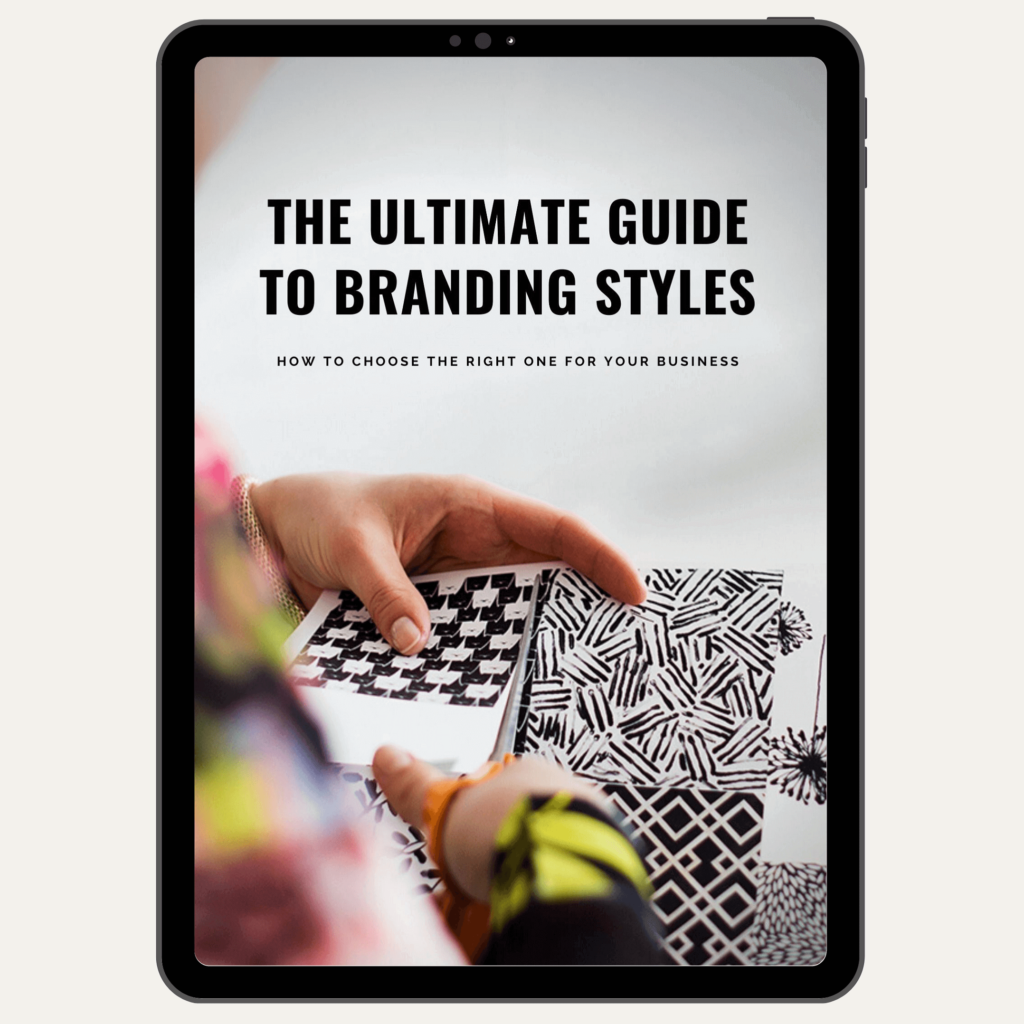
The Ultimate Guide to Branding Styles is an e-book that you can download instantly.
It includes the brilliant theory from the book by A. Wright, but is presented very visually, with many real-life examples and going deep into details.
The Beginner’s Guide to Color Psychology
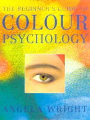
Angela Wright
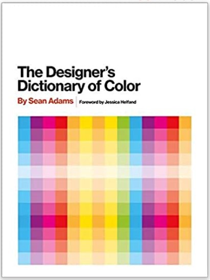
The Designer’s Dictionary Of Color
Why is Color Psychology So Important in Marketing?
When choosing a color scheme for your branding and marketing, your color preferences can be the difference between your brand standing out from the crowd or blending into it.
By using colors strategically for your marketing purposes, you can get your audience to see what you want them to see and help them perceive you the way you aim to be perceived. This is why understanding color psychology can be so beneficial for your marketing.
Because it can help you portray your brand the way you want to.
Marketers can use color psychology to influence how people think and behave toward a brand and how they interpret any information. The choice of colors can help people decide what is essential.
And that’s why content marketers need to understand color psychology and what different colors mean.

Color Psychology in Branding and Design
While choosing the right colors can enhance your brand perception, poor color preferences can harm your brand image.
For example, if you choose the wrong colors for your content or logo, it can be less readable and challenging for your audience to understand.
PURPLE: The purple color meaning
Correct use: UNUSUAL, OUTSTANDING, CREATIVE, LUXURIOUS, QUALITY, MYSTERY, AND FANTASY.
Incorrect use: IMMATURE, IMPRACTICAL, CYNICAL, SELF-CONTAINED, INEXPENSIVE.
If your business does not belong to group 4 personality, then is deep purple a suitable alternative to black color? But when it comes to group 4, the classical deep purple will support the business’s exclusiveness and firmness. A business focused on offering higher-value services can use purple in its marketing to emphasize the high-class offerings.
The softer and brighter purple leaves a much calmer and balanced impression. Light violet brings spiritual balance and peace. Purple is a sensitive color, and the right tonality selection is crucial. Using the wrong tonality of purple might bring a cheap look, confusion, and an immature feel.
In general, purple color catches women’s and children’s attention, but it is also suitable for male-oriented products in the right tonality and combination. Several academic institutions use purple in their visuals as this color inspires intellectual thoughts and motivates people to achieve.
Combined with gold, it reflects deep purple’s richness and extravaganza.
The color purple in group 1 light tonality works well for children, and the pastel purple from group 2 is romantic and nostalgic for women’s visuals.
BLUE: Meaning of the color blue
Correct use:
RELIABILITY, TACTFUL, LOGICAL, EFFECTIVE, CAREFREE, CALMING, CLEAR, COMMUNICATIVE, AUTHORITATIVE.
Incorrect use: SELF-CONTAINED, COLD, UNFRIENDLY, NON-EMOTIONAL, CONSERVATIVE.
Blue is considered to be the favorite color in the world.
People who wear blue clothing at work tend to be more focused than usual. Lighter blues reflect the willingness to communicate and the desire for delicacy.
Darker shades are authoritative and influential. Many people feel a feeling of trust when seeing another person wearing dark blue clothing. Interestingly, the effect of darker blue is transferred to the general premise, and therefore, a person wearing such a uniform influences us with authority and credibility. People’s subconsciousness is more likely to respond to the uniform than the wearer, which is also very important for firefighters, police officers, and pilots.
Blue is one of the cool colors, and it tends to feel dull and unfriendly, perhaps too commercial. Blue is often used in aviation and sports clothing because this color has a sense of speed, but even this calm color can overwhelm you in the case of excessive use.
A vibrant, intense cyan gives the impression that clarity and soft and light blue look reflective, calm, and comfortable. Light blue is a refreshing and soothing color. It has been found that the light blue color gives us a feeling that the temperature around us is lower than it actually is.
So we see light blue used everywhere during the summer months.
GREEN: The green color meaning
Correct use:
GROWTH AND POWER, CALM, BALANCED, HARMONIOUS, ABUNDANT, PRACTICAL, REALISTIC, KIND, AND LOYAL.
Incorrect use: MATERIALISTIC, BORING, SELFISH, OBSOLETE.
Green is a color that does not require any adjustment from the eye, and it is a calm color to look at. This color creates a relaxing mood in us and feels natural. It transmits harmony between body and emotions and can add balance and freshness to your color palette. So green is the ideal color for organic, natural, safe, or health-focused products.
Using the green color on the packaging gives the subconscious mind the impression that the product is exceptionally nutritious. On the other hand, the green color feels sterile and clean.
Usually, green is seen as one of the cool colors. Though in group 1 personality, bright green brings freshness, combining joyful and optimistic yellow energy with green luster. This green gives the impression that something new is happening.
The green color supports the feeling of cohesiveness and motivates people to join social groups.

TURQUOISE: What is a turquoise color?
Correct use:
CLARITY OF THOUGHTS, INNOVATION, CREATIVITY, FRESH IDEAS, IDEALISM, SELF-EXPRESSION, COMPASSION, CALMING, AND HEALING.
Incorrect use: RIGID, MYSTERIOUS, CLOSED, DEMANDING, UNTRUSTWORTHY, BOASTFUL
Turquoise is the name of a bluish-green color based on the gem of the same name. It is generally thought to consist of 70% blue and 30% green. We can see tonalities of turquoise vary from Caribbean blue up to soft aqua turquoise. We can find yellow, gray, or black added to the base color, giving each tonality a different feel and impression.
Blue, green, and yellow mixture, turquoise transmits many of the three colors. Peaceful and communicative blue with growth and balance from green, adding a yellow brush gives the elevated mood we see in turquoise.
This color is incredibly supportive of water and sport-related businesses.
Used together with group 2 pink, lavender, and lemon yellow, it delivers feminine energy, but turquoise is ideal for products for all ages and genders in the big picture.

YELLOW: Meaning of the color yellow
Correct use: OPTIMISTIC, HAPPY, FRIENDLY, EXTROVERT, PLAYFUL, SELF-CONFIDENT, CREATIVE, EMOTIONAL, ASSERTIVE.
Incorrect use: CRITICAL, IMPATIENT, IMPULSIVE, EMOTIONAL
Yellow is a happy and optimistic color that reflects self-confidence. It is a bright color that excites and makes people happy, and it works well in a dynamic and active environment. Yellow is a light in weighty, and highly visual color.
It stimulates the human brain’s logical side, offers mental clarity, inspires innovative thinking, and highlights creative ideas. Yellow raises analytical activity and our rational justification, helping to go through a decision-making process.
Too much yellow causes stress, nervousness, and distress to people who are already stressed. It can make people more critical and judgmental than average.
Yellow is generally a warm color and is at the core of group 1 and 3 personalities, expressing creativity and optimism.
Group 1 personality’s light and bright yellow is an excellent choice for products and services for children. Here, use yellow with other bright colors.
In the case of products and services for adults, group 1 yellow may also be a good idea, for example, for active and playful leisure services. In sales and discounts, yellow is a valued color since the human eye sees yellow before any other color.
Also, the yellow-colored surface appears more extensive than it is.

ORANGE: Orange color meaning
Correct use: SELF-CONFIDENT, WARM, ABUNDANT, SOCIAL, UPBEAT, PASSIONATE, SENSUAL, SAFE, COMFORTABLE, ENERGETIC, CREATIVE.
Incorrect use: SUPERFICIAL, DEPENDENT, PESSIMISTIC, LOW COST, INSECURE, “POOR ME”.
Orange is the color of happiness offered by the sunshine. This color is full of life, which in turn gives strength. When orange objects surround a person, the cognitive temperature of the person rises.
The orange color makes people happy because it combines two exciting, warm colors: the mighty red and cheerful yellow. That makes orange an eye-catching and memorable color.
The orange color can increase appetite and desire to interact. Therefore, incorrect tonality is an ideal color for restaurants that want to encourage visitors to stay on-site for a longer time, interact with each other, and order more food.
This color in the tonality of group 1 personality is adventurous and fun, making it a practical choice for tour operators and other companies that offer exciting activities. Similarly, bright and light orange tonality is appropriate for children-oriented services and products combined with other colors from group 1.
A softer orange, which can be found in the group 2 personality palette, is suitable for high-end beauty salons, spas, and restaurants.
Orange tonalities that have abundant pink in them add femininity to the color palette, and intense red-orange tonalities lead you to red color features: strength, durability, and dedication.

RED: Color red meaning
Correct use: STIMULATING, MOTIVATING, COMMITTED, BRAVE, WARM, ENERGETIC MAKER.
Incorrect use: AGGRESSIVE, DOMINANT, DEMANDING, FIGHTER, RANGER, TENSION.
Red is a compelling color. This color is the most eye-catching of all. This color encourages people to make decisions and quick purchases. That is also why red color is widely used for buttons on the web and discount promotions.
When you add a little red to your website design, you’ll get extra energy on the page—excessive amounts of red tire people. Be careful with choosing the tonality of red you will use: if you use an entirely wrong shade, it will strain people physically and may communicate anger or defiance.
Using red in the decoration of a café or a restaurant can enhance appetite and encourage visitors to order more. Red can also add energy to a business where speed, liveliness, and passion are essential keywords.
Red is one of the warm colors, considered the color of love, but it is more of the color of passion and sexuality. Romanticism is rather pink.
Red color transmits masculine energy, and pink color transmits feminine energy.

PINK: Pink color meaning
Correct use: WARM, CARING, LOVING, CALM, RELAXING, ROMANTIC, INTIMATE, KIND, FEMININE.
Incorrect use: TOO EMOTIONAL, NAIVE, CHEAP, OVER-CAUTIOUS, LACK OF WILL, LACK OF SELF-ESTEEM.
Compared to red, pink is a more delicate and graceful color, which supports our feelings. Women wearing pink are seen as feminine, and the men who wear pink leave an elegant impression.
The pink color tells us about the coming spring, representing joy and openness. Feminine, youthful in soft tonality, and more passionate and energetic in deeper shades.
Pink is undeniably feminine in color. Soft powder pinks and skin tones paired with black create a classy, elegant look and bring out a non-threatening, open, and sometimes even flirtatious touch.
Solid and daring pink tonalities like magenta appear playful and sensual, while softer and lighter tints and tones are more girl-like.
However, it’s essential to know that the color pink is often misused either in excessive amounts of pink or only in the wrong tonality – in this case, pink will make us physically tired, and the overall look appears cheap.

GRAY: Gray color meaning
Correct use: CLASSICAL, PROFESSIONAL, PROMINENT, ORGANIZED, CONSERVATIVE, MATURE.
Incorrect use: MELANCHOLY, LIFELESS, LACKING ENERGY, RESERVED, LONELY.
Gray is the only color that is entirely neutral. It does not have any psychological properties. In practice, gray has been used as an elegant neutral that brings out other colors’ beauty. But for example, in group 3, gray can erase the warmth that glows from the rest of the palette.
Unfortunately, gray often acts negatively, giving an impression of a lack of self-confidence; visually, it can suck the life out of other colors – if misused by mixing different groups’ personalities. Gray does not have a role as an active eye-catcher; it is a silent supporter.
Dark grays can be a valuable addition to the soft, delicate tones and are perfect for the main text. They work well both in print and on the web.
Softer, lighter gray can add delicacy and class to the palette, but you need to use it modestly, or you risk cutting the energy from your design.

BROWN: Meaning of the color brown
Correct use: PRACTICAL, EARTHY, STABLE, RELIABLE, BALANCED, COMFORTABLE, SAFE, WARM, PERFECT, ORGANIC, NATURAL.
Incorrect use: TOO SEVERE, DULL, OLD-FASHIONED, HEAVY, OVERLY MATERIALISTIC, DIRTY.
The brown color makes us think of nature, soil, and trees, giving us a calm and good feeling. This color brings out a sweet chocolate flavor or coffee with a deep, bitter smell.
Brown is also an excellent alternative to black, and it’s a natural choice for a business that wants to keep an image as an organic and natural brand. Try accompanying it with green, and you will get a beautiful, natural-looking palette. When the styling is done elegantly, brown looks calm and confident. If you mix deep brown with metallic or mint, you will get a luxurious and stylish palette.
Put brown together with bright orange and yellow, and you will achieve something substantial and confident.
Brown is statistically the most unpopular color for both men and women, but in the right place and with the right tonality, brown can appear irresistible.
GOLD: Gold color meaning
Correct use: WEALTH, ABUNDANCE, VALUE, QUALITY, LUXURY, PRECIOUSNESS, SUCCESS, EMPATHY, ACHIEVEMENTS, HAPPINESS, BEAUTY, WISDOM, ATTRACTION.
Incorrect use: IMMATURE, INTENSE, INTRUSIVE, PRETENTIOUS.
Silver and gold are metallics that add to your color palette luxury, and a stand-out feel.
The golden color will add exclusivity when applied to high-value products and packaging. Still, it may appear gray or brown and muddy on the web, so use gold as an accent rather than your palette’s primary color. Combined with dark blue or black, the palette will look luxuriously masculine.
The golden color reflects prosperity, prestige, and quality, combined with dark red, dark blue, or dark green.

SILVER: Meaning of the silver color
Correct use: ELEGANT, ENLIGHTENING, PRESTIGIOUS, CONSERVATIVE, BALANCED, CALMING, BALANCING, GLAMOROUS, ORGANIZED, RESPONSIBLE, DIGNIFIED.
Incorrect use: OLD AND INTIMATE, NON-BINDING, DISHONEST, MELANCHOLY.
Silver is associated with prestige, abundance, prosperity, and renaissance. Emotionally, the silver color is soothing and balancing, appearing lighter than the gray color.
Silver is a flowing and ever-changing color, and it looks understatedly shiny on the packaging, giving an impression of novelty.
WHITE: Meaning of the color white
Correct use: PURITY, CLARITY, SIMPLICITY, RELENTLESS, HYGIENIC, CLEAR, NEW BEGINNINGS.
Incorrect use: EMPTY, CRITICAL, ISOLATING, STERILE, BORING, HARSH.
Psychologically, the polar white color is demanding and challenging. It is a clinical, hygienic, relentless color that does not contain any exaggerated nuances. Just like black creates a sense of retention, the polar white communicates a “do not touch me” message.
With its cold drama, Polar white belongs only to the group 4 palettes. What’s more elegant than a group 4 personality man with a black suit and a bright white shirt?
However, white can also be used by other personality groups. Others can use a creamy white, greenish-white, or any different broken white tonality.
White is an excellent choice for a webpage background. It lets other colors and visuals pop up with all their qualities. Free and white space on the website gives your page a clean and open look.
Thanks to its simple and clean nature, white is suitable for businesses that offer products for newborns, bathroom and kitchen fittings, and health products.
Also, companies offer cleanliness, organization, and efficiency through their products or services.

BLACK: Color black meaning
Correct use: CONTROL, ROBUSTNESS, SECURITY, RELENTLESSNESS, LUXURIOUS, DRAMATIC, DYNAMIC, MYSTICAL, AND CONTROLLABLE.
Incorrect use: CONSERVATIVE, CONTROLLING, TIRING, THREATENING, HARASSING, DIFFICULT.
Black is a color that does not have light. Well, technically, black is not a color. It is the result of any color shifting to its darkest value.
Black gives us a sense of gravity and inflexibility. That’s why it fits perfectly into authoritative and formal situations. Because of all the drama, black acts as a valuable and exclusive color in its proper use. Using it beyond the group of personality 4 is likely to violate your color palette, and this color may highlight the negative qualities of itself and the other colors.
Black is a favorite choice for many people. Unfortunately, however, this color in clothing does not positively affect most of the wearers. People’s personalities can be divided into groups 1, 2, 3, and 4, the same way we do with businesses, and only people who belong to group 4 personality should wear black.
So black is a powerful color for group 4 businesses, and it is effortless to use there.
Avoid this color if your business belongs to groups 1, 2, or 3, and select alternatives from dark tonalities of other colors.

FLUORESCENT: What are neon colors?
Correct use: CONFIDENT, “PUNCHY,” CLEAR.
Incorrect use: AGGRESSIVE, COLD, TECHNICAL.
A solid fluorescent color will add visual presence to a project. It is extremely clear and confident. Neon colors — often called neon colors — are incredibly bright lights. Since neon colors are especially bright, they’re best described as highly luminescent primary and secondary colors. Neon colors can only be chemically created.
Fluorescent colors use more of the visible spectrum and lower wavelengths than conventional colors. As a result, your eye perceives a far more intense color. A conventional color reflects a maximum of 90%; a fluorescent color can reflect as much as 300%.
Andy Warhol, who entered the world of art in the late 1940s, described neon as ‘one of the great modern things. French artist Martial Raysse became one of the first artists to work with neon in an artistic sense, blending pop art portraiture with neon accents. – Neon Creations.
Fluorescent colors should only be used in a group 4 color palette, matching beautifully with black and white.
Last Updated on 26/05/2025 by Victoria Silber


