All About Sage Green Color
Sage Green Color: The New Neutrals. Move over gray and beige—sage green is the new neutral. This calming, earthy hue is popping up in homes and businesses worldwide, and it’s easy to see why. Sage green has all the benefits of other neutral colors with no drawbacks. Keep reading to discover why sage green is the perfect color for your next design project.

Also, check out this post about the color green: Green Color Psychology in Business & Design.
Sage green is easy on the eyes
One of the most important considerations when choosing a color for design is how it will affect the people who have to look at it daily. You want a color that’s pleasant and relaxing, not one that will cause eye strain or headaches.
Sage green hits the sweet spot—it’s soft enough to be soothing but still has enough contrast to be interesting. Designers often use sage green as a backdrop for other colors because it makes them pop without being too harsh.
Sage green is versatile
Another great thing about sage green is that it goes with everything. You can pair it with other neutrals like white and cream or use it as a base for brighter colors like pink or orange. No matter your design style, there’s a way to incorporate sage green into your space. This versatility makes sage green an ideal choice for busy areas like offices or waiting rooms where you need a calming influence without compromising style.
Sage green is timeless
Neutral colors are always in style because they provide a blank canvas that can be easily updated with new accent pieces as trends come and go. Sage green takes this a step further by also feeling fresh and modern. It’s the perfect color if you want your space to feel current but timeless.
Sage Green History
Sage green has been around for centuries. The color comes from the herb sage, which has been used in cooking and medicine since ancient times. Throughout history, sage green has been associated with wisdom, good fortune, and long life. In the Middle Ages, sage was thought to have magical powers and was used to protect against evil spirits.
In more recent years, sage green has been embraced by the fashion world. Pantone, named “greenery,” is the year’s color for 2017, and sage green was one of the most popular shades on the runways that season. Designers like Tory Burch, Oscar de la Renta, and Carolina Herrera incorporated the hue into their collections.
How to Use Sage Green in Your Design Projects
Sage green is a popular color for both home and fashion design. It’s a perfect blend of green and gray, making it versatile in various settings. Plus, sage green is associated with wisdom and calm, making it an excellent choice for businesses that want to convey a sense of authority and trustworthiness. Here are a few tips on using sage green in your next design project.
1. Use sage green as an accent color
Sage green is a great way to add a pop of color to a room without being overwhelming. Try using it as an accent color on walls or in accessories like throw pillows and rugs.
2. Pair sage green with neutrals
One of the best things about sage green is that it goes well with any other color. For a calming effect, pair sage green with neutrals like white or beige. Or, for a bold look, try pairing it with black or navy blue.
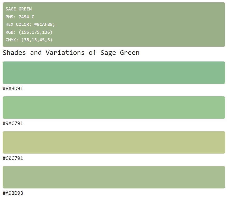
3. Use different shades of sage green
If you want to use sage green in a larger area, like walls or furniture, don’t be afraid to experiment with different shades of color. Lighter shades of sage green can create a more airy feel, while darker shades will add some richer dimension to your space.
Sage green is a popular color for a good reason—it’s trendy yet timeless, versatile yet unique. If you’re looking for ways to incorporate sage green into your next design project, start with these three tips. And don’t forget, when in doubt, pair sage green with neutrals!

Sage Green HEX code: 9CAF88
Colors that Compliment Sage Green
Sage green is a popular color for both home decor and fashion. It is a calming color that can be combined with many other colors to create different looks. This blog post will explore some of the best colors to use with sage green.
Sage green is a popular color because it can be used in many different ways. It is a versatile color that goes well with other colors. When choosing colors to compliment sage green, you must consider the overall look you are trying to achieve.
One of the best colors to use with sage green is white
White amplifies the calming effect of sage green. White also makes sage green seem brighter and fresher. Pair sage green with tan or cream to create a more traditional look, as these colors create a warm and inviting feeling.
For a modern look, try pairing sage green with black or gray
These colors add contrast and make sage green seem more sophisticated. If you want to add a pop of color, try using yellow or orange with sage green. These colors are eye-catching and add interest to the overall look.
Many different colors compliment sage green. The best color to use depends on the overall look you are trying to achieve.
When considering what colors compliment sage green, you must consider the feeling you want to create in the space. Do you want the room to feel calm and serene? Or do you want to add a pop of color to create an inviting and energetic space?
Colors that compliment sage green for a calm space
When creating a calm space, it is best to stick similar colors on the color wheel. Colors next to each other on the wheel are called analogous colors. Analogous colors create a harmonious feeling in a space. Some examples of analogous colors to sage green are lavender, blue, and green-gray.
Colors that compliment sage green for an energetic space
For an energetic space, go opposite sage green on the color wheel. These colors are called complementary colors and will create contrast in the room. Some examples of complementary colors to sage green are pink, orange, and purple.
When considering what colors compliment sage green, deciding the feeling you want to create in the space is essential. For a calm feeling, use analogous colors and for more energy, use complementary colors.

Sage green: the new It color for designers and entrepreneurs
Sage green is having a moment. This calming, muted shade is popping up all over the design world, and entrepreneurs are noticing. If you’re looking to give your brand a fresh, modern makeover, sage green might be the perfect hue. Here’s everything you need to know about this trendy color.
Today, sage green is having a moment in the design world. This calming color is popping up in home decor trends like Scandi-chic and mid-century modern. It’s also becoming increasingly popular in logo design, websites, and packaging. If you’re looking to give your brand a fresh new look, sage green is worth considering.
Sage green for entrepreneurs
Sage green is also excellent for entrepreneurs who want to convey professionalism and sophistication. This hue represents growth, stability, and longevity—all crucial to building a successful business. Sage green might be the perfect option when choosing a color for your brand identity.
Whether a designer or an entrepreneur, sage green is a color to keep on your radar. This trend is here to stay, so why not jump on board? Incorporating sage green into your brand identity can help you convey wisdom, stability, and success—all qualities that will help you take your business to the next level.
How to use sage green in design and branding
Sage green is a beautiful and versatile color that you can use in various ways. It is perfect for entrepreneurs and businesses who want to communicate growth, stability, and intelligence.
1. As an accent color
Sage green makes an excellent accent color. It is sophisticated and eye-catching without being overwhelming. Consider pairing it with light colors such as white or cream when using sage green as an accent color. This will create a beautiful and timeless look.
2. In branding materials
Sage green can be used in all branding materials, from business cards to website headers. Sage green is the perfect color if you want your brand to convey wisdom, stability, and growth.
3. On your website
A sage green website will make a lasting impression on your visitors. If your site looks sleek and professional, consider using sage green as your primary color. You can also use sage green as an accent color on your website by incorporating it into your design elements, such as buttons or links.
4. In marketing materials
Sage green is an excellent choice for marketing materials such as brochures and flyers. This color conveys trustworthiness and competence, two essential qualities for any business seeking to win over new customers.
5. In print advertising
When used correctly, sage green can make your print ads pop! If you want your ad to stand out from the rest, consider using sage green as your background color with white or black text overlayed on top.
As you can see, there are many ways to use sage green in your branding. Whether you use it as an accent color or incorporate it into your marketing materials, sage green will make a lasting impression on your target audience. If you want your brand to communicate growth, stability, and intelligence, consider using sage green in your next rebranding effort!
Conclusion
If you’re looking for a versatile, calming color for your next design project, look no further than sage green. This trendy hue is easy on the eyes and goes with almost anything, making it the perfect choice for any space. Whether you’re painting your living room or redecorating your office, this beautiful color is sure to give your area the refresh it needs.
Read more about visual branding and colors:
How To Create A Color Palette For Your Brand
The Beginner’s Guide To Color Psychology by Angela Wright
Branding For Creatives is an e-book that you can download instantly. It includes the brilliant theory from the book by A. Wright – plus it is presented very visually, with many real-life examples and going deep into details.

Last Updated on 05/03/2025 by Victoria Silber


