10 Essential Elements of a Strategic Moodboard
A strategic moodboard goes beyond pretty pictures.

It acts as a visual guide that shapes the entire creative direction of a brand or project. When I build a strategic moodboard, I don’t just focus on aesthetics – I link every element to a clear purpose and business goal.
This ensures the brand or project communicates consistently and effectively.
If you want to create a moodboard that truly drives your brand forward, it helps to know exactly what belongs in it.
In this post, I’ll walk you through the essential components of a strategic moodboard, why each matters, and how to choose them thoughtfully.
What Is a Strategic Moodboard?
Before we dive in, let’s clarify what I mean by a strategic moldboard.
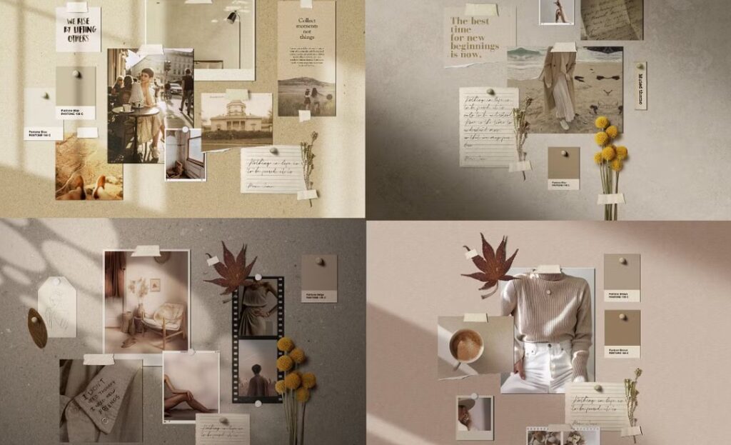
It’s a curated collection of visuals and design elements that reflect the personality, values, and goals of a brand or project. Unlike a regular moodboard, which might only focus on colors or style, a strategic moodboard aligns creative direction with brand strategy and target audience insights.
A strategic moodboard serves as a communication tool between you, your team, and anyone involved in bringing your brand to life.
It ensures everyone shares the same vision and understands the emotional and visual tone you want to create.
Why Build a Strategic Moodboard?
You might wonder why you need a strategic moodboard at all.
When I work without one, I risk losing focus, wasting time on styles that don’t fit, and creating inconsistent messaging.
A strategic moodboard saves time and resources by:
- Keeping all creative decisions aligned with your brand’s core
- Helping you make quick decisions about design direction
- Guiding designers, marketers, and content creators with a clear visual framework
- Ensuring your brand feels consistent and authentic across all touchpoints
Now, let’s break down what belongs in a strategic moldboard.
1. Brand Personality and Tone
Start with a clear sense of your brand’s personality.
Is it playful, serious, luxurious, approachable, or bold? The moodboard should visually express this personality through the style of images, typography, and colors.
For example, a playful brand might use bright, saturated colors and whimsical fonts, while a luxury brand leans into muted tones and elegant serif typography.
Including notes about your brand’s tone helps everyone involved remember the emotional undercurrent you want to convey.
2. Target Audience Insights
Your strategic moodboard should reflect the preferences and expectations of your target audience.
If your audience is young and trendy, the visuals might include edgy photography, modern layouts, and vibrant colors. For a more mature or corporate audience, you might choose classic imagery, structured design, and sophisticated color palettes.
I recommend including sample personas or descriptive keywords on your moodboard to keep your audience top of mind.
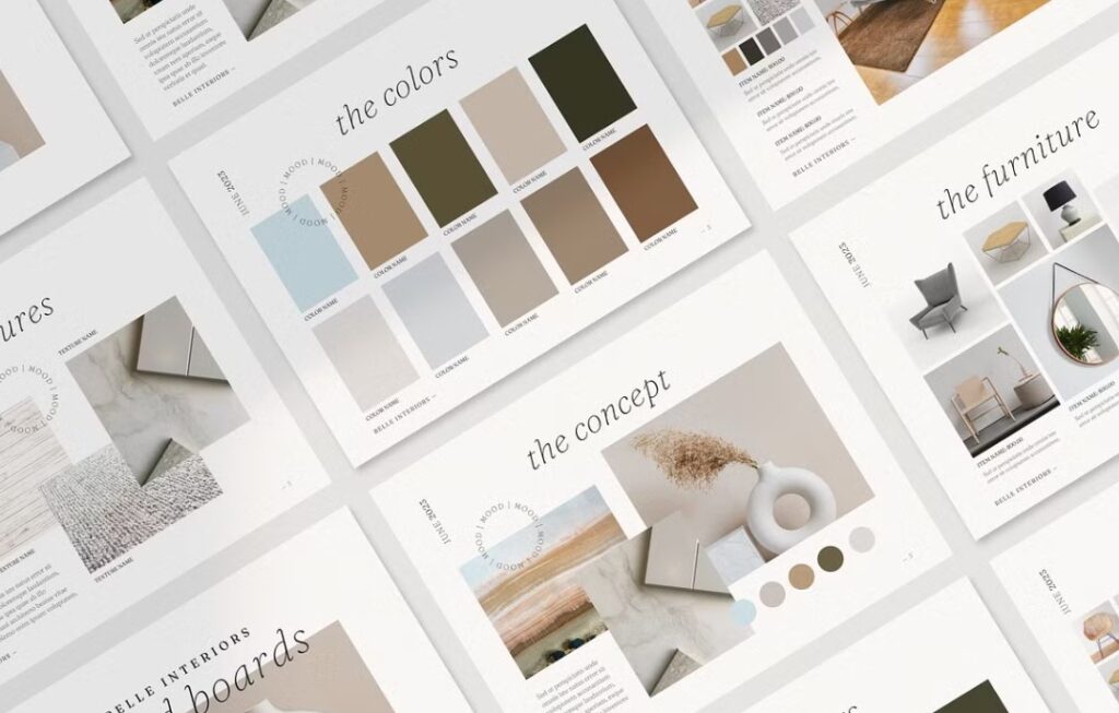
3. Color Palette
Color influences perception and mood instantly.
Your color choices should connect with your brand values and the feelings you want to evoke.
In my seasonal design approach, I pay attention to the volume of white and black in a palette, since these affect how colors feel. More white space creates a fresh, open vibe, while more black adds depth and sophistication.
Choose 3-5 core colors and add complementary shades.
Display color swatches clearly on your moodboard to guide all design work.
Spring colors– Brand Design 1: How to Brand a Youthful, Open, and Happy Business
Summer colors– Brand Design 2: How to Brand an Elegant, Feminine Business
Autumn colors– Brand Design 3: How to Style an Earthy, Community-Focused Business
Winter colors– Brand Design 4: How to Brand a High-End, Luxury Business
4. Typography Styles
Fonts communicate much more than words.
They set the tone and affect readability. Your moodboard should include examples of heading and body fonts that match your brand personality.
For instance, a tech startup might opt for clean, sans-serif fonts, while a handmade artisan brand could use textured or script fonts for warmth.
Add notes about font sizes and usage to keep typography consistent.
5. Imagery Style
Photos and illustrations bring your brand to life.
The moodboard should include examples of the style and tone of imagery you want. This could be bright and airy photos, moody and dramatic shots, minimal illustrations, or bold graphics.
Show a mix of images that reflect your brand lifestyle, product use, or mood.
If there are image styles to avoid, include those too.
6. Textures and Patterns
Textures and patterns add depth and personality.
For some brands, a natural, rough texture like wood grain or linen might fit perfectly. Others might want smooth gradients or geometric patterns.
Including texture samples on your moodboard helps convey a tactile feeling that supports your visual identity.
7. Brand Icons and Graphic Elements
Icons, logos, and other graphic elements can support your brand story.
Your moodboard can include examples or inspiration for these. If your brand uses minimalist icons or hand-drawn graphics, show those styles.
This guides designers to create visuals that fit seamlessly with your brand look.
8. Brand Positioning and Values
A strategic moodboard is not only about visuals.
It should communicate your brand’s core values and positioning. You can add keywords or short phrases that describe your brand’s mission, unique selling points, or emotional benefits.
This helps keep the moodboard grounded in strategy and reminds everyone why you chose these visuals.
9. Layout and Composition Ideas
How your brand elements are arranged on a page or screen influences how the brand feels.
Your moodboard can show preferred layout styles – whether you like clean and minimal with lots of white space or layered and dynamic with overlapping elements.
Include examples of grids, spacing, and composition styles that inspire you.
10. Examples of Competitors and Inspiration
Including examples of competitor brands or inspirational brands gives context.
It helps clarify what you want to differentiate from and what you want to emulate.
Highlight what you like and dislike about those examples to guide creative decisions.
How to Build Your Strategic Moodboard
- Gather your inputs: brand values, audience info, business goals, and any existing brand assets.
- Research visuals: Look for images, colors, fonts, textures, and layouts that feel right.
- Curate: Select only the most relevant and powerful visuals that align with your strategy.
- Organize: Arrange your elements clearly, grouping related visuals and adding notes.
- Share and refine: Use the moodboard to get feedback from your team and adjust as needed.
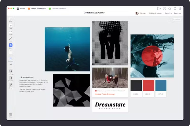
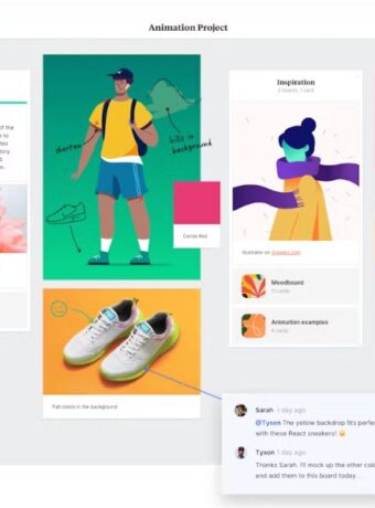
I usually create moodboards digitally in tools like Canva or Milanote.
They let me move elements around easily and collaborate with others.
Learn more about Canva and Milanote here.
Conclusion
A strategic moodboard does more than inspire.
It connects your brand’s soul to every visual decision. When I build one, I make sure every piece — from color to typography to imagery — aligns with the personality, values, and goals of the brand.
If you want your brand to stand out consistently and confidently, build a strategic moodboard before starting any design work. It will save you time, keep your team aligned, and help your brand tell a clear, compelling story.
What do you usually include in your moodboards? I’d love to hear how you make your visual direction strategic and effective.
Learn More About Moodboards in Brand and Design
How To: Successful Makeup and Beauty Branding
Last Updated on 01/06/2025 by Victoria Silber


