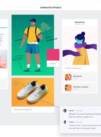
Neon Colors Palette: Perfect Schemes and Combinations for Bold Design
Neon colors, with their vibrancy and high-energy aesthetics, have significantly shaped various industries such as fashion, graphic design, interior design, and more.

These bold hues have a unique ability to grab attention and evoke strong emotional responses, making them powerful tools in visual communication. From retro 80s fashion trends to modern digital designs, neon colors are pivotal in creating bold, standout statements.
This is what we call a “neon colors palette,” our fascinating topic of discussion for this blog post.
What is a Neon Color Palette?
A neon colors palette is a curated selection of bold, vibrant colors that originate from the neon gas used in the illuminated signage industry.
These colors are eye-catching, radiating an almost electric intensity that sets them apart from the more traditional colors.
The palette typically includes a range of dazzling colors from intense pinks, blazing oranges, electric blues, and luminescent greens, to radiant yellows. Each color in the palette has a unique vibrancy, emulating the glow of neon lights under the night sky.
These bright colors are not merely a range of hues, but a design statement. When properly used, they can dramatically transform designs, imparting a modern, energetic, and even futuristic aesthetic. Whether they dominate the design or are used sparingly for accenting, they never fail to make an impact.
Neon colors can also be used as an accent color to add vibrancy and visual interest to designs.

Differences Between Regular and Neon Color Palettes
Regular color palettes and neon color palettes serve different purposes in design.
A regular color palette typically includes a wide range of hues – from muted to vibrant – and aims to provide a balanced, harmonious aesthetic that can be soothing and easy on the eyes. It often follows color theory rules closely, incorporating primary, secondary, and tertiary colors.
On the other hand, a neon color palette is defined by its vibrancy and energy. It’s packed with intensely bright, saturated colors that stand out and grab attention. These palettes often flout traditional color theory rules, focusing on impact and visibility rather than subtlety and harmony.
Neon palettes are bold and dramatic, and make a definite statement, marking a clear departure from the more subdued regular color palettes.
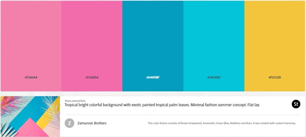
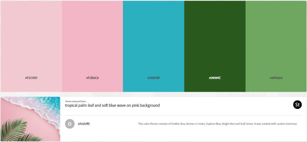
What Are The Benefits Of Using Neon Colors In Design
Neon colors bring an array of benefits to design due to their vibrant and compelling nature.
Here are a few of them:
- Attention-grabbing: Neon colors, with their intense brightness and saturation, instantly draw attention. They’re perfect for designs that aim to stand out or make a strong, immediate impact. For instance, bright orange can be used to create a bold visual statement and capture the viewer’s eye.
- Energizing Effect: Neons exude energy and excitement. They can invigorate a design, making it feel dynamic and lively, perfect for conveying a sense of enthusiasm and movement.
- Modern Appeal: They have a modern, trendy feel to them. They are often associated with futuristic designs, making them ideal for projects that aim to look cutting-edge.
- Versatility: While bold, neon colors can be mixed with softer, more muted hues to provide stunning contrasts and highlight important elements in a design.
- Emotional Impact: Neon colors evoke strong emotional responses, allowing designers to play with the psychology of color to influence the mood and reactions of the audience.
- Distinctiveness: Given their unusual and bold nature, these colors can help a design or a brand stand out, fostering uniqueness and memorability.
Incorporating neon colors into your designs can be an effective way to elevate the visual impact, communicate emotion, and create a distinctive aesthetic that sets your work apart.

Understanding Fluorescent Neon Color Palette
Fluorescent neon colors are a special category of neon hues known for their intense, glowing appearance.
The term “fluorescent” refers to the ability of these colors to absorb light energy and re-emit it, creating a bright, glowing effect. This is similar to how certain substances glow under ultraviolet light. Fluorescent colors are extremely vibrant and can appear to ‘pop out’ or ‘glow’ in design due to their high luminance. These colors include shades like electric lime, shocking pink, laser lemon, atomic tangerine, and citrus fruit orange, a specific shade of neon orange that adds vibrancy to designs.
When used effectively, fluorescent colors can inject energy, draw attention, and create a vibrant, dynamic aesthetic in designs.

Which Neon Color Groups Go Together?
Color harmony refers to the arrangement of colors in a way that is pleasing to the eye.
It creates a sense of balance, unity, and aesthetics in designs. With respect to neon colors, achieving color harmony can be slightly more challenging due to their intense vibrancy. Burnt orange can be paired with neon colors to create striking color schemes.
However, by using some key principles, harmonious neon color schemes can be created. These principles include:
- Complementary Scheme: This involves using colors directly opposite each other on the color wheel, like neon blue and neon orange. This creates a vibrant contrast.
- Analogous Scheme: Here, adjacent colors on the color wheel are used, like neon green, neon yellow-green, and neon yellow, for a more harmonious and less contrasting look.
- Split-Complementary Scheme: This scheme uses a base color and two colors adjacent to its complement, allowing for strong visual contrast with less tension.
- Triadic Scheme: This involves three colors evenly spaced on the color wheel, such as neon pink, neon yellow, and neon blue, offering a vibrant yet balanced look.
Remember, neon colors are impactful, so moderation is key. Incorporate neutral or less saturated colors to balance out the intensity and create a more visually comfortable design.
Color Harmony For Neon Colors
Color harmony refers to the arrangement of colors in a manner that is visually appealing, creating a sense of order and balance.
When it comes to neon colors, achieving this harmony becomes both exciting and challenging due to the vibrancy and intensity these colors bring. A variety of orange tones, including soft, pastel, burnt, dark, neon, and light, can be used in neon color schemes to create harmony.
To create harmonious neon color schemes, understanding color theory is essential. Here’s how some of these schemes work with neon colors:
- Complementary Colors: Using neon colors that are opposite each other on the color wheel, like electric blue and hot pink, can create a vibrant, high-energy effect.
- Analogous Colors: Using neon colors next to each other on the color wheel, such as bright green and neon yellow, provides a more cohesive, less contrasting look.
- Split Complementary Colors: This scheme uses one base color and two colors adjacent to its complement, like neon orange with blue-green and blue-violet. This allows for strong visual contrast without the tension of the standard complementary scheme.
- Triadic Colors: This involves three colors evenly spaced on the color wheel, such as neon pink, electric blue, and radiant yellow, providing a balanced yet vibrant look.
In all these cases, the aim is to balance the vibrancy of neon colors with the overall aesthetic of the design.
It’s about managing contrast, creating visual interest, and using color to enhance, not overwhelm the design’s message.
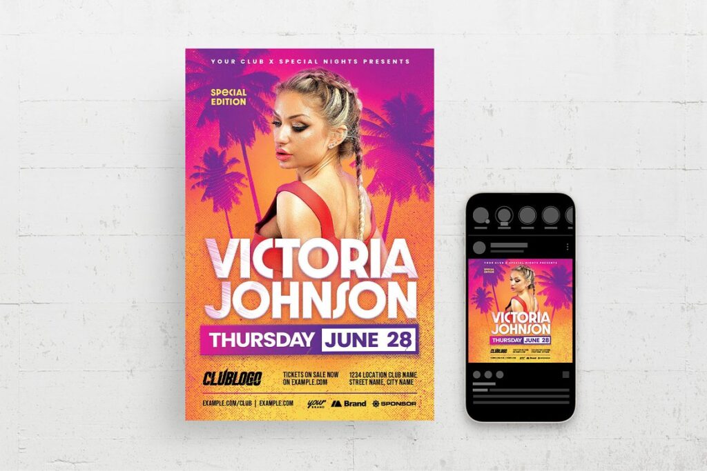
Which Neon Colors Pair Well?
Certain neon colors inherently pair well due to their positions on the color wheel and the visual contrast they offer. Rust orange can also be paired with neon colors to create visually appealing combinations.
These pairs are not only pleasing to the eye but also evoke certain moods and emotions that can elevate a design. Here are a few notable examples:
Neon Blue and Neon Pink:
These colors are opposite each other on the color wheel, creating a complementary color scheme.
The cool, calm blue pairs wonderfully with the warm, vibrant pink, creating a visually striking contrast.
Neon Yellow and Neon Purple:
This is another complementary pairing that’s quite visually appealing.
The bright, energizing yellow contrasts beautifully with the deep, mysterious purple, providing a balanced, dynamic look.
Neon Green and Neon Orange:
These colors, though not directly opposite on the color wheel, offer an exciting, high-contrast look that’s full of energy and vitality.
Neon Pink and Neon Orange:
As adjacent, or analogous, colors on the color wheel, pink and orange offer a harmonious pairing that’s warm, exciting, and cohesive.
Neon Blue and Neon Green:
Another pair of analogous colors, blue and green create a cool, refreshing look that’s vibrant yet harmonious.
Remember, the key to successful color pairing lies in balance. Too much neon can be overwhelming, so consider using these pairs against a neutral background or incorporating some less saturated hues to balance out the intensity.
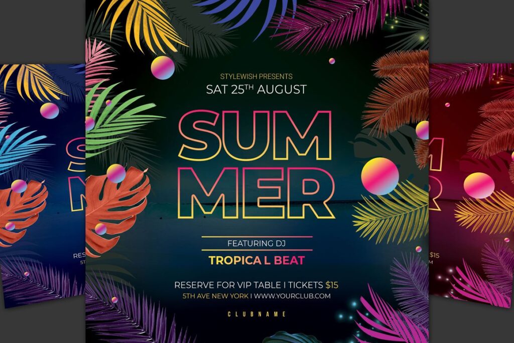
How To Create Neon Color Schemes
As a seasoned graphic designer, I’ve come to appreciate the impact of vibrant neon colors in design work.
Here’s a step-by-step guide to creating your own neon color schemes:
1: Choose Your Base Colors
Start by selecting your base colors. Neon colors are typically bright and saturated, so think about colors like electric blue, hot pink, and lime green.
2: Understand Historical Color Naming
Before the 15th century, the color we now know as orange was referred to as ‘yellow-red’. This historical context can inspire unique and vibrant color combinations in your neon schemes.
3: Add Accents and Highlights
Once you have your base colors, add accents and highlights to make your design pop. Use contrasting neon colors to create a dynamic and eye-catching effect.
7 Steps To A Bold Color Scheme Creation
Step 1: Understand your Project’s Needs
Before you begin creating a color scheme, it’s crucial to understand your project’s requirements. What emotions or reactions are you aiming to evoke? Who is your target audience? How will the color scheme align with the project’s theme or brand?
So the first step in creating a neon color scheme involves understanding your project’s needs.
This requires analyzing what emotions you want to stir, identifying the target audience, and considering how the color scheme will align with the project’s theme or brand. This understanding lays the groundwork for your design, setting the tone for the selection and application of your neon color selection.
By meeting your project’s needs, your neon color scheme can effectively deliver the intended message and impact.
Step 2: Know your Neon Colors
Step 2 requires familiarizing yourself with the spectrum of neon colors.
Far from ordinary, these hues are characterized by their vibrancy, saturation, and boldness. From the intensity of electric blue to the fervor of hot pink, each color presents its unique energy.
Understanding the impact of each neon color is crucial, as it allows you to effectively harness their power, enabling the creation of visually stunning and emotionally resonant designs.
Step 3: Start with a Base Color
The third step in creating a neon color scheme is selecting your base color.
This primary neon color will serve as the cornerstone of your palette, dominating your design and setting the overall tone. Whether it’s a striking electric blue or a vibrant neon green, your base color should align with the mood or ambiance you wish to establish. It could convey anything from fiery passion to calm tranquility.
Choosing your base color is not just about visual appeal; it’s also about creating a meaningful emotional resonance in your design.
Step 4: Choose Complementary, Analogous, or Split-Complementary Colors
Step 4 involves deciding the type of color scheme that best suits your project.
You can choose between complementary, analogous, or split-complementary schemes. Complementary colors lie directly opposite each other on the color wheel, providing high contrast and vibrant visuals. For instance, neon blue and neon orange can create a dynamic balance.
Analogous colors are situated next to each other on the color wheel, offering a harmonious and visually pleasing scheme. An example could be a combination of neon green, neon yellow-green, and neon yellow.
Split-complementary schemes involve selecting a base color and then picking two colors adjacent to its opposite on the color wheel. This approach maintains the contrast of a complementary scheme while adding variety and richness. For instance, if you chose neon purple as a base color, your split complements would be neon yellow-green and neon yellow-orange.
Selecting the right scheme forms a crucial step in ensuring your design is visually balanced, harmonious, and impactful.
Step 5: Test Different Combinations
Step 5 involves testing different color combinations.
Based on the color scheme type chosen in Step 4, generate multiple variants. Experiment with different neon color pairings, and see how they interact and influence each other. Remember, balance is key when working with neon colors, ensuring the design remains vibrant but not overwhelming.
This exploratory phase will help you find the perfect harmony and contrast in your neon color scheme, leading to a compelling and successful design.
Step 6: Add Neutral or Muted Colors
Step 6 is about introducing neutral or muted colors into your neon color scheme.
Due to their intense nature, neon colors can sometimes be overpowering. Therefore, it’s beneficial to incorporate some neutral hues like whites, grays, or blacks, or less saturated colors to provide some visual relief. This inclusion can help balance out the vibrancy of the neon colors, adding depth and dimension to your design.
This approach can enhance your design’s overall aesthetic, making it vibrant yet comfortable to engage with.
Step 7: Evaluate and Adjust
Consider the visual impact and emotional resonance of your color scheme. Ask for feedback and be prepared to make adjustments. Remember, what looks good in theory might need tweaking in practice.
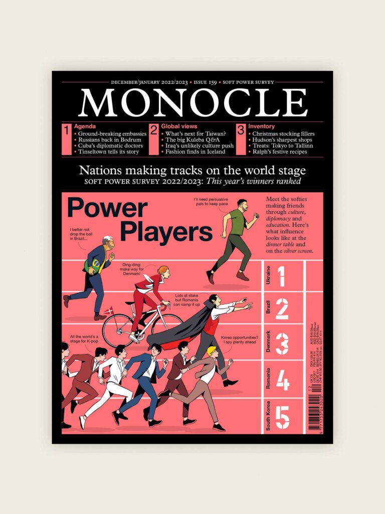
Diving Deep into Neon Palettes
Neon palettes have carved a unique niche in contemporary design, serving as a potent tool to captivate and engage audiences.
The importance of these electric hues lies in their ability to provide an energetic, modern aesthetic, breathing life into otherwise mundane designs. The color orange, for instance, gets its name from the typical hue of the citrus fruit orange, linking it with healthy foods and warming spices like pumpkin, paprika, sweet potato, carrots, and citrus fruit.
In the realm of graphic design, neon palettes are commonly used to highlight important information, guiding the viewer’s eye towards specific elements. They’re a favorite in advertising and marketing, where the goal is to immediately grab attention amidst the sea of visual clutter.
In the world of fashion and interior design, neon colors have found their way into textiles, furnishings, and accessories, offering bold accents that invigorate the space or ensemble. They exude a sense of confidence, optimism, and youthful energy, resonating with those seeking to express their unique style.
In digital and web design, neon colors enhance user interface elements, making buttons, icons, and calls-to-action pop. They create striking contrasts against darker backgrounds, contributing to the popularity of dark mode design.
Despite their vibrancy, neon palettes must be used judiciously to prevent sensory overload.
They are best combined with neutrals or less saturated colors to balance their intensity.
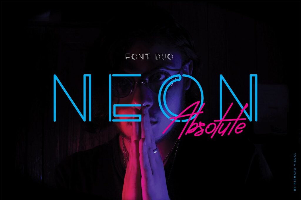
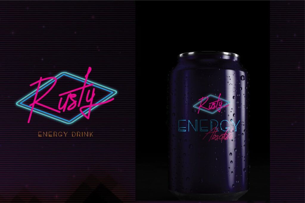
Neon Palettes in Contemporary Design
Neon palettes have carved a unique niche in contemporary design, serving as a potent tool to captivate and engage audiences.
The importance of these electric hues lies in their ability to provide an energetic, modern aesthetic, breathing life into otherwise mundane designs. The color orange, for instance, conveys warmth, excitement, and enthusiasm, and is often associated with autumn, Halloween, good value, and healthy foods.
In the realm of graphic design, neon palettes are commonly used to highlight important information, guiding the viewer’s eye toward specific elements. They’re a favorite in advertising and marketing, where the goal is to immediately grab attention amidst the sea of visual clutter.
In fashion and interior design, neon colors have found their way into textiles, furnishings, and accessories, offering bold accents that invigorate the space or ensemble. They exude a sense of confidence, optimism, and youthful energy, resonating with those seeking to express their unique style.
In digital and web design, neon colors enhance user interface elements, making buttons, icons, and calls-to-action pop. They create striking contrasts against darker backgrounds, contributing to the popularity of dark mode design.
Despite their vibrancy, neon palettes must be used judiciously to prevent sensory overload. They are best combined with neutrals or less saturated colors to balance their intensity.
Conclusion
In digital and web design, neon colors have revolutionized user interface elements.
They make buttons, icons, and calls-to-action pop, creating striking contrasts against darker backgrounds. This vibrant contrast has contributed significantly to the increasing popularity of dark mode design.
Despite their intensity, neon palettes need to be used thoughtfully to avoid sensory overload. Balancing them with neutrals or less saturated colors is often an effective strategy.
In essence, neon palettes’ significance extends beyond just making designs more eye-catching. They play a crucial role in eliciting emotions, guiding user interactions, and crafting bold statements.
Last Updated on 15/03/2025 by Victoria Silber


