Green Color Psychology In Business & Design
Green is a color that does not require any adjustment from the eye, and it is a calm color to look at. This color creates a relaxing mood in us and feels natural.

It transmits harmony between body and emotions and can add balance and freshness to your color palette. So green is the ideal color for organic, natural, safe, or health-focused products.
The use of the green color on the packaging gives the subconscious mind the impression that the product packaged is exceptionally nutritious. On the other hand, the green color feels sterile and clean.
Usually, green is seen as one of the cool colors. Though, in group 1 personality, bright green brings freshness, combining joyful and optimistic yellow energy with green luster. This green gives the impression that something new is happening.
The green color supports the feeling of cohesiveness and motivates people to join social groups.
Also, check out the post about the color sage green: All About Sage Green Color.
Color green
Green. From Old English gréne (adjective), grénian (verb), of German origin, related to Dutch groen, German grün, also to ‘grass’ and ‘grow’.
Blue and yellow combine to create green. The most common tone has equal parts of blue and yellow. It communicates nature and the environment. It is also the color of money, regardless of a country’s own currency design. Green can also communicate illness or decay. Historically, it was avoided in food packaging, but this practice has evolved with the onset of the organic and green movement.
Green is a great choice as a design element to calm warm colors, such as orange or red. This, however, needs to be monitored, as the right tone of each will create an optical vibration. Green is also an excellent complement to pink, suggesting ease and a casual lifestyle. It is closely related to Ireland; the color symbolizes Saint Patrick’s Day.

Cultural meanings
In Western culture, green is considered lucky, as in “the luck of the Irish.” Green is the color used to say “go” in traffic lights. We often associate green with envy and anger. Eastern cultures use green to convey fertility and regeneration.
Avocado green
Avocado. From the mid-17th century, by the Spanish, alteration (influenced by avocado, or ‘advocate’) of aguacate, from Nahuati ahuacatl.
Avocado green is dark green with more yellow than blue. While bright green may appear loud or abrasive, avocado is easier to manage. It feels restful to the viewer’s eye as the eye’s lens focuses green light precisely on the retina. It is a color that may be used to cool down a palette that is too sweet or hot.
As part of the secondary green family, avocado shares the subjective issues of orange. One person may love the tone, while another prefers the green that is bluer or lighter. It also elicits strong opinions. The term ‘avocado green’ may have associations with 1970s appliances and cars. A safer description to use is ‘dark green.’
Cultural meanings
Avocado green represents new beginnings in New Age and mystical beliefs. In Western culture, it was used as a color of clothing, appliances, and automobiles in the 1970s to communicate nature. This was in response to the anticonsumerism ideas of the 1960s counterculture movement. If the station wagon is avocado green, it must be good for the Earth.

Olive green
Olive. From Middle English, via Old French from Latin oliva, from Greek elaia.
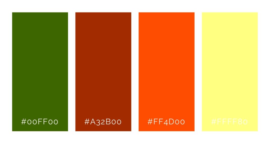
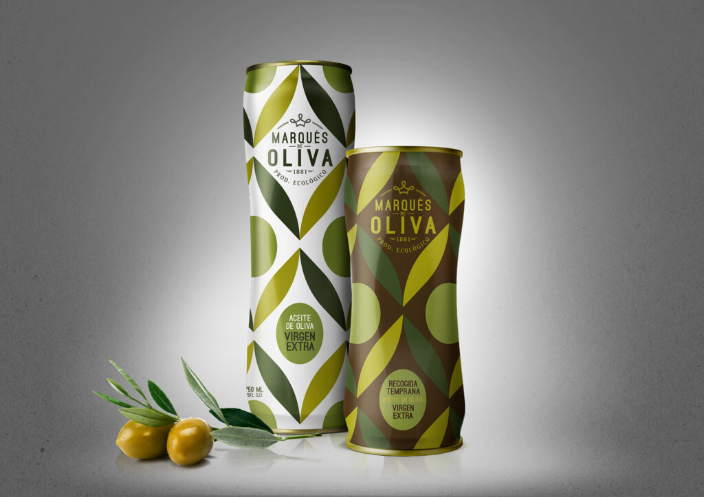
Olive green color is a combination of yellow and black. It is a softer version of avocado. Designers love the olive green color, but clients hate it. It is complex and intense, changing with the light. It is the color of a perfectly ripe avocado but is also the color of the vomit from The Exorcist. Designers should refer to the color as “olive# not #baby **** green#. Olive creates a somber and peaceful tone, as opposed to dark gray, which may read as a funeral. In internal spaces, olive walls or furniture can be calming. Brand designers also use it to communicate environmental or “green” products.
Olive green is the traditional color of peace, derived from the olive branch and dove. At the same time, it is the color of the majority of military universe uniforms in the world due to its ability to blend in with the environment.
Cultural meanings of olive green color
In Buddhist culture, olive green symbolizes natural wisdom, intuition, and meditation.
Mint green
Mint. From Old English minte, related to German Minze, ultimately via Latin from Greek minthé.
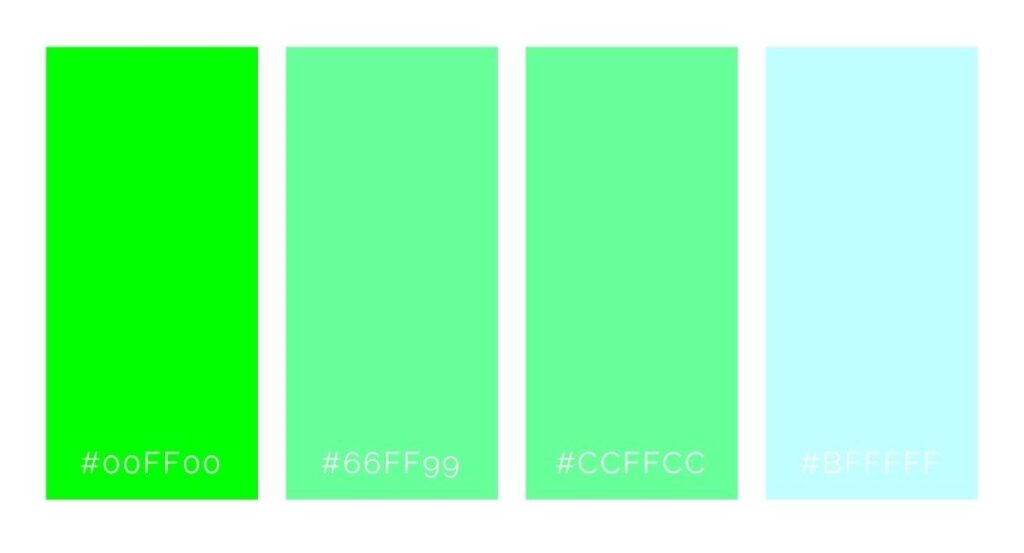
Mint exists between light blue and light green. Mint is the younger sibling of green. It communicates growth, life, and the natural world. But it also conveys spring, youth, and beginnings. It is an exceptionally pure color, maintaining a crisp and cool appearance. Mint is also delicate. Watch it closely on the press as it can shift to light blue or turquoise with too much or too little yellow. Due to the color differences on all monitors, mint rarely displays precisely as intended.
Have you tried to use mint as an alternative to grey? It works well as mint green is light and works well as a neutral tone. The upside of mint is the cool and clean flavor as if it were toothpaste. The downside is a chilly and clinical tone. Mint grew in popularity after World War II. Its synthetic and pure appearance countered the muted and dull colors of the 1930s and 1940s.
Cultural meanings of mint green color
Western weddings use mint green to symbolize growth, financial prosperity, and innocence. A mint green candle is lit to achieve financial gain in New Age beliefs. In auras, mint green is seen with people involved in spiritual pursuits and advancement.
Chartreuse green
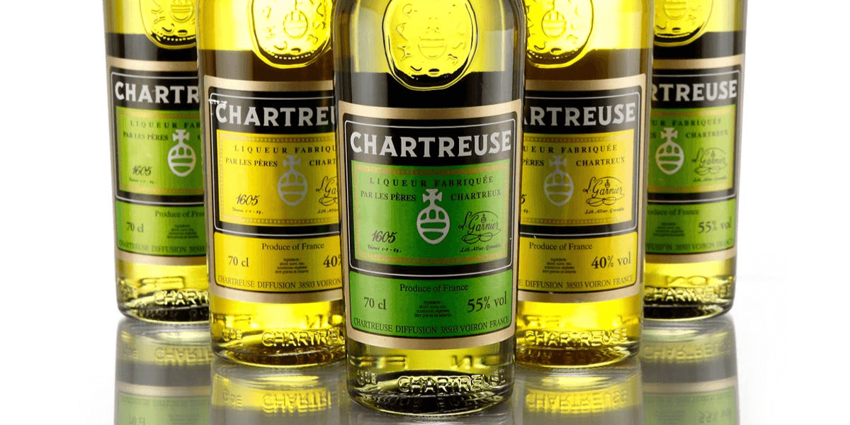
Chartreuse. From LaGrande Chartreuse, the Carthusian monastery near Grenoble, where the liquor was first made.
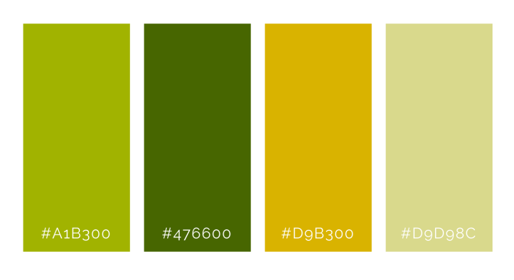
Chartreuse is the color between green and yellow. Its name comes from the similarity to the color of the French liquor, green chartreuse. It is a bold color verging on neon. Designers can use chartreuse as a substitute for yellow when they need a more aggressive tone. It communicates boldness, youth, vitality, and creativity. Unlike midrange green and its connection to nature, chartreuse is less restful.
For people who prefer yellow greens, chartreuse will work. But if a client likes green tones with more blue, it will never be accepted. Chartreuse as a name has a bad reputation. People often refer to it as a “fake” color, like aubergine, named by tricky marketing committees.
Cultural meanings
A chartreuse aura suggests confidence, prosperity, travel, and growth. Negative connotations are slickness, disease, jealousy, and envy.
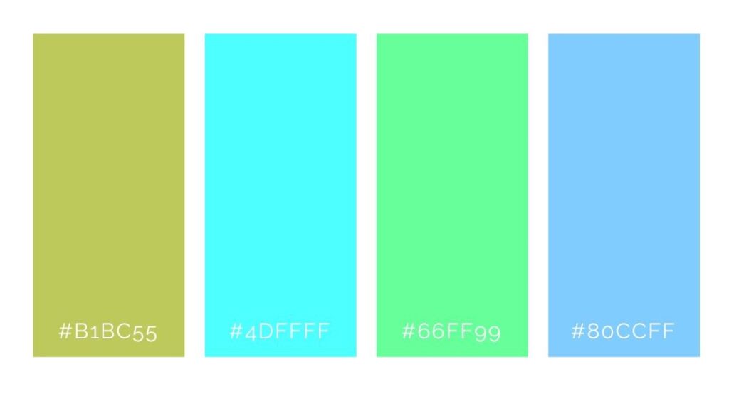
CHARTREUSE
HEX COLOR: #B1BC55;
RGB: (177,188,85)
CMYK: (6,0,55,26)
Should I use dark green color, light green, or any green at all…?
Remember, as with almost any other color, green works in basically any branding. Simply don’t forget to pay attention to the value of the colors used – is the green a shade, tone, tint, or pure? Is the yellow more of a mustard or bright lemon? These details make a huge difference and are a massive part of color psychology in business.
Learn all about all four color psychology personalities:
- Group 1- Brand Design 1: How To Brand a Youthful, Open, and Happy Business
- Group 2- Brand Design 2: How To Brand an Elegant, Feminine Business
- Group 3- Brand Design 3: How To Style an Earthy, Community-Focused Business
- Group 4- Brand Design 4: How To Brand a High-End, Luxury Business
As a tool for creating your own color palette, I recommend Adobe Color. It has a wide variety of features that help you find the colors that work best for you.
Color theory in shades of green
Some more fantastic knowledge about green color by PlaidOnline:
Last Updated on 05/03/2025 by Victoria Silber


