The Basic Principles Of Marketing Design
What is marketing design, and what are its objectives?
Marketing design is a specialized form of design that helps businesses achieve their marketing and advertising objectives. By working with a marketing design firm, companies can create a comprehensive marketing campaign focusing on their unique products, services, and target audience.

The objectives of marketing design are to create a unique and compelling visual identity for a business, to develop an integrated marketing campaign that delivers the desired message to the target audience, and to increase brand awareness and sales. A well-designed marketing campaign will achieve these objectives by using a variety of design elements such as logo design, brand identity development, web design, print design, and social media marketing.
Why Use Marketing Design?
There are many reasons why businesses use marketing design. One of the most important reasons is that it helps companies to stand out from their competitors. In today’s overcrowded marketplace, it is more important than ever for businesses to have a solid and distinct visual identity. Without an easily recognizable brand, businesses will find it challenging to attract new customers and retain existing ones.
Another reason why businesses use marketing design is that it helps them save time and money. An experienced marketing designer can develop an integrated marketing campaign quickly and efficiently. This will free up businesses to focus on other aspects of their operations. In addition, by working with a marketing designer from the beginning, businesses can avoid the costly mistakes that often occur when inexperienced individuals try to handle all aspects of the marketing process themselves.
Types of Services Offered by Marketing Design Firms
Marketing design firms offer various services that can help businesses achieve their objectives. The most common services include logo design, brand identity development, web design, print design, and social media marketing.
Logo Design
A logo is one of the essential elements of a business’s visual identity. It is often the first thing potential customers will see when they come across a business’s products or services. As such, logos need to be well-designed and easily recognizable. A good logo should be simple, memorable, relevant, and timeless. It should also be able to convey the essence of a business in just a few seconds.
Brand Identity Development
A brand identity is more than just a logo; it is the complete package of how a business wants to be perceived by its target audience. A strong brand identity will make potential customers more likely to do business with a company because they will feel like they know what they can expect from the products or services offered. Brand identity development includes developing logos, taglines, color schemes, typography, and overall branding guidelines.
Web Design
An effective website must be well-designed and user-friendly if it is going to achieve its objectives. In addition to having an aesthetically pleasing design, websites must also be easy to navigate so that users can find what they are looking for quickly and easily. Furthermore, websites must be optimized for search engines to appear as high as possible on search results pages. Good web design considers all of these factors while incorporating the latest trends in web design so that websites stay current over time.
Conclusion:
As you can see, there are many reasons businesses use marketing design services. Whether you want to create a stronger visual identity for your business or develop an integrated marketing campaign, working with a qualified marketing designer can help you quickly and efficiently achieve your objectives.
The Importance of Marketing Design
As a designer, you may wonder what role marketing design plays in the success of a business. In short, marketing design is about creating visually appealing and effective marketing materials promoting a product or service. This can include everything from website design and development to creating physical advertisements, product packaging, and more.
While the specific objectives of marketing design will vary depending on the business, some common goals include increasing brand awareness, boosting sales, and improving customer engagement. In other words, marketing design is an essential piece of the puzzle regarding success in any industry. Let’s take a closer look at ways marketing design can help businesses achieve their goals.
How marketing design can help boost sales
One of the most essential objectives of marketing design is to boost sales by increasing conversions. For customers to make a purchase, they need to be persuaded that your product or service is worth their money. This is where compelling visuals come into play.
Using colors, fonts, and other aesthetically pleasing design elements, you can create marketing materials that grab attention and convey trustworthiness. Good marketing design instills confidence in potential customers and encourages them to take the next step and make a purchase.
In addition to increasing conversions, good marketing design can also help businesses boost sales by attracting new customers. In today’s highly competitive marketplace, businesses need to do everything they can to set themselves apart from the competition. Investing in high-quality marketing materials can help your business stand out from the crowd and attract new leads that may not have considered your products or services before.
Improve customer engagement
Another key objective of marketing design is to improve customer engagement. For customers to keep coming back, they need to have a positive experience with your brand every time they interact with you. Strong visual branding helps create consistency across all touchpoints and makes it easy for customers to recognize your business when they see it.
In addition to creating a consistent visual identity, good marketing design also considers the user experience when designing websites and other digital materials. By making your website easy to navigate and ensuring that all information is easy to find, you can keep customers engaged with your brand long enough to convert them into loyal fans.
Marketing design plays a vital role in the success of any business. Creating visually appealing and effective marketing materials can help boost sales, attract new customers, and improve customer engagement.
How to create a style guide for your marketing designs
A style guide is essential for any designer, especially regarding marketing designs. A style guide helps ensure that all your marketing materials are consistent with your brand identity, making it easier for customers and clients to recognize your business.
1) Start by gathering examples of your past work.
This could include print advertisements, email newsletters, and social media posts. The goal is to have a good variety of examples to reference when creating your style guide.
2) Look closely at each of the examples you’ve gathered.
Note their commonalities, such as color scheme, font choices, overall tone, etc. These will be the elements that you’ll want to include in your style guide.
3) Create the style guide
Once you’ve identified the key elements of your brand’s design, it’s time to develop your style guide. A style guide should include your logo (with specific color values), color scheme, font choices, and any other design elements that should be used consistently across your marketing materials.
Style Guide: How To Write One For Your Brand
Be sure to give your style guide to anyone who creates marketing materials for your business, whether an in-house team or an outside agency. And don’t forget to keep it updated as your design evolves!
A well-crafted style guide is invaluable for keeping your business’s marketing designs consistent and on-brand. By following the steps outlined above, you can easily create a style guide that will make sure all of your future marketing materials are up to par with your brand identity. So what are you waiting for? Get started on creating your style guide today!
The four principles of graphic design in marketing
1) Proximity: the importance of proximity in design
Proximity is one of the most essential principles of design. It is the relationship between elements on a page. Reasonable proximity creates a visual connection between elements and guides the viewer’s eye to scan the page in an intended way. Poor proximity can make a design look cluttered, disconnected, and confusing. This blog post will discuss the importance of proximity in design and how to use it effectively.
Why is proximity important?
Proximity is important because it helps to organize information in a way that is easy for the viewer to understand. When elements are close together, they are perceived as being related. This makes it easier for viewers to process information and find what they want.
How to use proximity effectively
There are a few things to keep in mind when using proximity in your designs:
• Layout: The layout of your page should be designed to allow different types of information to be grouped together appropriately. For example, you would want to put all the text on a page together in one area and images in another.
• Relationships: Be intentional about which elements you put together. Only group together elements that have a relationship with each other. For example, if you are designing a poster for an event, you would want to put the date, time, and location together so that viewers can easily find that information.
• White Space: Use white space intentionally to create a visual hierarchy and emphasize certain areas of your design.
Proximity is an important principle of design that should not be overlooked. By keeping these tips in mind, you can use proximity effectively in your designs to create visual interest, emphasize specific areas, and guide the viewer’s eye around the page.
2) Alignment
Humans are hardwired to respond to visual order. If we look at a collection of letters or shapes, we will always try to make visual sense of the jumble. Alignment is a valuable design tool for delivering information in the ordered, organized way that viewers respond best.
Alignment is the lining up two or more elements along a margin or other line. The line is usually not visible; the arrangement of elements implies it. Alignment is attractive: the eye is more drawn to where shapes form a regular pattern.
Showing connections
Aligning the elements helps audiences understand that they are related to each other. For instance, if a picture needs a caption, aligning text with the edge of the image makes it clear that they are connected.
Aligning text
Any text that’s longer than a single line needs to be set out to align with itself at the start, finish, or through the center of each line. You can text us left the line, right the line, center aligned, or justified. Justified text aligns along both its right and left edges.
Aligning layouts
Left alignment
The most popular way of aligning different elements in a layout is along the left-hand margin or line. This arrangement looks natural to an audience used to scanning from left to right because this is how layouts are conventionally designed.
Center alignment
Elements can be aligned along the line that runs through their center. Centering can be tricky to use: takes sometimes look ragged and hard to read, as each line starts in a different position. It works best if there is minimal text or no layout or when one or more blocks or text are justified.
Right alignment
This alignment encourages the viewer to look across a whole layout, as the eye is drawn to the top right corner. It often works well with landscape formats. It’s also helpful to connect text to an image when they appear on the right-hand side of the layout.
The alignment principle states that nothing should be placed arbitrarily on the page. Every item should have a visual connection with something else on the page.
3) Repetition
Repeat some aspects of the design throughout the entire project. The repetitive element may be a particular bullet, a thin line, color, a specific typeface, format, etc. it can be anything that an audience will visually recognize.
The purpose of the repetition
It is to add visual interest and to unify. The more attractive the page looks, the more likely people will read it.
Avoid repeating the element so much that it becomes overwhelming. Be careful with the value of contrast as well.
4) Contrast
Contrast is one of the most effective ways to add visual interest to your page and to create an organized hierarchy among different elements.
Contrast various design elements to draw the audience’s eye to the page. If two items are not the same, then make them visibly different.
The easiest way to add contrast to any design project is with typefaces. But also use colors, textures, spacing, etc.
The essential purpose of contrast
Contrast has two purposes:
- Create interest in the design.
- Aid in the organization of the information
The contrasting elements should never confuse the viewer or create a focus that is not supposed to be the focus.
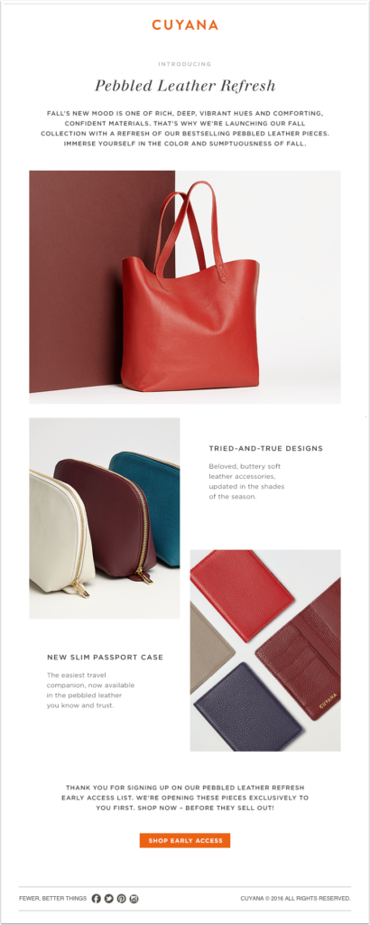
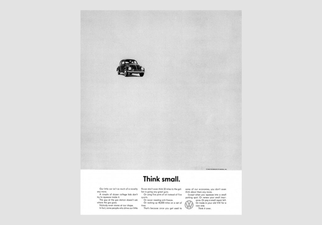
Examples of great marketing design
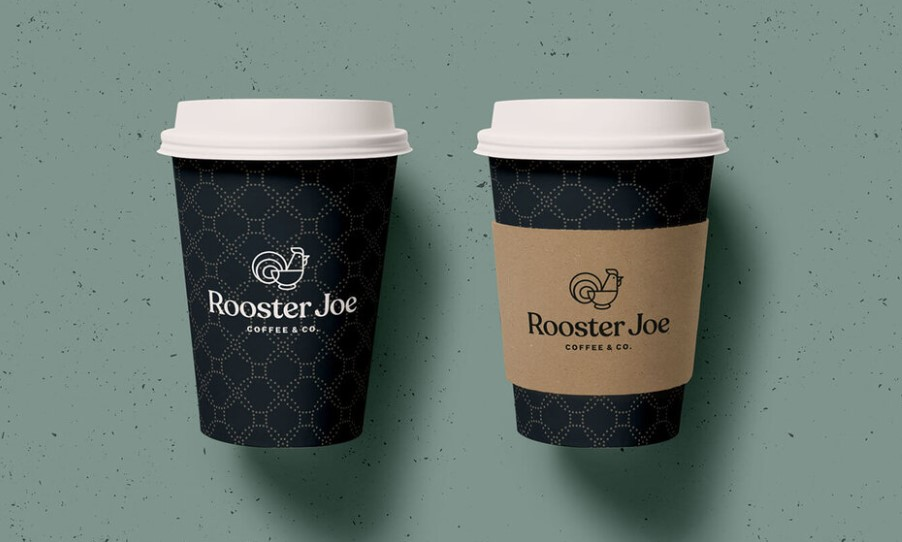
Rooster Joe marketing design elements by Copperheart Creative
Read more about brand design and marketing:
Visual Brand Strategy – What Is It?
Brand Design 4: How To Style A High-End, Luxury Brand
Last Updated on 05/03/2025 by Victoria Silber


