Color Psychology in Branding: Clarify Your Visual Identity
Color psychology in branding is a powerful tool.

It helps you communicate your brand’s tone, attract the right clients, and make design decisions easier. At Silber Consult, we use Seasonal Brand Design theory to guide this process. It helps creative entrepreneurs choose colors that fit who they are, not just what looks trendy.
This post explains how color psychology works in branding and how seasonal brand design makes your visual identity clear and confident.

Why Color Matters in Brand Communication
Color is the first emotional connection people have with your brand.
It shapes what they expect and how they feel before they even read a word.
Here are some key truths about color:
- Soft colors create trust without drama
- Bright colors spark energy without confusion
- Neutral colors give breathing room without boredom
- Cool tones communicate calm without feeling cold when used correctly
Color only works well when it matches your brand’s emotional tone. Otherwise, your visual identity risks sending mixed signals.
What Is Seasonal Brand Design?
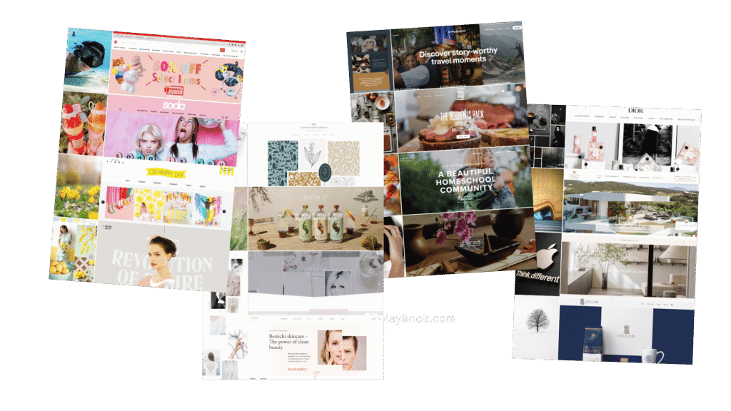
Seasonal Brand Design connects your brand personality to your visual style through the metaphor of seasons.
It divides brand energy into four clear profiles based on nature’s cycles.
Spring Brands’ Color Psychology
Spring brands feel fresh, optimistic, and creative.
Their colors are lively but gentle. Typical palette choices include warm greens, lemon yellows, soft turquoise, and light neutrals that avoid gray tones.
Spring brands want to inspire and energize, not overwhelm.
Summer Brands’ Color Psychology
Summer brands are calm, elegant, and soft.
They favor cool blues, dusty rose, lavender, and muted gray-blues. Their palette avoids bright primaries and harsh contrasts. Summer brands soothe and uplift with quiet confidence.
Autumn Brands’ Color Psychology
Autumn brands are warm, grounded, and confident.
Their colors echo nature’s earthy tones: rust, olive, ochre, deep green, terracotta, and creamy neutrals instead of stark white. Matte finishes are common.
Autumn brands feel authentic and lived-in.
Winter Brands’ Color Psychology
Winter brands are bold, sharp, and precise.
Their palette includes black, white, navy, crimson, icy blue, and silver.
They use bright accents carefully. Clean lines and geometric shapes support their clear, confident energy.
How Seasonal Brand Design Helps You Use Color Psychology
Choosing colors without a clear system leads to confusion and endless tweaking.
You might pick colors that look good alone but clash with your brand’s voice. Seasonal Brand Design fixes that.
Here’s what happens when you follow this method:
- You get a color palette that fits your unique energy
- Your visuals stay consistent across websites, social media, and products
- You gain confidence and avoid second-guessing every choice
Using Color to Attract Your Ideal Client
Your ideal client reacts to your brand colors before they decide to learn more.
Colors influence emotions and perceptions on a deep level.
For example:
- A Spring brand attracts clients looking for fresh ideas and creativity
- A Summer brand appeals to clients who want calm and sophistication
- An Autumn brand draws clients who value authenticity and warmth
- A Winter brand connects with clients who seek boldness and professionalism
When your colors match your brand season, clients recognize you instantly and feel at ease.
4 Tips for Choosing Your Brand Colors with Seasonal Design
1. Start With Your Brand Personality
Visual identity must come from how your brand feels, not just what you like or what’s trendy.
Start by defining your brand season based on your personality and values.
2. Pick a Primary Palette Based on Your Season
Use the seasonal color profiles to choose 3–5 main colors.
Stick to these colors consistently.
3. Add Secondary and Accent Colors Carefully
Secondary colors support your primary palette.
Accent colors create focus but should never clash with your base colors.
4. Keep Contrast Clear But Balanced
Each season uses contrast differently.
Winter thrives on high contrast, while Summer uses soft blends. Follow the seasonal rules to keep harmony.
Final Thoughts
Color psychology in branding works best with a clear framework like Seasonal Brand Design.
It stops you from guessing and creates a visual identity that feels authentic and magnetic.
Focus first on your brand personality and season: How to Define Your Brand Personality.
Let your colors grow naturally from that foundation. This approach builds a strong, clear brand that stands out and connects deeply with your ideal clients.
Learn More About Color Psychology in Branding
Color Psychology in Branding & Logo Design
How to Use Neon Or Fluorescent Colors In Branding & Design
Color Black In Branding? Only For The Chosen Ones
Last Updated on 26/05/2025 by Victoria Silber


