5 Powerful Ways to Use Color Psychology for Visual Identity
Color psychology is one of the most important tools you have when creating a visual identity.

It influences how people feel about your brand and how they remember it.
But color is more than just picking pretty shades. It is a way to communicate your brand’s personality, values, and message without words. When you use color psychology correctly, you clarify your brand and make it easier for your audience to connect with you.
In my seasonal design approach, I pay special attention to how white and black mix with colors. That mix changes how your colors feel. A bright color with lots of white will look soft and open. The same color with more black feels deep and serious. This detail can make a huge difference in how your brand mood comes across.
Here are five powerful ways you can use color psychology to clarify your visual identity and create a brand that stands out.
1. Understand What Colors Mean
Every color carries meaning.
Some meanings are almost universal. Others change depending on culture or context.
To build a clear visual identity, you need to understand the emotions and ideas behind colors.
- Blue suggests trust, calm, and professionalism. It works well for brands that want to feel reliable and secure.
- Red evokes energy, passion, and urgency. It grabs attention and motivates action.
- Green connects with nature, health, and growth. It fits brands focused on balance or sustainability.
- Yellow feels optimistic and warm. It adds cheer and friendliness.
- Purple communicates creativity and luxury. It adds a sense of mystery and quality.
- Orange blends excitement with friendliness. It is fun and inviting.
- Black adds sophistication, power, and authority. It is bold and confident.
- White signals purity, simplicity, and cleanliness. It feels fresh and modern.
Knowing these basic associations helps you choose colors that match your brand personality and goals.
Learn much more about the meaning of colors here: Color Psychology in Branding & Logo Design
2. Use the Seasonal Design Approach to Find Your Color Palette
A color’s impact depends on how light or dark it is and how much white or black it contains.
This is where the seasonal design approach becomes useful. It groups color palettes into four seasons.
Each season uses a different mix of white and black that creates unique moods.
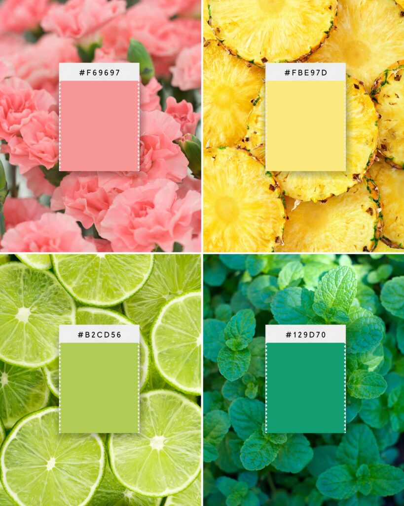
Spring palettes have high white volume
These colors look bright, fresh, and youthful.
They give a feeling of openness and optimism. Use these colors if your brand feels energetic and friendly.

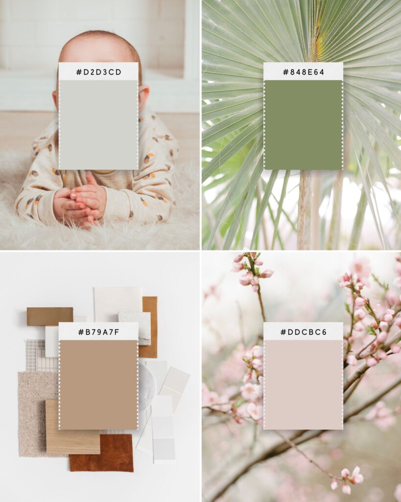
Summer palettes also have white, but with softer saturation
These muted colors feel calm, approachable, and gentle. They suit brands that want to be welcoming and relaxed.

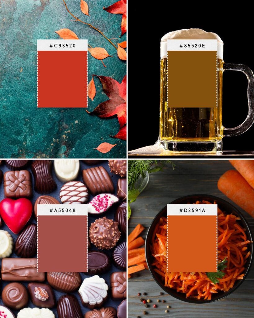
Autumn palettes lean toward black with warm undertones
They look rich, earthy, and grounded.
These colors add depth and warmth. They work well for brands that feel cozy, natural, or community-focused.

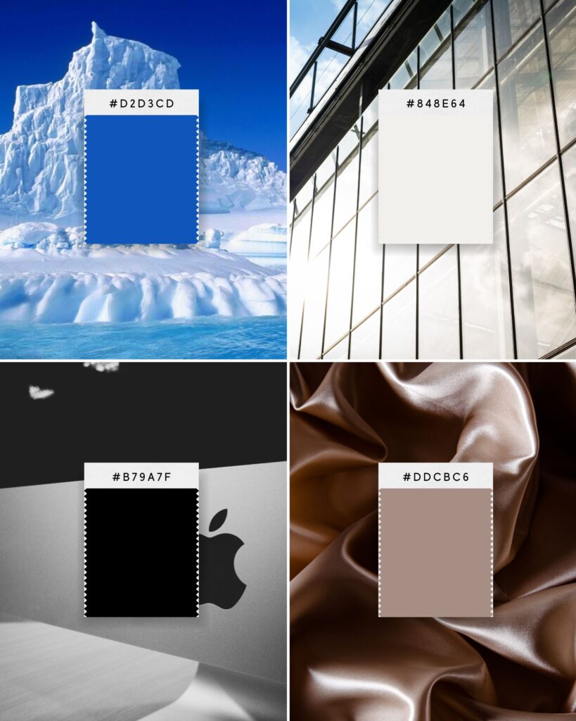
Winter palettes use high black volume and cool undertones
The colors are deep, clear, and bold.
This creates a sharp, elegant, and powerful look. Choose winter colors if your brand wants to stand out with clarity and confidence.

By identifying which season matches your brand personality, you narrow your choices to colors that work naturally together.
This keeps your visual identity consistent and strong.
3. Adjust the Volume of White and Black to Refine Your Mood
After choosing your season, fine-tune your colors by adjusting the white and black volume.
This process changes how a color reads and how your brand feels.
Adding white lightens a color, creating tints.
It makes your brand look more open, airy, and inviting. This works well for brands that want to feel youthful, fresh, or optimistic.
Adding black darkens a color, creating shades.
It creates depth, seriousness, and sophistication. This suits brands that want to appear grounded, professional, or luxurious.
Adding black and white makes gray, creating tones.
These colors are called tones, and tones give a calm, collected mood. Elegant and sophisticated vibe.
This simple shift changes your entire brand mood. It allows you to use the same base colors but gives them a new personality. For example, a red with more white feels playful and fun. The same red with more black feels powerful and intense.
Knowing how to control white and black volume helps you design a visual identity that feels intentional.
You create a consistent mood that matches your message.
4. Use Your Color Palette Consistently Across All Touchpoints
Choosing the right colors is just the start.
To clarify your visual identity, you must use your color palette consistently. Your colors should appear in your logo, website, social media, packaging, and marketing materials.
Consistency builds recognition and trust. When people see your colors repeatedly, they connect those colors to your brand. This connection makes your brand more memorable and easier to identify.
Make sure to define your color palette clearly. Document the exact colors with hex codes or Pantone numbers. Create guidelines for how to use your colors in different formats. For example, which colors should be dominant and which are accents.
Train your team or anyone creating content for your brand to follow these rules.
This keeps your brand looking professional and cohesive.
5. Test Your Colors with Real People and Adjust Based on Feedback
Finally, test your colors in real contexts with your audience.
Colors can look different on screens or in print. They can also evoke different reactions depending on who sees them.
Collect feedback from customers, employees, and partners. Ask how your colors make them feel and what they think about your brand mood. Use this input to refine your palette.
Don’t be afraid to make small changes. Sometimes, a subtle adjustment to white or black volume can improve how your brand connects with people.
Use this feedback loop to keep your visual identity strong and relevant as your business grows.
Conclusion
Using color psychology to clarify your visual identity is a powerful way to make your brand stand out.
When you combine this with the seasonal design approach and carefully control white and black volume, you create a clear and consistent brand mood. This helps your audience connect emotionally and remember your brand.
Start by understanding color meanings. Find your seasonal palette. Adjust the volume of white and black to refine your mood. Use your colors consistently. Test with real people and adjust.
This process creates a visual identity that supports your brand message and values. It helps you communicate without words. It makes your brand feel intentional and authentic.
Remember, your colors tell your story.
Make them work for you.
Learn More About Color Psychology in Design and Branding
Color Psychology in Branding: Clarify Your Visual Identity
Color Psychology in Branding & Logo Design
How to Use Neon Or Fluorescent Colors In Branding & Design
Color Black In Branding? Only For The Chosen Ones
Last Updated on 30/05/2025 by Victoria Silber


