How to Adapt Visual Identity for Local Cultures
A brand’s visual identity shapes how people feel about your brand.

It tells a story before a single word is read. But what happens when that story travels across borders?
A visual identity that works well in New York might fall flat in Tokyo. What resonates in Stockholm might confuse buyers in Dubai. To build global trust and recognition, you need to adapt your brand’s visuals to local cultures without losing its essence.
Here’s how to do it with confidence, creativity, and clarity.
Understand What Visual Identity Includes
Before you can adapt it, you need to understand what you’re adapting.
Core Elements of Visual Identity
- Logo and logo variants
- Color palette
- Typography
- Imagery and photo style
- Iconography
- Patterns and textures
- Layout and spacing rules
All of these elements carry meaning.
A color that suggests “trust” in one culture might suggest “mourning” in another. Fonts can feel formal, playful, or even dated, depending on cultural context.
And imagery that seems neutral in one country might be loaded with assumptions elsewhere.
Why Culture Shapes Design Choices
Culture influences everything.
From the way people read (left to right or right to left) to how they interpret symbols, gestures, colors, and space.
Color Meanings Shift Around the World
Red is a powerful example.
In China, it’s associated with luck and joy. In South Africa, it can represent mourning. In the U.S., it often signals urgency or passion. If your brand uses red as its main color, you need to think about how that will land in each market.
Visual Norms Vary by Region
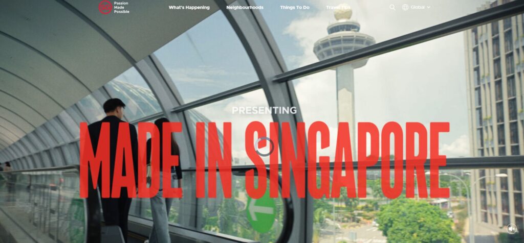
In Japan, clean space and minimalism signal elegance.
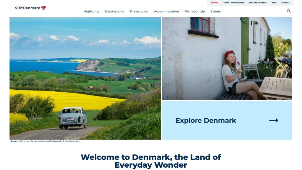
In Brazil, rich color and energetic patterns are part of the visual culture. Scandinavian brands often lean toward soft, muted tones and functional design.
These preferences aren’t just aesthetic – they shape what people trust and what they buy.
People Want to See Themselves
Localization isn’t only about language.
It’s about representation. People are more likely to engage with a brand that feels familiar, relatable, and respectful of their local context.
That’s why visual identity needs to flex, not break, when it goes global.

Start with Research
Adapting your brand begins with listening and learning.
Avoid assumptions. Culture is nuanced, and even neighboring countries may respond differently to the same design.
Talk to Local Experts
Work with local creatives or cultural consultants in your target region.
They’ll catch visual cues and hidden meanings that outsiders might miss.
Study Competitors and Local Brands
What are successful brands in your category doing in that market?
Notice patterns in colors, styles, or photo choices. These can help you calibrate your approach without copying.
Look at the Culture’s Design Legacy
Design roots run deep.
Traditional motifs, national symbols, historical color palettes, and regional design schools all shape what people expect from visuals.
Knowing this can help you strike the right balance between fresh and familiar.

Localize Without Losing Brand Consistency
The challenge is to adapt without diluting your brand.
You don’t want to look like a totally different company in each country. The goal is harmony, not fragmentation.
Set Flexible Brand Guidelines
Create global brand guidelines that allow room for cultural flexibility.
Define which parts of your visual identity are core and which can be adapted.
For example:
- Core (never change): Logo structure, core brand values, main font
- Flexible (adjust to market): Secondary color palette, imagery style, layout proportions
This gives your team or partners a clear framework without locking them into one-size-fits-all visuals.
Create Regional Toolkits
Build a version of your brand kit tailored to each market.
Include localized templates, visual examples, and guidance on cultural sensitivity. These kits can save time, reduce design risks, and make teams feel empowered.
Translate Brand Personality Visually
Ask yourself: How would this brand feel in a new language?
Then ask: How would it look?
If your brand is bold and playful in the U.S., what does that look like in India or Germany? You might keep the same energy but swap your color intensity, photo style, or font choices.
You’re keeping the personality, just letting it speak a slightly different visual dialect.
Use Imagery That Feels Local
Stock photos or visuals that scream “foreign” will create distance.
People want to see places, faces, and stories they recognize.
Feature Local People and Contexts
Whenever possible, use real people from the culture you’re speaking to.
This builds trust and relevance. Avoid generic global imagery. It often feels cold and disconnected.
Watch for Symbols and Gestures
Even subtle body language or background elements can carry meaning.
A hand gesture that’s friendly in one place might be offensive elsewhere. Double-check every image before you publish.
Be Strategic About Color
You don’t need to change your whole palette for every country, but you should test how your core and accent colors are perceived in key markets.
Adjust Accent Colors First
Instead of replacing your primary brand color, consider adapting secondary colors.
This lets you maintain brand recognition while softening or amplifying the emotional tone.
For example, you might:
- Use more white space and lighter tones in Nordic countries
- Bring in warmer accents for Latin American markets
- Soften dark tones in markets where they signal grief
Test Color Combos in Context
Colors behave differently depending on what they’re paired with.
What looks modern and sleek in one combo can look harsh or old-fashioned in another. Always test full designs, not just isolated swatches.
Consider Typography and Language
Type is culture.
Fonts carry emotion, personality, and even history.
Choose Fonts That Support Local Scripts
If you’re working in non-Latin scripts like Arabic, Cyrillic, or Chinese, make sure your font choice fits the visual style of the culture.
It should also support the full character set.
Match Font Style to Local Expectations
Even with the Latin alphabet, style matters.
A script font that feels elegant in France might feel cluttered in Germany.
A rounded sans-serif that seems friendly in Sweden might seem childish in Korea.
Don’t just translate the words. Translate the tone.
Let Layouts Breathe with Cultural Awareness
The layout is invisible until it feels wrong.
Every culture has subtle expectations about space, flow, and rhythm.
Respect Reading Direction
In markets where people read right to left, flip your layouts.
Align text and key visuals to feel natural for the reader.
Adapt Density and Hierarchy
Some cultures prefer dense information and overlapping visuals.
Others favor clean space and clear hierarchy. Adjust line spacing, block size, and how much visual weight you give each element.
Use Feedback Loops
Don’t guess.
Test.
Local feedback will give you faster insights than global opinions.
Run Local A/B Tests
Compare variations of a visual element across regions.
Look at engagement metrics, but also collect qualitative feedback. Ask local users how they feel about the design.
Build a Feedback Network
Create a standing group of local reviewers who can quickly assess whether visuals feel authentic or off-brand in their market.
This network is more valuable than any style guide.
Case Study Examples
Here are three examples of brands that adapted their visuals well.
Airbnb
Airbnb’s Bélo symbol stays the same worldwide, but imagery changes to reflect local hosts, neighborhoods, and homes.
Their font and layout stay consistent, while photography and color accents shift by market.
Coca-Cola
Coca-Cola’s red stays universal.
But their holiday campaigns, product photos, and local partnerships look completely different across cultures.
They also adapt their script font for markets like China and India.


IKEA
IKEA uses the same blue and yellow identity globally.
But their catalogs, in-store visuals, and packaging are all localized. Product shots reflect local home styles, space constraints, and cultural needs.
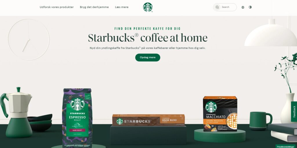
STARBUCKS


Final Thoughts
Adapting your visual identity for local cultures doesn’t mean changing who you are. It means showing up in a way that feels respectful, relevant, and clear.
Stay consistent with your brand’s values. Be flexible in how you express them. Start with deep cultural understanding, build systems that support local teams, and test everything before you scale.
When you make the effort to meet people where they are, your brand earns trust. It becomes more human. And that’s how global brands grow – by looking and feeling local.
Learn More About Visual Identity in Branding
Color Psychology in Branding: Clarify Your Visual Identity
Checklist: Visual Brand Consistency
Visual Brand Strategy – What Is It?
Brand Your Photography Business Like A Pro
Last Updated on 01/06/2025 by Victoria Silber


