This guide explores the benefits of using these eye-catching colors, providing valuable tips for incorporating them effectively.
Whether you’re a graphic designer, marketer, or business owner, this resource empowers you to create a vibrant and memorable visual identity that stands out from competitors.
Neon colors infuse designs with energy, but their intensity requires cautious application. Fluorescent colors, currently in vogue, can add a strong visual presence to projects.
-
 Ebook: Brand Your Etsy Shop Like A Pro11.00 $ incl. VAT
 -
The Ultimate Beauty Branding Handbook11.00 $ incl. VAT
-
E-book: The Ultimate Guide to Branding Styles11.00 $ incl. VAT
Are Fluorescent and Neon Colors The Same?
Fluorescents and neons are similar in that they are both bright and vibrant, but they are not exactly the same.
Neon is a specific subset of fluorescent color that is especially bright and vivid. They are created using neon gas in glass tubes that are charged with electricity to create a visible glowing effect. Fluorescent colors, on the other hand, are created using a chemical process that makes the emission of them appear brighter and more intense than the emission of standard colors.
Both color types are popular choices for creating attention-grabbing designs, but neons are often associated with retro or vintage aesthetics, while fluorescent colors are more commonly used in modern and contemporary designs.
What Is Neon Color?
Neon color radiation is a subset of the emission of electromagnetic radiation of fluorescent color that is extremely bright and vivid.
These fluorescent colors are created by using neon gas in glass tubes and fluorescent lamps that are charged with electricity to produce a glowing effect. Neon colors typically include shades of pink, blue, green, yellow, and orange, and they are often associated with retro or vintage aesthetics. They can be used in a variety of design applications, including signage, packaging, and branding, to create eye-catching and memorable visual identities.
Because they are so bright and attention-grabbing, neon colors are particularly effective for businesses or products that want to stand out from the competition.

How Many Neon Colors Are There?
There is no definitive number of neon colors, as the term “neon” is often used to describe a broad category of bright, vibrant, and intense colors.
Neon colors are characterized by their ability to mimic the bright glow of neon lights and are typically highly saturated and eye-catching.
Some of the common neon colors include:
- Neon Green
- Neon Pink
- Neon Orange
- Neon Yellow
- Neon Blue
- Neon Purple
- Neon Red
However, the range of neon colors can vary depending on the context and the specific shade or hue being referred to.
Different manufacturers or brands may also have their unique interpretations of neon colors, adding to the diversity of options available.
What Are The Best Known 4 Neon Colors?
The four neon colors are typically considered to be:
1. Neon Green: A bright and vivid green color, reminiscent of fluorescent green.
2. Neon Pink: A vibrant and eye-catching pink shade that commands attention.
3. Neon Orange: A bold and intense orange color, often associated with high visibility.
4. Neon Yellow: A brilliant orange and luminous yellow hue emit light that stands out in any dark setting.
These neon colors are known for their striking and electrifying appearance, making them popular choices for various applications, including signage, fashion, and design elements.

What Is a Fluorescent Color?
Fluorescents are vibrant and saturated hues that exhibit a unique light-reflecting property, even appearing to glow in interior settings.
This phenomenon, known as fluorescence, involves materials absorbing light and emitting lower-energy or shorter-wavelength light, resulting in a glowing effect. Such colors are created using fluorescent dyes combined with resin to form solid and intensely luminescent shades. Visible under ultraviolet light, they are characterized by their high reflectivity, exceeding even 300% compared to traditional colors’ 90%.
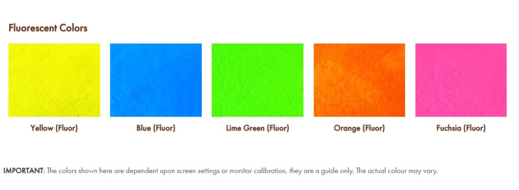
These eye-catching primary and secondary colors, including pink, yellow, green, orange, and blue, find widespread use in design and branding to create attention-grabbing visuals.
Moreover, their effectiveness in low-light environments, like nightclubs or outdoor events, and application in safety equipment and clothing further exemplify their utility and versatility.

Fluorescent Colors In Different Lighting Conditions
- Test the colors in different lighting conditions: Fluorescent colors can appear differently depending on the lighting conditions in which they are viewed. It’s a good idea to test your colors in different lighting conditions to see how they will look in the real world. This will help you make any necessary adjustments to the color palette before finalizing your design.
- Use complementary colors: Pairing fluorescents with complementary colors can help ensure your designs are legible and visually appealing. For example, using a dark color or neutral background can help the fluorescent color pop and stand out.
- Consider the context: When using fluorescent colors, it’s important to consider the context in which they will be used. For example, fluorescent colors may work well for nightclub promotions, but may not be appropriate for a corporate branding project.
- Use high-quality materials: When using them on printed materials or products, it’s important to use high-quality materials that are designed to showcase the colors to their fullest potential. This can include using high-quality paper, inks, or printing techniques that enhance the brightness and vibrancy of the fluorescent colors.
- Be mindful of accessibility: While fluorescent colors can be visually striking, they may not be accessible to all users. It’s important to ensure that your designs are accessible to users with different visual abilities by providing alternative options or considering color contrast ratios.

What Are Fluorescent Reagents?
Fluorescent reagents are essential components in various scientific and medical applications.
These specialized compounds possess the remarkable ability to absorb light energy and subsequently emit it at a longer wavelength, resulting in a fluorescent glow.
When introduced to specific biological or chemical samples, fluorescent reagents can selectively bind to target molecules, making them valuable tools for detection and analysis.
Moreover, in materials science, fluorescent materials are engineered to exhibit similar light-absorbing and emitting properties. These materials find application in diverse fields, including sensors, imaging technologies, and displays.
The remarkable interplay between absorbed light energy and emitted fluorescence has paved the way for groundbreaking advancements, revolutionizing research and enabling innovative solutions across a wide spectrum of industries.
How Many Colors Are Fluorescent?
Fluorescents encompass a wide range of shades, but there is no specific fixed number of fluorescent colors.
The term “fluorescent” refers to a category of colors that exhibit high visibility and intense luminescence, created using a chemical process with fluorescent dyes and resins. Common fluorescent hues include neon green, neon pink, violet end neon orange, and neon yellow, among others.
These colors are often used to create eye-catching and attention-grabbing visuals in various applications such as design, branding, safety equipment, and clothing.
While some standard fluorescent paint colors are well-known, the actual number of unique fluorescent shade selections is vast and can vary depending on the specific dye formulations and applications.
Fluorescent White
Fluorescent white is not a standard color term or a common designation in the realm of colors.
Unlike fluorescents such as emit light as green or pink, fluorescent white does not refer to a specific hue with luminescent properties.
White is the combination of all colors in the visible spectrum, and fluorescent colors are known for their vibrant intensity and intense nature-absorbing light. However, there are materials or coatings that can appear white under normal lighting conditions but exhibit fluorescent properties under ultraviolet (UV) light. In such cases, the material may emit a visible bright glow or shine when exposed to UV light, but it would not be considered a standalone fluorescent white color.
In general, fluorescents are more commonly associated with bright and vivid hues like neon green, neon, fluorescent pink, and others, rather than with the concept of fluorescent orange and white.

Cultural Meanings Of Neon Bright Colors
The cultural meanings of neon and other substances with fluorescent colors can vary depending on the context and cultural background.
In general, neons are often associated with vibrancy, energy, and youthfulness. In Western cultures, for example, neon colors are often associated with 1980s and 1990s nostalgia, while in some Asian cultures, neon colors are associated with futuristic and technological themes.
They are commonly used in safety equipment and clothing and can also be associated with safety and visibility.
Neon Colors In Marketing And Branding
In terms of marketing and branding, the use of neon colors can convey a sense of boldness, excitement, and uniqueness.
They can help brands stand out in crowded marketplaces and attract attention from younger or more adventurous audiences. However, it is important to consider the cultural context and the target audience when using neons or fluorescents in branding and design, as different cultural backgrounds and age groups may have different associations and interpretations of these colors.
Andy Warhol, who entered the world of art in the late 1940s, described neon as ‘one of the great modern things.
French artist Martial Raysse became one of the first artists to work with neon in an artistic sense, blending pop art portraiture with neon accents. – Neon Creations.
Both of these use neon colors to simulate a hallucinogenic experience. By the 1980s, neon colors were adopted by teenage and juvenile audiences – this time, more closely aligned with optimism.

The Pros and Cons of Neon and Fluorescent Colors
When making a statement with color, it’s hard to beat neon and fluorescent hues.
These super-saturated colors are eye-catching and attention-grabbing, which makes them perfect for use in design projects that need to make a significant impact. But before you reach for that neon green or fluorescent pink, it’s essential to understand the pros and cons of these two very different types of colors.
The Pros And Cons Of Neon Colors
Neon color is the radiation created by adding special phosphors to the glass used in making tubes fluorescent lights or bulbs.
When energized by a light source or an electric current, these phosphors glow with emitting a bright, intense blue light. Neon lights have been around since 1910 when they were first used in public signage. Neon colors are enjoying something of a renaissance in the design world.
Pros:
Neon colors are exceptionally eye-catching, making them ideal for use in designs that need to grab attention. Designers can combine neon colors to create unique color palettes you won’t find with other color types.
Designers can use neon colors in many applications, including web design, marketing materials, product packaging, etc.
Cons:
Neon colors can be overwhelming if misused, making your design look garish or unbalanced. The brightness of neon colors can make them difficult to read when used as body text or for extended periods.
The Pros And Cons Of Fluorescent Colors
Fluorescent colors are created using fluorescent pigments, or dyes, molecules that contain fluorescent compounds.
These compounds absorb invisible ultraviolet light from the sun or artificial sources and re-emit it in the visible spectrum, resulting in a bright, glowing color. Fluorescent colors have been used in everything from highlighter pens to black lights since the 1930s.
Pros:
Highly pigmented, making them brighter and more vibrant than other colors.
They can help add excitement and energy to any design project.
Cons:
Can be challenging to work with because they can overwhelm other elements in your design.
They can fade over time when exposed to sunlight, which means they’re not always suitable for outdoor applications.
Are Fluorescent Colors Safe to Use In Design and Branding?
Fluorescent colors are generally considered safe to use in design and branding – when used correctly.
However, like any other colorant or pigment, fluorescent dyes, chemicals and pigments used to create fluorescent colors can vary in their safety and toxicity. It’s important to ensure that the specific fluorescent color you are using is certified safe for use in your particular application.
It’s also worth noting that some other fluorescent materials and colors may be more prone to fading or discoloration over a small amount of time when exposed to light, so it’s important to use high-quality, fade-resistant materials when incorporating fluorescent colors into your design and branding.
How To Use Neon Colors In Design?
1. Use neon colors as accents.
Neon colors are best used as accents. This means using them in small amounts to add pop to an otherwise subdued design. For example, in a black-and-white website design, you could use a neon pink color for the links. Or you could use a neon green color for the call-to-action button on a landing page. When used as accents, neon colors can make your design stand out without overwhelming the viewer.
2. Pair neon colors with neutral colors.
Another effective way to use neon colors is by pairing them with neutral colors like black, white, or gray. This will help create a more balanced design that is not too jarring to the eyes. For example, you could use a black background with neon yellow text. Or you could use a white background with neon pink text. Experiment with color combinations to see what looks best for your particular design.
3. Don’t use too many different neon colors.
When using neon colors in your design, it is essential not to use too many different colors. TOo many neon colors in one design will create a chaotic and busy look that will be difficult for viewers to process. Instead, please stick to one or two neon colors and use them sparingly throughout your design. The humble use of these bright colors will help create a more cohesive and polished look.
4. Use fluorescent tones sparingly.
In addition to using standard neon colors sparingly, it is also important to use fluorescent tones sparingly. Fluorescent tones are even brighter than regular neon colors and can be overwhelming when used in large quantities. If you want to use fluorescent tones in your design, we recommend using them only for small details like button hover states or underlined text links.
5. Avoid using neon colors for textured backgrounds.
If you are considering using a neon color for a textured background, we would advise against it. Neon colors are very light-sensitive, so they can cause eye strain and headaches when used as background textures.
If you want to use a Neon Color for a background, we recommend doing so only in small areas or using a muted version of the color.
Fluorescent color palette
When designing with fluorescent colors, keep in mind that they can be quite bold and eye-catching, so it’s essential to use them judiciously and consider the overall visual impact of your design.
Fluorescent color palettes are often used in various applications, including graphic design, branding, marketing materials, and even fashion, to create attention-grabbing and memorable visuals.
So, feel free to explore different combinations of fluorescent colors to bring a bold and vibrant touch to your creative projects!
Unlike traditional pigments, which use only one color for their hues and allow other colors to be mixed in through paint or paper preparation techniques such as watercolor painting with an ink pen respectively, fluorescent hues can capture light at many different wavelengths.
This allows them to produce a much brighter display than what our eyes would naturally see without any illumination present giving it more visual impact on top of being easier on battery life – perfect if you want your work seen!
How To Use Neons For a Pop Of Color
Another way to use neon colors is to add them as a pop of color in an otherwise neutral design.
This can help add some personality and interest to your work. For example, if most of your design is white, you could add a Neon pink accent color. Or, if your design is mostly black, you could use a Neon green color for accents.
This approach is perfect if you want to experiment with Neon colors but don’t want them to be the show’s star.

Neon Color Palette
A solid, highly, fluorescent pink, orange color will add visual presence to a project.
It is extremely clear and confident. Neon colors should only be used in a group 4 color palette, matching beautifully with black and white.
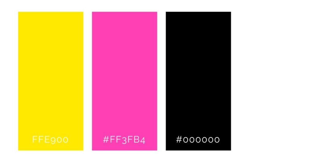
CMYK process color cannot replicate fluorescent colors.
Read more here: Brand design 4: How to design a high-end, luxury business.
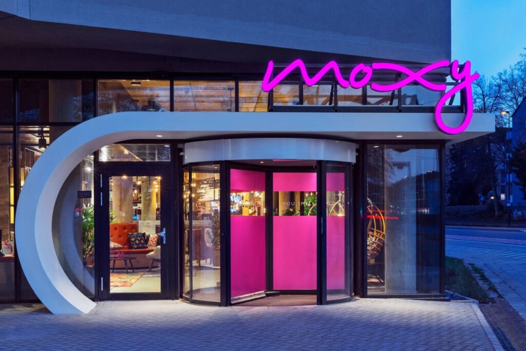
Neon / fluorescent colors in branding
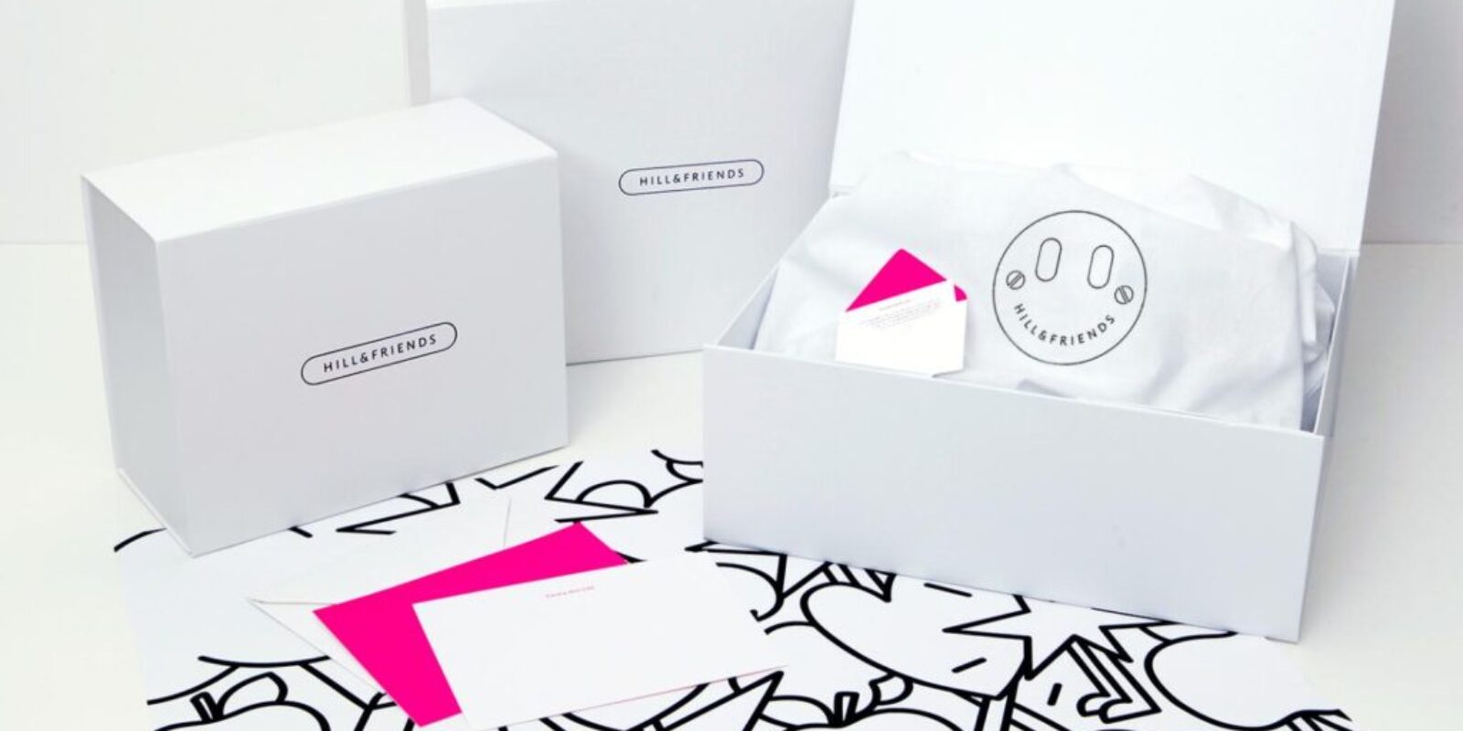
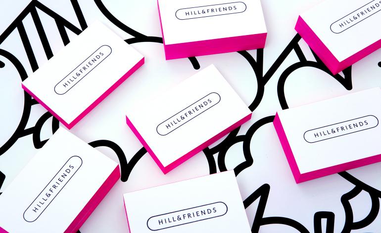
Neon colors in branding: hillandfriends
Read more about Hill&Friends branding here: wallpaper.com.
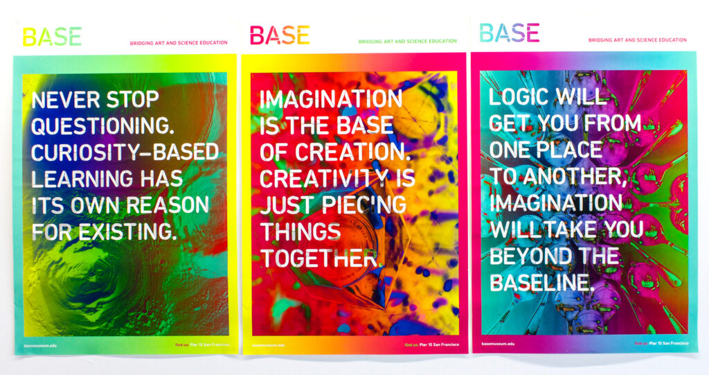
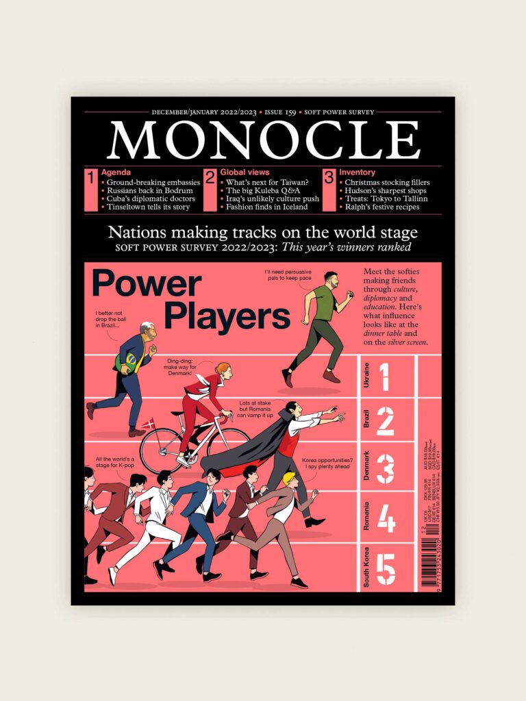
Base Museum 2015 poster Paola Meraz[/caption]
Conclusion
In conclusion, fluorescent and neon colors can be powerful tools for creating attention-grabbing visuals in branding and design.
By adding a pop of energy and bright, intense color to a design, brands can create a sense of energy, excitement, energy, and youthfulness that can help them stand out in crowded marketplaces.
When used thoughtfully and strategically, these colors can be effective elements in a brand’s visual identity and help create a strong and memorable brand presence.
-
 Ebook: Brand Your Etsy Shop Like A Pro11.00 $ incl. VAT
 -
The Ultimate Beauty Branding Handbook11.00 $ incl. VAT
-
E-book: The Ultimate Guide to Branding Styles11.00 $ incl. VAT

